


Like a written equivalent of an elevator pitch, your one-pager summarizes the core elements of your business. If a typical elevator pitch takes around 20 to 30 seconds, the challenge of a one-pager is to fit all the pertinent points, i.e., your business model, target audience, competitors, unique selling proposition, business objectives, and team, in one single page, without overwhelming the reader.
Aside from the right format and focused content, what makes it effective is having a clean, cohesive one page layout design.
In this blog, we’ll help you achieve that with these fundamental one pager design ideas and free templates that you can customize:
1. Stick to your brand personality
The whole point of branding is having a recognizable identity that can be associated with certain qualities or values that your business espouses. It would be impossible to achieve this with your document if its one page layout design has no discernible connection to your company’s branding.
Branding in design covers both visual and written elements. From the color palette and the logo variations to the fonts and typefaces to the tone of your text, everything has to work in concert to project the image you want for your business.
Establishing these elements from the start brings into focus what to expect from your company while reining in any creative impulses that can result in a garish, over-designed document.
2. Consider font size and contrast
One of the foremost considerations with a one page responsive design is legibility. After all, you want people to read this particular document. Font size and contrast are the two design elements that have the most obvious effects on legibility:
- Font size — Generally speaking, 10 or 12 point font size works well. Either size is large enough to be readable on paper but doesn’t take up too much space that you have to heavily limit your word count.
- Contrast — Black font on white space is the standard. When using colors, avoid combinations such as red and green, blue and yellow, or red and blue/purple.
3. White space works wonders
What you leave blank on your one-pager factors heavily into its overall design, whether it’s the invisible borders to the sides, the top, and the bottom or the empty lines between paragraphs.
Making full use of white space accomplishes three key goals:
- Improves legibility — By spacing apart text and design elements, you avoid visual clutter that makes your one-pager hard to read.
- Guides readers’ gaze — White space around text and design elements tells readers which ones they should direct their attention to.
- Exudes elegance — Using more white space on your one-pager creates a professional look that signals confidence and sophistication compared to a busy design that reads as cheap and tacky.
4. Distinguish through hierarchy
Keeping a reader’s attention throughout your entire one-pager can be difficult if it feels monotonous. You can make the experience of reading your one page layout design flow much better when there is a distinct visual hierarchy that readers can follow:
- Group-related items by style — When readers see certain items share the same look, they naturally assume these items are related.
- Take advantage of reading patterns — People generally scan in F or Z patterns (left to right then down and repeat). Either follow this pattern or break it to highlight a focal point.
- Highlight critical info — The most important points of your business one-pager should stand out. Use different design elements (e.g. font size, color, etc) for such purposes.
5. Wield color and typography wisely
As the most visible design elements you can have on your one-pager, your choice of color and typography make the most immediate impact on readers. Choose carefully, taking into account your audience and what reaction you want to get from them:
- Color sets the mood — People associate concepts and mindsets with colors, such as red with boldness and green with nature. Remember your brand and reinforce it with color.
- Typography sets the tone — Your font choice expresses how you present your ideas. Serif fonts can give your one-pager an air of formality and tradition, while sans serif suggest a modern sensibility.
6. Make formatting dynamic
Apart from strategically utilizing discrete design elements such as fonts and colors, you can enhance the readability of your one-pager through dynamic formatting. You are more likely to keep readers engaged when the contents of your one-pager aren’t just blocks of text.
- Make bulleted lists — They act as attention-grabbing mini-headlines to pull readers further in, while also letting them skim if they want to.
- Use bolded text — This formatting goes with lists, but outside of that context, only use them if you really need to underscore a point and have no other option.
- Write short paragraphs — Two to three sentences should do. The more concise you can deliver your one-pager’s message, the better.
7. Emphasize with an image
If you have the space on your one-pager, you can include an image. It can do a lot of heavy lifting if you need to explain a particularly complex concept or show an example of a process at work. Use it as a sort of exclamation point to end your one-pager with something readers can easily remember.
8. Balance your composition
A well-thought-out one page layout design means no one section should be getting all the attention to the complete detriment of the rest of the document. You can only really see that a one-pager has a balanced design by literally looking at it with your eyes. Try to achieve either of the following two types of balance:
- Symmetrical balance — Each section has equal visual weight balanced on a central point.
- Asymmetrical balance — One section has one dominant element that is balanced by the other section with smaller multiple elements.
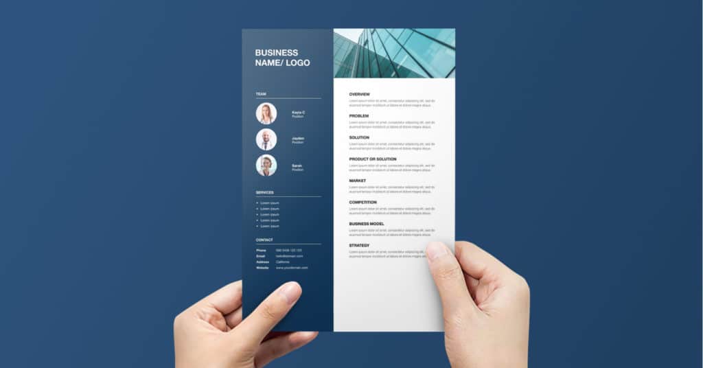
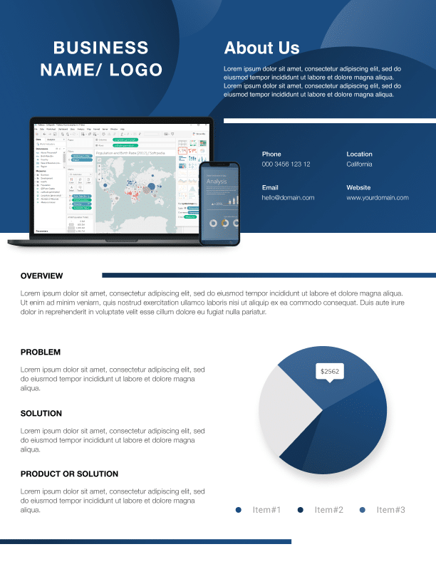
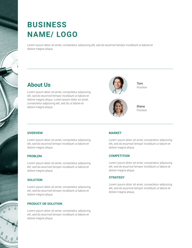
One Page Brochure Design Inspiration You Can Use For Free
Now that you know how to design a one pager, here are some of our business one pager design templates that you can use and customize:
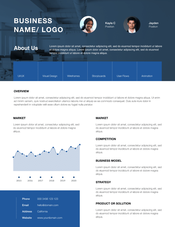
1. Tech Theme
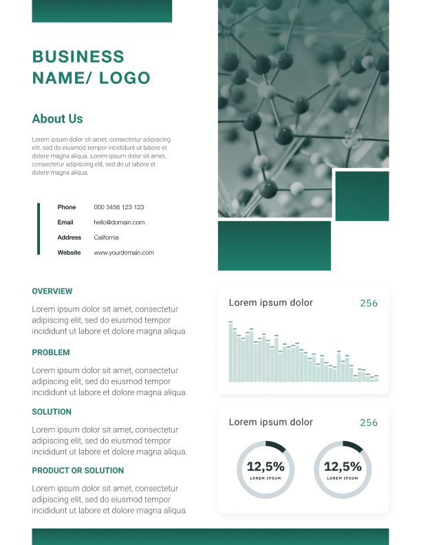
2. Health Theme
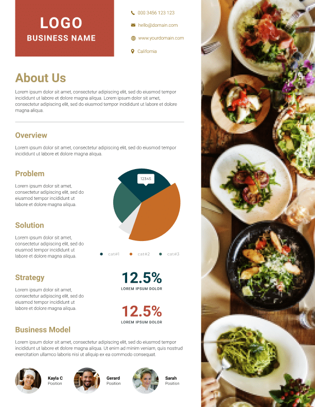
3. Restaurant Theme
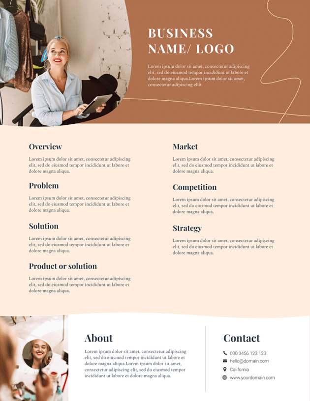
4. Beauty Theme
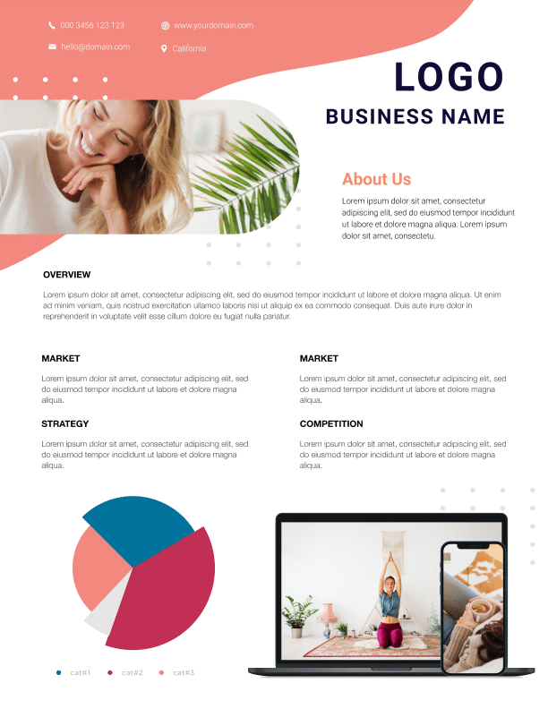
5. Lifestyle Theme
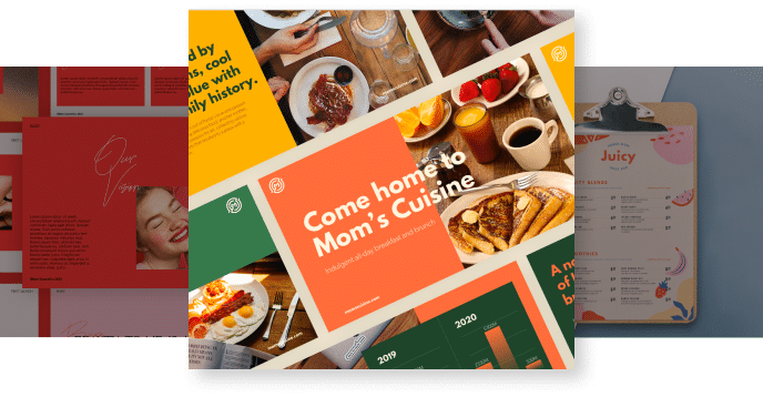
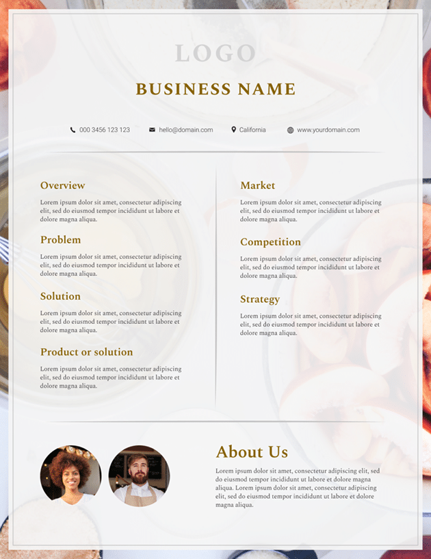
6. F&B Theme
7. Pharmaceuticals Theme
8. Corporate Theme
Access more customizable one pager design ideas and design tips when you download our free business one-pager guide here.
If you’re looking for help designing a custom one-pager, you can leave the task (and more) to our top designers.


")
")