


1. Success is in Simplicity
People only spend about 1.3 seconds looking at a banner ad on their desktop computer and 1.5 seconds for mobile ads. With such precious little time your ad has to make an impression, it has to get its message across quickly. A good foundation for a creative banner ad design is a high-quality graphic and easy-to-read copy.
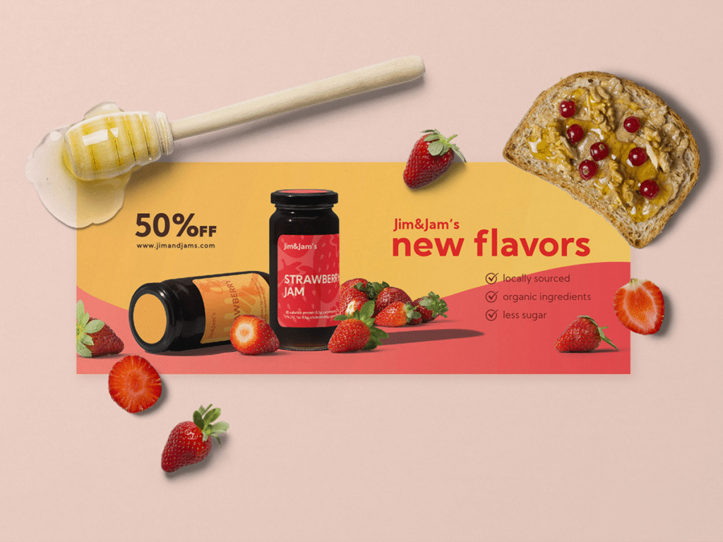
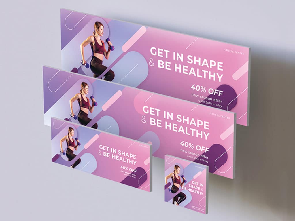
2. Showcase the Product
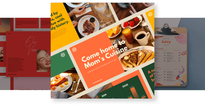
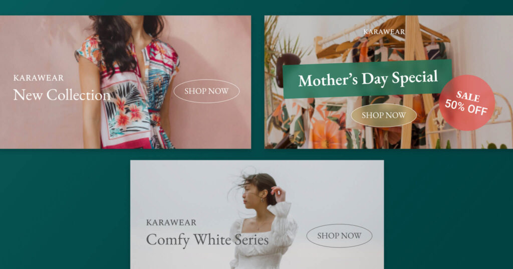
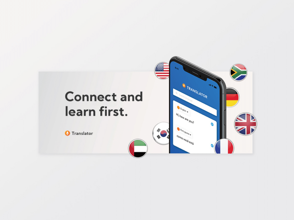
Put your offer front and center in your banner ad. Physical products in particular should have the spotlight so that people know exactly what they’re getting when they click on the ad.
However, this may not be as straightforward for digital products or services. The solution is to underscore a benefit or to address a pain point, then add a call-to-action that leans more toward getting your audience to click and learn more about your offer.
3. Hierarchy is Key
There is limited space to even the biggest banner ads, so using that space requires a careful balance. There are three crucial banner ad elements with varying levels of priority:
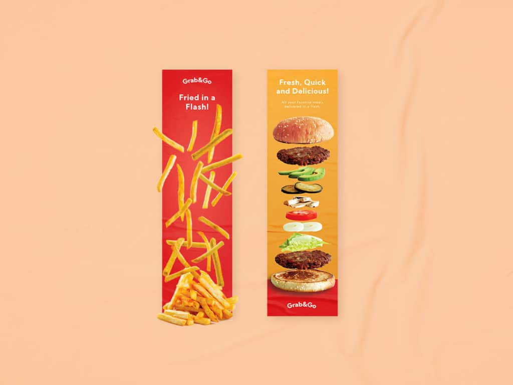
The Logo
Your logo should be immediately visible. It’s how people unfamiliar with your company can start recognizing your brand, and it’s how people who are familiar with your company can instantly know that your offer is trustworthy.
The Value Proposition
At the core of your banner ad should be the offer you are making. The value proposition aims to fulfill a desire or solve a problem for your target audience, and it’s the one element that people’s eyes must gravitate towards.
The CTA
The call-to-action actively pushes the target audience to click. It should come after people have seen the offer so they can take direct action afterwards, whether it’s buying a product or learning more about it.
4. Framing Draws Attention
Remember: Your ad is directly competing with the rest of the content on the page for the attention of site visitors. It can easily blend into the background if you don’t put enough care into how you set it apart. A solid frame that contrasts with the colors of both the site and the ad itself will help lead your audience’s eyes onto your product.
5. Animate your Ad
To see Animation Example from Design Force.
When everything on a page is static, an animated ad will naturally get people to look. You also have a little more room to tell a short but impactful story. However, you shouldn’t go overboard with the animation, as it can annoy people instead. Flashy animated ads can also feel cheap. Limit the animation to 15 seconds max and keep it simple.
6. Colors Are Evocative
Humans associate feelings and concepts with colors on a subconscious level, so it’s important that you choose the right colors that best fit your ad’s message to instantly strike a chord with your target audience.
Here’s a basic rundown of what we associate with colors and how you can match them with your banner ad design:
- Red — Excitement, urgency, and passion. Extremely useful in getting attention.
- Blue — Security, clarity, and masculinity. Good for gaining trust and why plenty of logos have it.
- Yellow — Energy and warmth. Eye-catching and infectious.
- Orange — Playfulness. Puts people in the mood for fun.
- Green — Health, nature, and positivity. It’s calming and also works as a go signal.
- Purple — Luxury. Adds a touch of sophistication.
- Pink — Femininity. It’s a go-to for advertising products aimed at women.
- White — Purity and simplicity. Can also be used as negative space to emphasize your offer.
- Black — Prestige and class. Premium products shine with black, and it’s also practical for contrasting purposes.
7. Maintain Brand Consistency
Designing banner ads goes beyond the ad itself. When people click on your ad, they expect to get a similar brand experience on whatever page they end up on. The tone and aesthetic should match for both your banner ads and their landing pages.
If your website has a classy, professional look to it, create banner ad design that give off that same vibe. It would be jarring for people to click on a bright and cheery ad with bombastic language and find themselves on a website with an elegant atmosphere and subdued copy.
Clickable Banner Ads Need Great Design
Banner ads continue to be effective marketing materials to this day. However, making them clickable is a whole discipline. For a successful banner ad campaign, apply these banner ad design tips to your creation process to help you out.
But if you find yourself needing the expert direction of seasoned designers from a banner ad design company, contact us today and a member of our team will reach out to you within 24 hours.