

Every hero needs a guide: why design grids matter
Ever had that moment where you pour your creative soul into a layout, only to step back and feel… something’s missing? The visuals are stunning, the colors pop, but the overall flow just isn’t clicking. Here’s a little secret: even the most boundary-pushing designers have a reliable sidekick working in the shadows.
Enter: grid systems in graphic design. The invisible guides that bring alignment, balance, and order to your creative chaos. Grids are the creative equivalent of a trusty road map, giving your ideas the structure and rhythm they need to shine.
In this article, you’ll meet the full grid squad, learn when and how to use each design grid, and discover real-world strategies for making grids your not-so-secret weapon.
What is a grid system? (And why your layouts want one)
Let’s start with the basics. A grid system in graphic design is a framework of intersecting horizontal and vertical lines. Think of it as scaffolding for your creative ideas—it quietly organizes all those text blocks, images, and white space so everything falls into place.
But grids aren’t just about neatness. Their true superpower is in how they create relationships between elements. When you use a grid, your designs gain:
- Alignment
Every element sits exactly where it should, creating a sense of order and professionalism - Consistency
Repeated spacing and structure mean every page, screen, or spread feels like part of the same story - Harmony
Grids give your layouts a rhythm, helping the viewer’s eye move naturally from one element to the next
Visualize two layouts: one where every headline, image, and button floats freely—quirky, but maybe a bit confusing. Now, imagine the same content locked to an invisible underlying grid. The result? A design that feels intentional, navigable, and cohesive. Even if you’re breaking a few rules along the way.
Grids don’t box you in. They free you to be bold, knowing your foundation is rock-solid.
Meet the grid squad: Types and when to use each
Like any great superhero team, each design grid has its own unique strengths. Here’s your introduction to the grid squad—the creative sidekicks ready to tackle any layout challenge.
Manuscript (block) grid: The storyteller
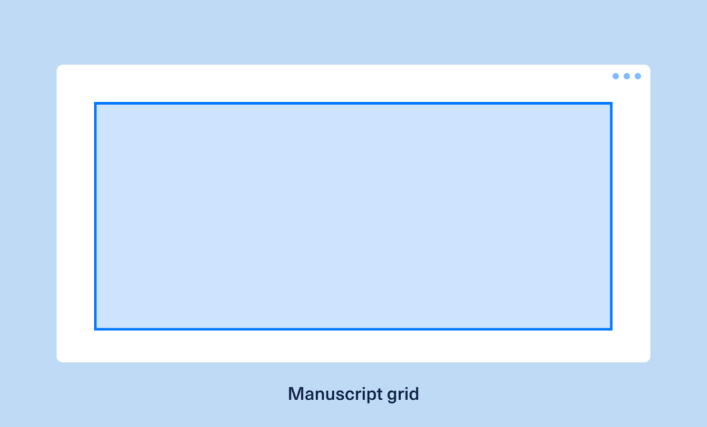
The manuscript grid is the wise storyteller of the group. It’s as classic as it gets: a single, wide column that’s perfect for long blocks of text. This grid is the backbone of editorial layouts—think novels, reports, and immersive articles where reading flow is everything.
Use case:
Editorial spreads, eBooks, articles, and white papers—anywhere you want readers to get lost in the narrative, not distracted by clutter.
Why it matters:
By focusing attention and creating a smooth reading path, the manuscript grid lets your story take center stage.
Column grid: The multitasker
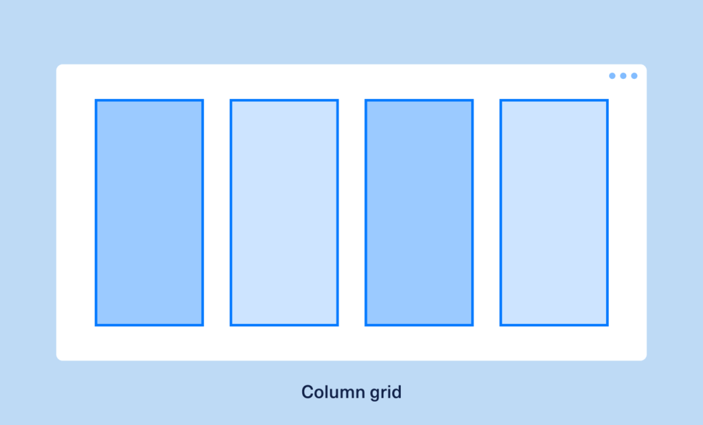
If the manuscript grid is the storyteller, the column grid is the agile multitasker—splitting your page into multiple vertical columns separated by gutters. This design grid is the foundation of magazines, newspapers, and modern web pages, letting you juggle headlines, images, sidebars, and pull quotes without losing your grip on structure.
Use case:
Magazines, newspapers, blog layouts, and multi-column web pages where flexible content flow is a must.
Why it matters:
Column grids offer flexibility and help you play with hierarchy—making it easy to guide the reader’s eye and create dynamic, engaging experiences.
Modular grid: The organizer
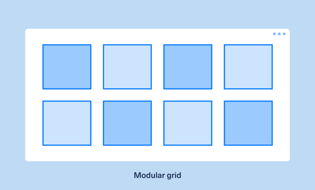
Here’s where things get really interesting. The modular grid adds horizontal lines to the column grid, forming a matrix of equally sized modules. It’s the ultimate organizer—ideal for designs with lots of moving parts, like dashboards, galleries, or e-commerce sites.
Use case:
Data-heavy interfaces, portfolios, product grids, and card-based designs. Basically, anywhere you need to present lots of information clearly.
Why it matters:
Modular grids make it easy to maintain order, even when your content is complex or constantly changing. They’re the backbone of scalable, repeatable layouts.
Hierarchical grid: The creative rebel
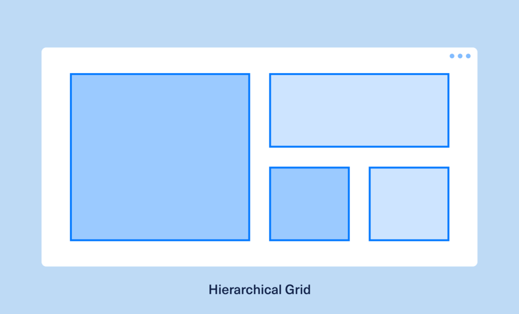
Not every story is linear, and not every design should be, either. The hierarchical grid is your creative rebel: it ditches strict modules in favor of a structure based on content importance and flow. This design grid is all about leading the viewer’s eye, creating emphasis, and making an impact.
Use case:
Creative posters, asymmetrical editorial layouts, landing pages, and advertising. Places where you want to break free from predictability.
Why it matters:
Hierarchical grids let you go bold and break the mold, without losing all sense of order. They’re perfect for layouts that need to surprise and delight.
Baseline grid: The perfectionist
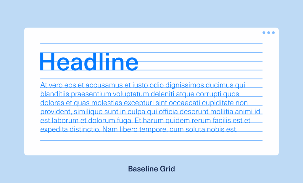
Meet the perfectionist of the group. A baseline grid is a set of evenly spaced horizontal lines, used to align text across columns. This grid is a typographer’s dream, ensuring every line of copy sits perfectly in sync, no matter how wild the rest of your design gets.
Use case:
Multi-column text layouts, magazines, web articles, and anywhere typographic consistency is crucial.
Why it matters:
Baseline grids keep your text rhythm flawless, making your work look clean, professional, and easy to read.
How to choose and apply your grid sidekick
Ready to recruit the right grid for your next creative mission? Here’s how to pick your sidekick and put them to work:
1. Assess your content
Start with a simple question: What’s the star of your layout?
Is it a flowing narrative, a gallery of images, or a mix of both? Manuscript grids excel with long-form text, while modular grids shine when organizing cards, data, or visuals.
2. Define margins and gutters
Margins are your content’s breathing room. Gutters are the space between columns and modules. Both are essential for clarity and focus—don’t crowd your elements. Let them shine with the right amount of space.
3. Establish a baseline grid for typography
A baseline grid is essential for keeping your typography crisp and consistent.
👉 Design Force tip:
If your design features multiple columns of text, sync your lines using a baseline grid to create a visual rhythm that feels instantly more professional.
4. Adapt for responsiveness
Welcome to the era of responsive grid design. Today’s designs need to flex across devices, so use fluid column widths or modular adjustments to keep your layout structure consistent, whether on desktop, tablet, or mobile.
5. Break the grid (intentionally)
Once you’ve mastered the rules, don’t be afraid to bend them. A headline that spans columns, an image that pops outside the grid, or a block of color that disrupts the rhythm—these creative “plot twists” add emphasis and energy.
👉 Design Force tip:
Break the grid with purpose. Like any hero, your design needs a strong foundation before it can pull off a daring move.
Tools and resources: Your grid utility belt
You don’t have to invent your design grids from scratch. Here’s what the pros use to keep their layouts in line:
- Figma
Layout Grid settings let you add columns, set margins, and adjust gutters for pixel-perfect alignment - Adobe InDesign
Margins and Columns panel makes it easy to set up custom grids for both print and digital projects - CSS frameworks
Bootstrap and CSS Grid plugins are essential for responsive grid design on the web, with ready-made options for layout structure - Design Force resource library
Explore our collection of free grid templates for both print and digital projects—perfect for experimenting or getting started fast
👉 Design Force tip:
Save your favorite grid setups as reusable templates. You’ll work faster, smarter, and with more confidence.
Real-world examples: When grids save the day
Let’s take a look at how top brands and creative platforms use their grid sidekicks to create magic:
The New York Times
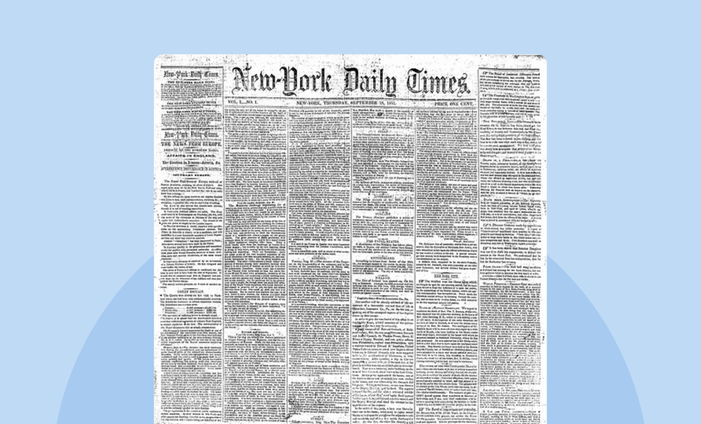
The Times is a master of the column grid. Multiple columns of content, images, and headlines are perfectly aligned, making dense information not only readable but inviting. Their layout structure is classic yet flexible, adapting seamlessly across print and digital.
Behance portfolio pages
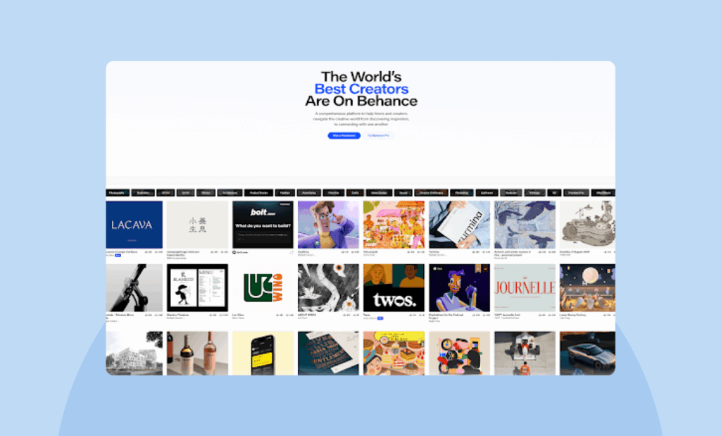
Behance uses modular grids to showcase creative projects in neat, card-based layouts. Each portfolio piece gets its own space, and the grid adapts fluidly to different screen sizes—proving that modular grids are perfect for responsive grid design.
Apple’s product pages
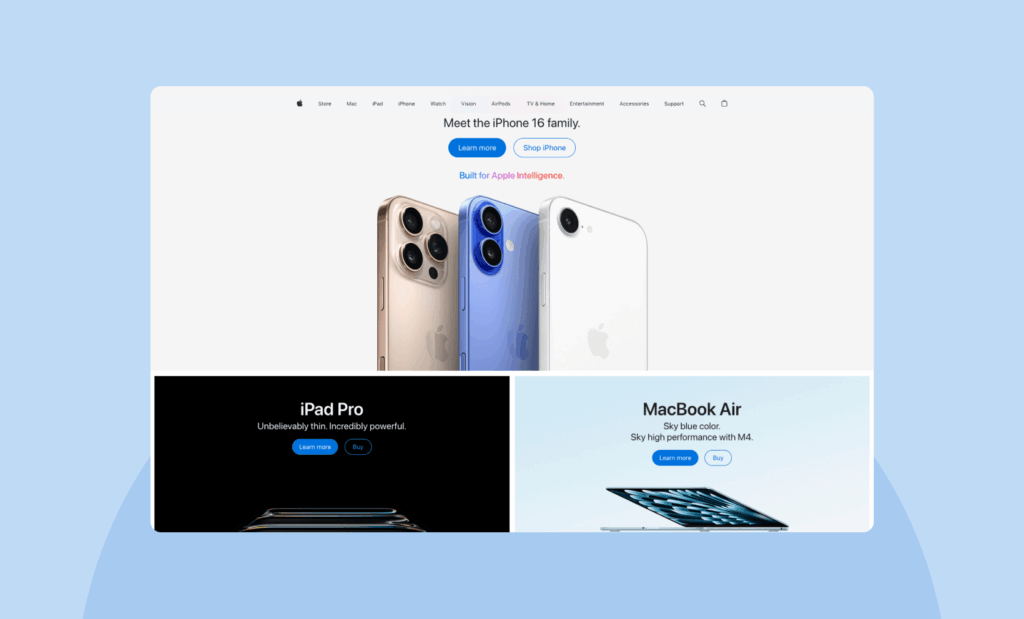
Apple’s web pages often rely on hierarchical grids, balancing large imagery with supporting text blocks. The result is a layout that feels both structured and free-flowing—guiding users through product features with clarity and style.
These examples prove that grid systems in graphic design aren’t just for textbooks; they’re the backbone of some of the world’s most engaging, effective layouts.
Give your creativity a framework (not a cage)
Let’s bust a myth: grids don’t stifle creativity—they amplify it. With the right design grid, you can dream bigger and push bolder ideas, knowing you’ve got a solid structure supporting every move.
Here’s a challenge…
The next time you approach a new project, try working with a grid system you haven’t used before. Whether it’s a modular grid for your portfolio, a baseline grid for a long-form article, or a hierarchical grid for a striking poster—see how it changes your flow and elevates your work.Want more design frameworks, tips, and inspiration? Subscribe to the Design Force newsletter and discover our Design Subscription Services—your shortcut to smarter, more creative workflows.