
Color is your silent persuader
Ever notice how you instantly “feel” a brand before you even read a word? That’s not a happy accident—it’s color psychology in design at work. Whether you’re a designer, marketer, or brand strategist, you already know color choices aren’t about playing favorites; they’re about guiding emotion and perception on a gut level.
Color psychology is the study of how hues influence human feelings and behaviors. In branding, it’s how you set the mood, trigger action, and create a memory—all within seconds.
In this article, you’ll learn the key color associations that shape audience reactions, how to use color theory for branding with intent, and actionable tips for applying the emotional impact of color in your daily design projects.
Why color psychology matters
Color isn’t just the icing on the cake—it’s the engine driving your audience’s gut reactions and clicks. The emotional impact of color is more than theory; it’s backed by hard data and real-world results.
Take CTA buttons, for example. A massive analysis of more than 2,500 A/B tests found that blue buttons performed best 31% of the time, outranking other popular hues like green and red. But red has its own claim to fame: in HubSpot’s now-classic experiment, a red “Buy Now” button outperformed a green one by 21%—and further studies show that simply switching a CTA to red can lift conversions by as much as 34%.
Another standout? Orange and red buttons can boost clicks by 32–40% compared to more subdued colors, thanks to their urgency and energy. When you realize that even a small color tweak can make a major difference in engagement, you start to see color psychology in design as a vital tool for influence—not just decoration.
When used intentionally, the right hue becomes a handshake, a mood setter, and a call to action all rolled into one.
Core color associations: Your quick-reference cheat sheet
Let’s break down the basics. Here’s a compact list of core color associations, so you can match hue meaning in design to your project’s goals.
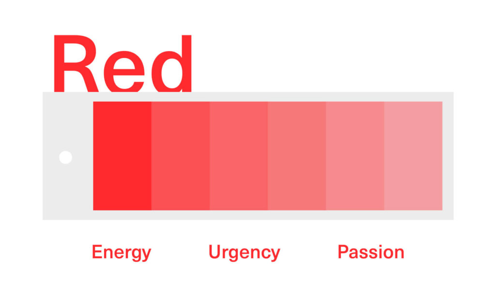
- Red:
Energy, urgency, passion
Great for calls to action, sales banners, brands that thrive on excitement
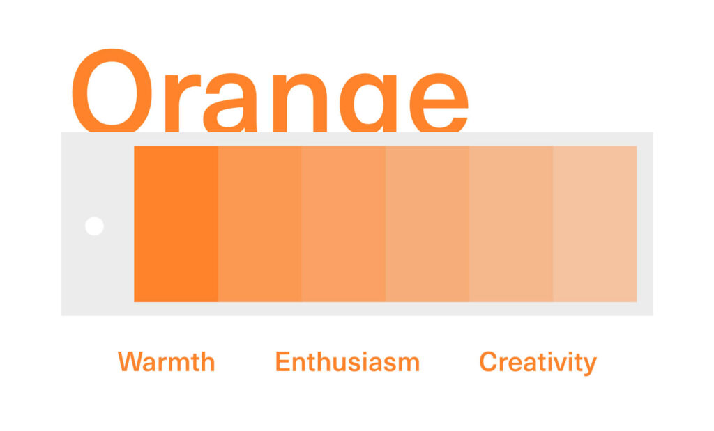
- Orange:
Warmth, enthusiasm, creativity
Great for youth-focused brands, creative agencies, food and beverage
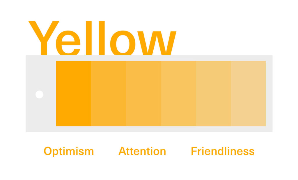
- Yellow:
Optimism, attention, friendliness
Great for highlighting info, kids’ products, brands that want to feel cheerful
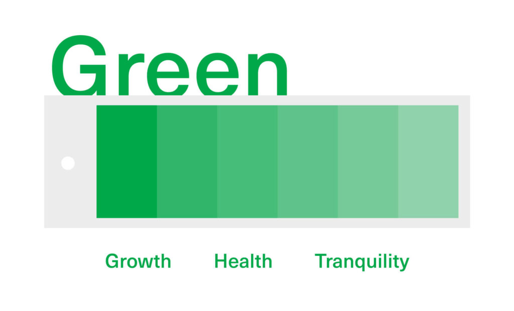
- Green:
Growth, health, tranquility
Great for eco-friendly brands, wellness, finance
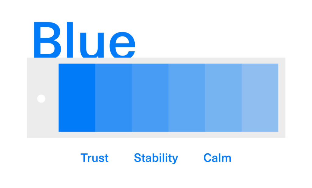
- Blue:
Trust, stability, calm
Great for tech, healthcare, banking
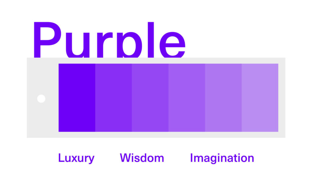
- Purple:
Luxury, wisdom, imagination
Great for beauty, education, premium products
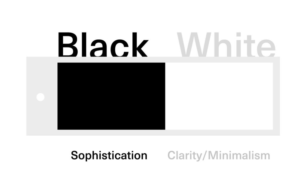
- Black and White:
Sophistication (black), clarity/minimalism (white)
Great for luxury brands, tech, editorial design
Understanding color associations makes it easier to craft the emotional journey you want your audience to take. But remember—context is everything. A splash of red in a health app might signal danger, while in a sports brand, it’s a symbol of pure adrenaline.
Applying color psychology in your designs
So, how do you move from theory to practice? Here’s how to make color psychology in design work for you—not just as a finishing touch, but as a core strategy.
1. Establish your intent
Start by asking: What do you want your audience to feel or do?
If you’re designing for an eco-conscious startup, green and earthy tones should dominate. For a fintech brand seeking trust, blues and whites are your best friends. Define your emotional goal, then let color lead the way.
2. Use contrast strategically
Contrast isn’t just about legibility—it’s about focus.
Use a bold accent hue (think yellow or orange) to draw the eye to the most important action, like a “Subscribe” button or headline. For example, a calm blue background with a red CTA demands attention without shouting over the rest of your design.
3. Consider cultural context
Color associations aren’t universal.
White is purity in the US but can symbolize mourning in parts of Asia. Red is lucky in China but can mean warning elsewhere. Especially for global brands, always research the hue meaning in design for your target region before finalizing a palette.
4. Test and iterate
Don’t leave color decisions to chance.
Share your color choices with teammates or test with a small user group. Tools like A/B testing and heatmaps can reveal which colors drive the emotional impact you want.
Remember, what works for one audience may flop with another—so experiment, gather feedback, and refine.
Design Force tip: Document your color system alongside your brand guidelines. This keeps everyone on the same (colorful) page and ensures consistency across every touchpoint.
Quick tools and resources for color psychology
If you feel like color theory for branding is a rabbit hole, here are some fast-track resources to make color psychology in design easier:
- Online generators:
- Adobe Color “Mood”
Build palettes based on emotional targets - Coolors psychology filter
Generate color schemes by mood or association
- Adobe Color “Mood”
- Plugins:
- Figma Color Blind Simulator
Preview how your palette works for all users - Sketch Contrast Checker
Ensure readability and accessibility for every audience
- Figma Color Blind Simulator
- Further reading:
- Color Psychology Cheat Sheet (Infographic)
A visual guide to quick color associations and meanings
- Color Psychology Cheat Sheet (Infographic)
Bookmark these tools for your next project—they’re lifesavers when you need to craft a palette that not only looks great, but feels right.
Color: The designer’s silent superpower
Here’s the thing: color isn’t just decoration—it’s a silent communicator, shaping how people feel, act, and remember your brand.
Next time you sit down to design, challenge yourself → swap out one primary color based on the emotion you want to evoke and see what changes. Maybe you’ll trade blue for green to signal fresh beginnings, or inject orange to spark creativity.
Ready to put color psychology in design to work? Get more quick, practical insights like this—sign up for the Design Force newsletter and stay ahead of the curve.