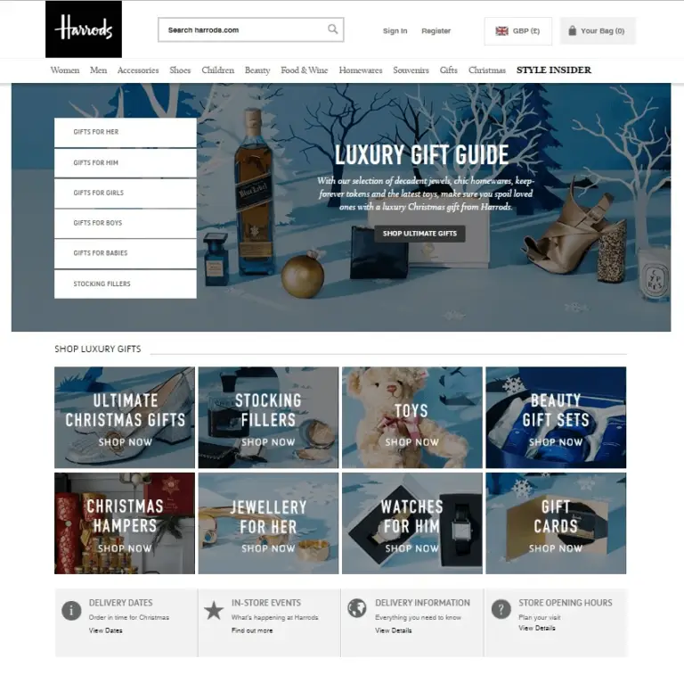
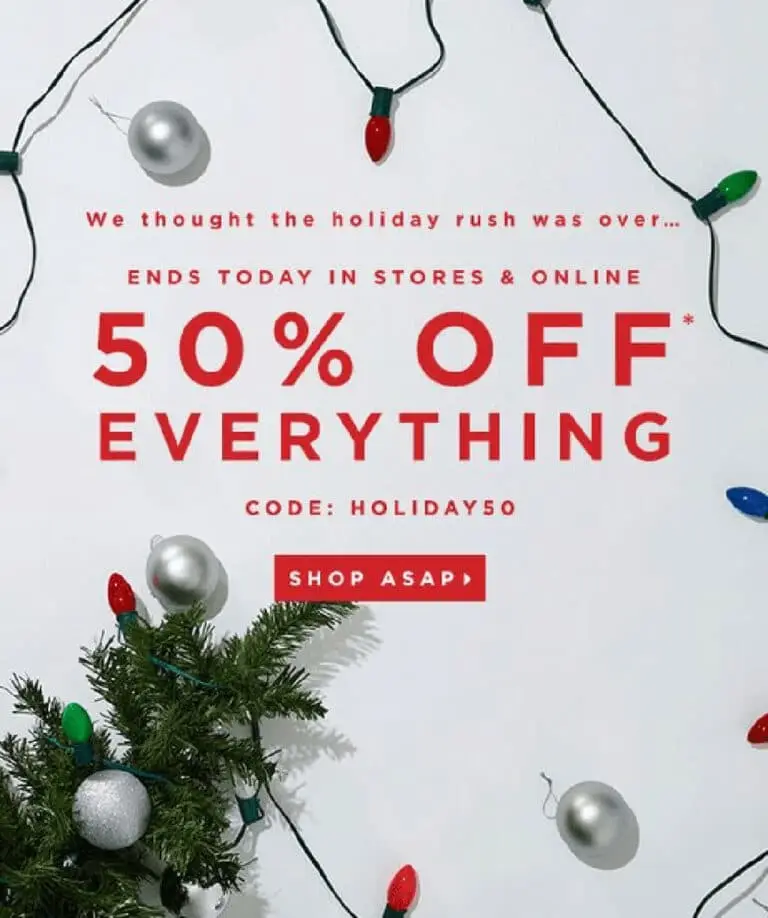
Whether you’re offering discounts or launching a more affordable version of your product, your Christmas landing page needs to be designed effectively as it plays a massive role in how well it converts. Keep in mind that you’re not the only business trying to win the game for consumer’s attention. Take note of our 7 best christmas landing pages design ideas:
1. Use Holiday Colors, Images, and Themes
Of course, it won’t be a Christmas landing page design without its all-too-familiar elements, including:
- Icons like snowflakes, reindeers, Christmas trees, and Santa Claus
- Sceneries like winter tourist spots (e.g. skiing resorts) or pavements adorned with Christmas lights
- People wearing winter clothing or holiday sweaters
- Bows and presents (some even add these to their logos)

When it comes to colors, make sure that you don’t go overboard. You can work with classic Christmas colors like red or green accents. You can also go for a more subtle approach with gold, blue, and silver.
2. Use Visual Cues

Visual cues help direct a person’s attention towards the most important parts of the landing page and subtly guide them to take action. Some of the visual cues you can use for your holiday landing page include:
- Text-based visual triggers — Capitalize a word or a phrase, underline text, bold to highlight words, use different fonts for key phrases or words
- Icons — Use arrows, pointing fingers, shapes, or boxes to highlight important copy.
- Color contrast — Use contrasting colors to draw attention (usually done for the CTA buttons)
3. Highlight What’s New and Special

If you’re running a special promotion, make sure that your Christmas landing page template makes it easy for your customers to see what’s on offer. Remember: You’re competing for their attention. If they can’t immediately see the value, they may go elsewhere .
Use some of the visual cues mentioned earlier to highlight your offer. Whichever way you approach this, keep discounts or promos front and center.
4. Add A Sense of Urgency

The fear of missing out is a powerful psychological trigger, because people are naturally risk-averse. This is why adding a sense of urgency is a tried and tested approach to converting your shoppers . Among the many ways you can tap on FOMO for your Christmas landing page include:
- Add an ending time for your offer or even a countdown timer
- Offering temporary deals (e.g. a huge discount that expires at midnight)
- Indicating how much is left in stock
- Playing on loss aversion (e.g. a coupon they will lose if they close the window)
5. Optimize for Mobile
Living in the new normal prompted a major change in customer behavior. Holiday purchases through mobile shopping are projected to reach $314 billion this year, making up 44% of all e-commerce sales, according to eMarketer. This is a potential 57% growth from $200 billion m-commerce sales merely four years ago.
Needless to say, your holiday landing page needs to be optimized for mobile users. We have written a guide on designing a website for the mobile-first consumer, and among the several tips we’ve shared include:
- Designing for different devices as they vary in size, format, and software versions
- Making sure the elements on the page have enough spaces in-between, so customers won’t accidentally tap on the wrong button
- Ensuring the site loads quickly (Google recommends 3 seconds or less)
6. Know The Right Words to Use
The copy on your page goes hand-in-hand with your design. When writing your landing page content, keep these in mind:
- Use your customers’ language so you can connect with them, be conversational, and don’t be afraid to inject personality into your copy
- Speak directly to your customers by using ‘you’ or ‘your’
- Emphasize the benefits instead of the features of your product (e.g. how can your product make their lives better vs what your product can do)
- Don’t skimp on brainstorming and writing your headlines and subheadlines as these are what customers usually read
- Use formatting to your advantage so the page can be easily skimmed (e.g. bullet points, short paragraphs, and sentences, headings/subheadings, etc)
7. Have a Clear CTA

What is the goal of your landing page? Is it to buy your product, sign up for a demo, or complete a contact form? Whatever it is, your call-to-action should be clear and direct the person to their next step (e.g. Buy Now, Add to Cart, Call Us, etc). Use the appropriate visual cues and the right words or statements to make your CTA more prominent.
Create Your Landing Page for the Holidays
An underperforming holiday landing page can hurt your bottom line, especially if you’re trying to make up for revenue loss due to the pandemic. Implement our tips above (and look at the Christmas landing page examples) to make sure that you’re ready for the incoming online holiday traffic. Don’t forget to spend time testing how your landing page performs so you can tweak it as needed.
Running out of time to create your own Christmas landing page? Get in touch with our on-demand designers today and we’ll have your landing page ready on time.


