
Packaging, in itself, is a strategy.
Brands that invest heavily in advertising and retail execution, then send products into market in outdated packaging. That disconnect is costly.
With the global packaging market projected to reach $1.14 billion 2026, packaging design isn’t a finishing touch. It’s one of the most important brand investments a company can make.
Strong packaging design does far more than organize colors, copy, and logos. It influences shelf impact, ecommerce conversion, supply chain performance, and the customer experience at home.
Whether you are exploring a new packaging direction or looking for packaging design tips to reassess your current ones, this guide covers the decisions that matter most.
Start with where your packaging will live
Before anyone opens a design file, the most useful question to answer is: Where does this packaging need to perform?
Physical retail and e-commerce make completely different demands on a design. A product sitting on a crowded grocery shelf needs to be read from three feet away.
This means your packaging needs to have:
- Strong contrast
- Type that is legible at a distance
- A clear visual hierarchy to draw the eye
A product thumbnail in an online catalog needs to communicate brand and key information within a very small image. These two requirements don’t always point to the same solution.
Spend time in the actual environment before briefing a design team. If your product is going into retail, visit stores and study the competitive set.
Some questions to consider:
- What colors dominate the category?
- Where does the eye naturally land?
- How much of the package is actually visible in its shelf position?
If e-commerce is the focus, look at your product listing beside competing products on the platform. Seeing them side by side will help guide the decisions that come next.
Define the visual hierarchy before the brief
A common mistake is not defining what the shopper should see first. You have about two seconds to communicate your brand, product, and differentiation. Every front-panel element needs a clear priority, with only one being dominant. Agree internally on the order of importance—product name, benefit, or brand mark—before briefing designers to save revision time.
Real-world example: Great Value by Walmart

Source: Walmart
In April 2026, Walmart fully redesigned the brand’s packaging for nearly 10,000 products, the first major update in over a decade. The goal was to improve how customers find, compare, and choose products in both physical stores and online.
The new system achieved this by:
- Making the placement of key details (like nutrition labels and benefit claims) consistent
- Using clearer visual signals to help shoppers quickly identify products.
- Standardizing the layout and hierarchy across thousands of items

Source: Walmart
At Walmart’s scale, small packaging changes can make a big difference. The redesign helps products stand out on shelves while staying easy to read in small online thumbnails.
Instead of relying on complex graphics, the new system focuses on clarity and consistency. That makes it easier for shoppers to quickly find the right product, whether they’re in-store or browsing online.
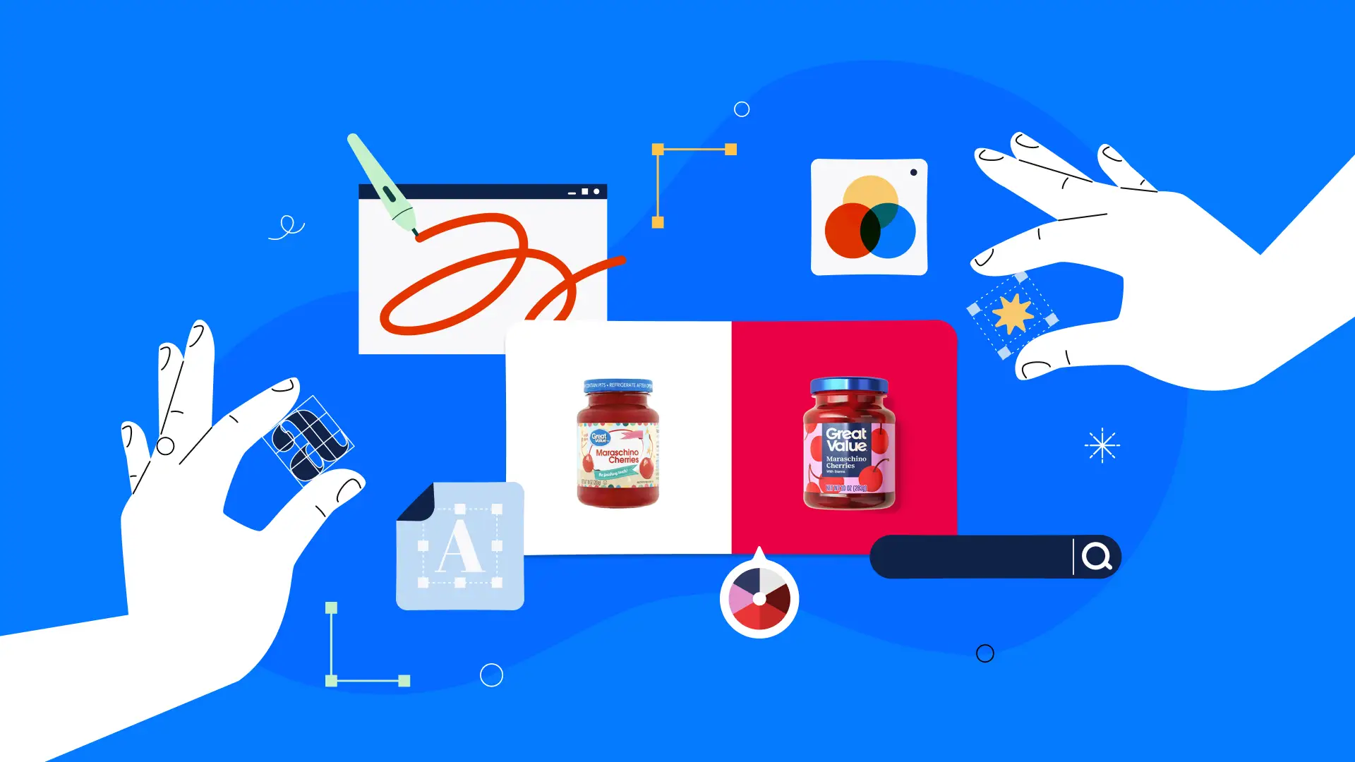
Treat color and typography as strategic decisions
Color and typography are two areas where brands consistently under-invest in strategic thinking. If you’re working through how to design product packaging, this is where many of the most choices get made.
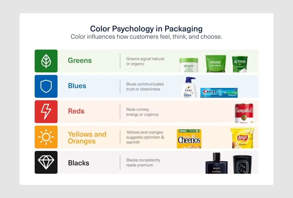
Color psychology in brand packaging design operates on two levels. At the category level, certain palettes carry built-in meaning:
At the brand level, color is one of the fastest signals of recognition across any retail or digital environment. If your brand has an established palette, extending it consistently into packaging is one of the most effective things you can do for shelf impact.
If you’re launching something new, think about how that palette will scale across a product line rather than a single SKU. That forward-looking decision tends to save significant redesign work later.
Typography is its own strategic conversation. The rules that apply to digital type don’t necessarily carry over to print. Fonts that look strong on screen can become difficult to read when printed small on a curved surface or textured material.
Typographic hierarchy on packaging typically means working with a clear distinction between no more than two or three typefaces, each assigned a specific role. The moment there’s ambiguity about which element carries the most weight, the design loses clarity.
Think in systems, not single SKUs
If your brand has more than one product, or expects to, packaging needs to function as a system from the start.
One of the most common pain paints from brands that have gone through a packaging overhaul is that they designed for the product line they had, not the one they were building toward.
A well-structured packaging system lets each SKU look distinct enough to differentiate within the line while still reading as part of the same family.
This balance is usually achieved through a consistent structural template covering logo placement, type zones, and information hierarchy. This is then combined with variable elements such as color, photography, or variant naming that shift across SKUs.
This is also the right time to think about how the system handles seasonal editions, limited-run collaborations, and future product extensions. Planning for those scenarios from the start means you won’t rebuild from scratch every time a new campaign comes up.
When you have a strong packaging system, it becomes a simple way to show your brand identity clearly at every stage of the customer’s journey.
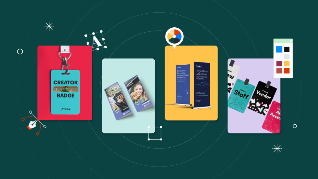
Real-world example: Scaling packaging as a system

Source: Design Force
Sackville & Co., a cannabis lifestyle brand, needed packaging and brand assets that could keep pace with rapid product launches without losing consistency. Design Force supported the brand across packaging design, retail assets, and marketing materials, helping reduce time-to-market by 65% while keeping the brand system cohesive.
It’s a clear example of why packaging should be treated as part of a larger brand ecosystem, not as a one-off design task.
Read the full Sackville & Co. case study to see how Design Force helped the brand scale creative production.
Material and structure communicate before words do
The physical properties of packaging are design decisions. Decisions like whether a box feels rigid or lightweight, or if a label has a matte or glossy finish, matter. Even whether a container is clear or opaque sends a signal before a customer reads any copy.
For consumer brands, material and structural choices directly affect how quality is perceived. For example, a high-end skincare brand may struggle to look and feel premium if it uses thin, flexible packaging and simple printed graphics instead of sturdier materials and more refined finishing.
A brand built around sustainability will undermine its own messaging if its packaging has excess plastic or unnecessary layers of material.
The practical side matters just as much. Can the packaging be shipped without damage? Does the closure work intuitively? Is the product straightforward to access without breaking anything?
If there is structural difficulty when the customer uses the packaging, it negatively affects their perception of the product itself.
Real-world example: McCormick’s Gourmet collection
Recent packaging updates show how much material and structure affect the way customers experience a product.

Source: Trend Hunter
McCormick’s Gourmet Collection is a strong example of how packaging materials and structure can reposition a familiar product as more premium.
The rebrand uses burgundy and gold labels, paired with a gold screw cap, to give the spice range a more elevated, artisanal feel on store shelves. Instead of relying on the full McCormick name, the packaging uses the brand’s signature badge, making each product feel more refined and less mass-market.
Design for the unboxing, not just the shelf
Unboxing is still a growth channel, especially for DTC brands, subscription products, and influencer gifting programs. The brand experience your packaging creates at that moment is something customers remember and talk about.
When a customer opens the box, it’s often the first physical interaction they have with the brand after purchase. The psychology is simple: ritual and reward. People remember the anticipation. The reveal. The texture of the materials, and how easy the package was to open.
But that does not mean every box needs to be elaborate. Intentionality matters more than budget. A thoughtful unboxing experience can include packaging design, tactile materials, and clean product staging.
For DTC and e-commerce brands, these details can also drive shareability. A well-designed opening moment gives customers a reason to take a photo, post a video, or talk about the brand online.
Real-world example: Alltrue builds unboxing into the product

Source: Alltrue
Alltrue shows how unboxing can become part of the product experience. Customers customize each Artisan Crafted box by choosing from multiple products across home, beauty, lifestyle, and other categories, so anticipation starts before the package arrives.
That mix of curation, personalization, and perceived value makes the reveal feel more intentional. The takeaway? Strong unboxing starts before the box is opened. For Alltrue, customization and thoughtful product selection make the experience feel personal, shareable, and aligned with the brand’s low-waste, community-driven positioning.
Real-world example: Drunk Elephant turns unboxing into discovery

Source: James Gulliver Hancock
Drunk Elephant shows how unboxing can feel like part of the brand experience, not just a delivery step. The packaging uses full-wrap graphics, bold spot colors, and themed kit concepts like “Inspector Drunk Night Kit” and “Agent Ellie” to make the box feel playful and distinctive.
Inside, the products are arranged in a fitted tray, which gives the reveal more structure and intentional. What makes this work is the sense of staging and discovery. The outer box creates anticipation, and the inside layout makes the products feel curated the moment the package is opened.
Evaluate before you finalize
Before any packaging design goes to production, run it through a practical set of questions.
- Does the design read at thumbnail size?
Pull it up on a phone screen and check whether the brand and product are still clear at that scale.
- Does it hold up across the full line?
Place all SKUs side by side. Assess whether they feel like a coherent family. Make sure there is enough variation to differentiate but enough consistency to signal the same brand.
- Have you seen a physical prototype?
Digital mockups aren’t a substitute for printed and assembled samples. Colors shift in print and finishes look different in person. Text that reads well in a PDF can become difficult to parse on a textured or curved material.
- Has someone outside the internal team reviewed it?
A fresh perspective catches things that familiarity tends to overlook.
- Does it still communicate your brand promise?
Ask whether someone with no prior knowledge of your brand could accurately describe what you stand for based on the packaging alone. If the answer is unclear, something in the design still needs attention.
Make packaging a strategic priority, not a production step
The brands that get packaging right treat it like a business decision, not a last-minute creative task. The strongest packaging design for consumer brands is usually built through early, deliberate choices about positioning, shelf presence, usability, and production—rather than rushed execution.
If your team is planning a new packaging project and wants a creative partner that can work through these decisions with you, book a call with Design Force. Our packaging design services cover everything from initial concept through production-ready files, with a dedicated team that learns your brand and keeps everything consistent across every deliverable.