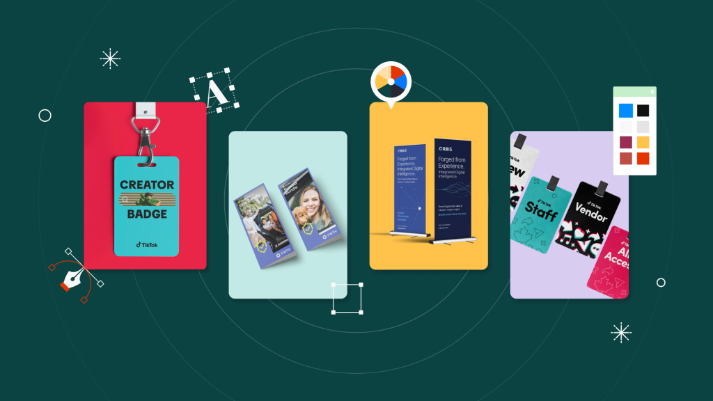
Mood boards are powerful visual tools for capturing the essence of a brand identity, guiding style guide decisions, and sparking creative ideas.
In 2025’s fast-paced design landscape, a well-crafted mood board is more than a collage of pretty pictures: it’s a deliberate roadmap that ties together color palettes, typography, imagery, and core brand elements.
Below, you’ll find practical tips and updated insights on how to create a mood board that sets the tone for any design project—whether it’s a personal endeavor or a professional campaign requiring strategic market research.
1. Define Your Purpose and Audience
Before you start pulling images or experimenting with layouts, clarify the primary goal of your mood board:
- Establishing a brand identity: If you’re creating or refining a brand, your mood board can direct the overall style guide, influencing everything from typography to logo design.
- Sparking design inspiration: For personal projects or exploratory work, your board serves as an evolving collection of visuals you can revisit and refine. If you’re looking for more ideas on creative direction, here’s where to get design inspiration for your brand.
- Communicating with stakeholders: If you’re working with clients, a mood board can showcase initial concepts and gather feedback before finalizing design elements
Additionally, research your target audience and market trends—an aspect often overlooked but crucial for ensuring your style resonates with the right people. Market research for branding offers insights into competitor visuals and industry best practices, helping you build a mood board that aligns with current expectations.
2. Choose the Right Format
When planning how to make your mood board, consider the practicalities of a physical vs. digital format. Each has distinct advantages that can shape your workflow.
Physical Mood Board
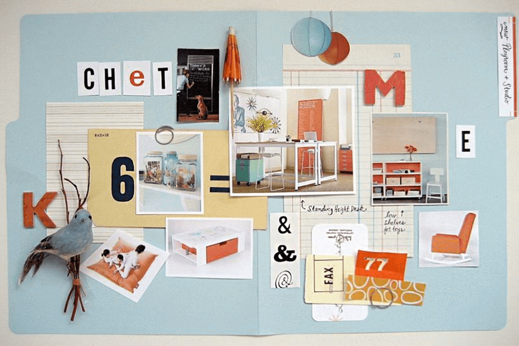
- Promotes out-of-the-box thinking – Laying out materials by hand (fabric swatches, magazine clippings, photographs) can spark creativity that’s sometimes harder to achieve on a computer.
- Harder to share – Physical boards can be cumbersome to photograph or transport. If your team or client is remote, sending digital snapshots can lose some of the tactile magic.
Digital Mood Board
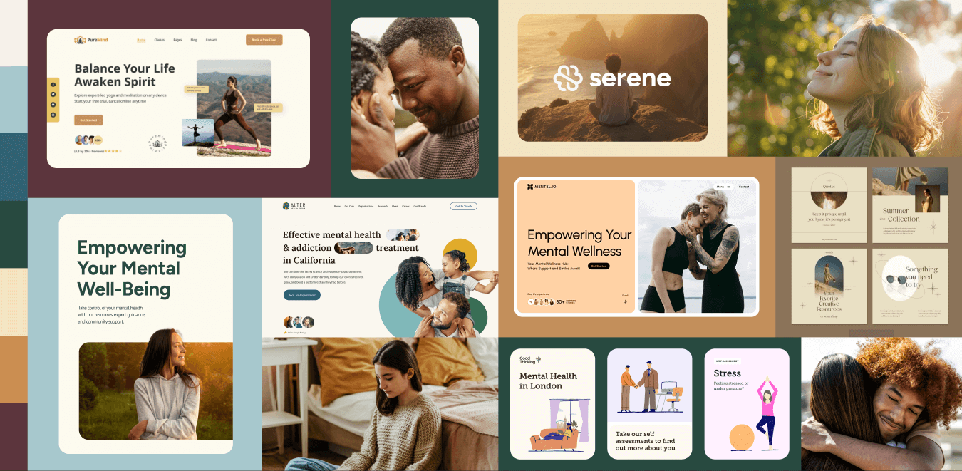
- Convenient and flexible – Quickly gather images online, experiment with typography choices in real-time, and easily incorporate brand or style guide elements.
- High expectations for polish – Clients may assume your digital mood board is close to a final design, so set expectations early about what feedback you need at this exploratory stage.
If going digital, popular tools include Figma, Sketch, Adobe XD, and Canva. Some professionals also utilize Miro, Pinterest, or Notion to gather inspiration and collaborate in real-time.
3. Capture Original Inspiration
While it’s tempting to rely solely on online images, there’s a world of inspiration waiting outside:
- Use your smartphone camera to photograph anything eye-catching—architectural details, vibrant storefronts, natural textures, or unique signage.
- Leverage your immediate surroundings: If your mood board will inform a style guide for a local brand identity, visit relevant physical spaces (like cultural landmarks or local art galleries) to capture an authentic aesthetic.
This hands-on approach ensures your mood board stands out, showcasing genuine influences rather than solely repurposing digital content that others have already curated.
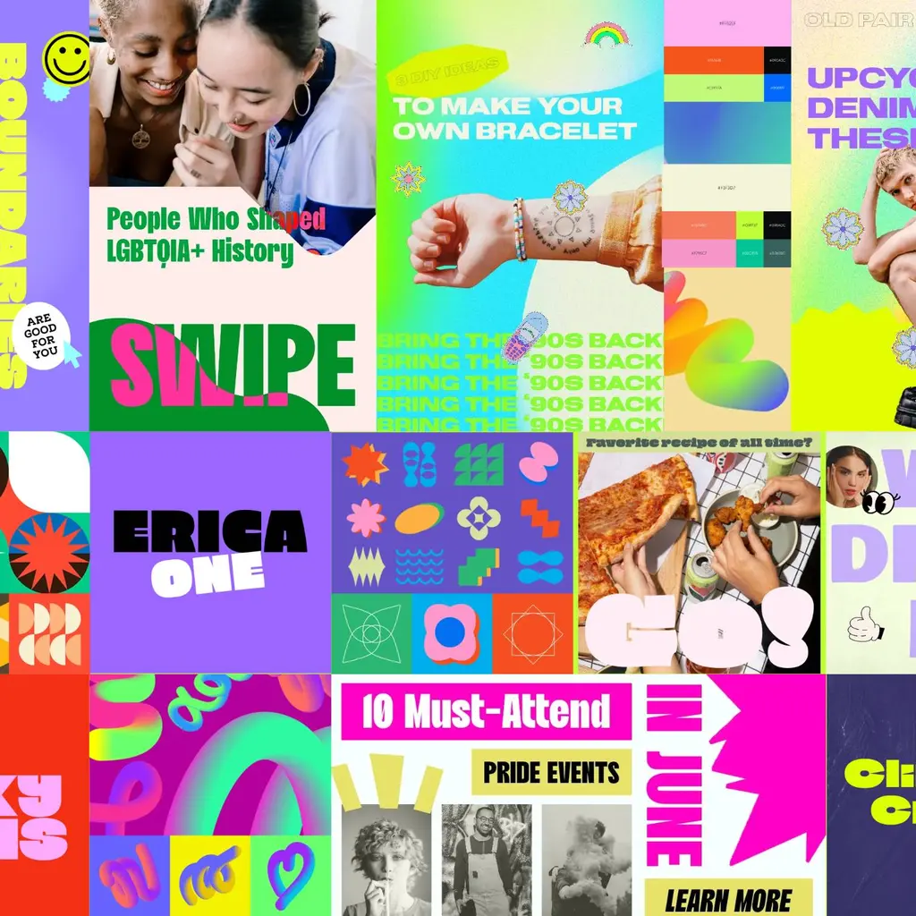
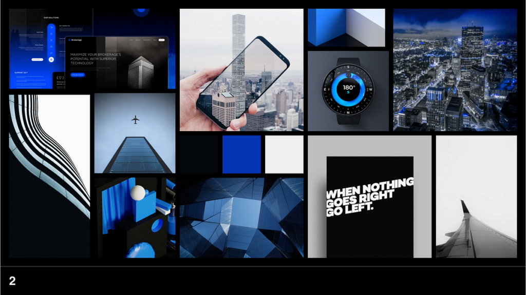
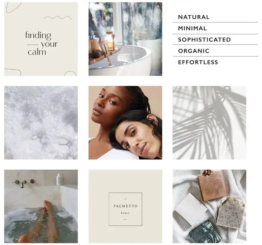
4. Build Around a Clear Aesthetic
A strong mood board often hinges on a well-defined theme—one that resonates with your company’s goals, audience, and brand personality. For example, you could consider these modern approaches:
- Maximalist Approach: Bold colors, large-scale graphics, and playful typography can instantly catch attention. Use exaggerated shapes or layered visuals to convey a dynamic, energetic brand story.
- Tech-Forward: Sleek lines, subtle gradients, and futuristic elements help reflect innovation and cutting-edge solutions. Lean on digital-inspired visuals—think circuitry patterns, data visualizations, or modern iconography—to underscore your commitment to technology.
- Minimalism: Stripped-down layouts, clean typography, and ample white space can project professionalism and sophistication. By focusing on only the essentials, you foster clarity and highlight your brand’s core messaging.
If visiting relevant physical locations isn’t feasible, dive into online platforms like Behance, Dribbble, Awwwards, or Pinterest to expand your research. These spaces often highlight the latest design trends and innovative visuals, which can spark new ideas for your board.
5. Keep It Understandable and On-Brand
As you brainstorm how to make your design mood board both visually striking and clear, remember its core function: communicating a cohesive style guide direction.
- Avoid obscure references that require too much explanation. Aim for visuals that immediately convey your intended vibe.
- Use annotations or short captions to clarify why a particular image, color, or typeface is included. If you’re proposing brand colors, include hex codes or Pantone references. For typography, note the font family, weight, and why it suits the brand personality.
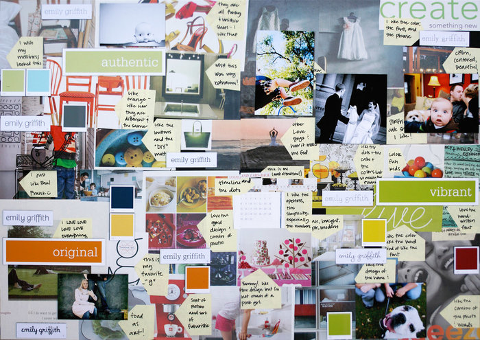
6. Merge Text with Design Elements
Many designers hesitate to add text to a mood board, but short, strategic notes can reinforce the theme:
- Identify brand words: Summarize the brand personality with keywords like “bold,” “minimal,” “playful,” or “refined.”
- Highlight typography choices: Briefly explain how the selected fonts support the brand’s tone—whether it’s friendly, authoritative, or sleek.
- Reference target audience insights: If market research indicates a preference for soothing colors or a modern feel, mention this to tie your visuals back to data-driven decisions.
7. Embrace Iteration and Experimentation
Creating a mood board is inherently messy and exploratory. Don’t be afraid to:
- Switch out elements as you find better fits for color schemes, typography, or imagery.
- Gather feedback from stakeholders early to ensure you’re on the right track.
- Explore multiple versions if you have several creative directions in mind. This experimentation can yield surprising concepts you might not have considered otherwise.
Remember, the process isn’t about perfection on the first try; it’s about discovering what resonates most.
8. Transition Your Mood Board into a Style Guide
Once you’ve refined your mood board and received the necessary approvals, it’s time to create a style guide that outlines your brand’s visual and messaging rules. This style guide serves as a comprehensive reference for future designs, ensuring consistency across all media:
- Color Palette: List exact color values (CMYK, RGB, HEX, Pantone) to maintain brand consistency.
- Typography: Specify font families, weights, and sizes for headlines, body text, and accent text.
- Imagery & Iconography: Provide guidelines on preferred photography styles, icon sets, or illustration approaches.
- Brand Voice & Tone: Summarize the personality and language style your brand adopts in copywriting and communications.
✨ Design Force tip: The mood board is the creative spark; the style guide is the rulebook that solidifies it for long-term brand identity success.
Final Thoughts
A thoughtfully assembled mood board is the foundation for any successful brand identity. It sets the visual tone, clarifies direction for your style guide, and ensures every design element—from typography to color choices—is rooted in a cohesive concept. By incorporating thorough market research, original imagery, and clear annotations, you’ll create a versatile resource that keeps you and your clients aligned throughout the entire design process.
Ready to elevate your brand with a striking mood board and comprehensive style guide?
Contact the expert designers at Design Force today and let’s collaborate on bringing your creative vision to life.