
On Facebook, attention disappears fast. Your ad needs to earn the click before the next scroll.
With billions of people using Meta platforms and ad impressions still growing in 2026, brands have a massive reach, but also more competition in the feed. The best Facebook ad examples are clear, easy to understand, and built around one strong idea. Below, we break down some Facebook ads and show what you can apply to your own Facebook campaigns.
1. Wonderskin

Wonderskin keeps it refreshingly simple. The hook, “Glide on at 9AM, still flawless at midnight,” tells you exactly what the product does in a single line, and the video earns the claim by showing the liner going on and staying put.
For beauty brands, that pairing of a specific promise and quick visual proof is tough to beat.
What you can apply: Lead with the benefit your buyer actually cares about. Long wear, easy application, true-to-tone shades, whatever your edge is, say it plainly and show it fast.
2. monday.com

monday.com opens with a number that does the heavy lifting: “There’s a reason why 180k+ customers use monday.com.”Right away you’re looking at a tool plenty of teams already rely on, which lowers your guard before you’ve even taken in the screenshot.
From there the message stays grounded, helping teams manage their work and processes without the usual mess. It’s a smart fix for a problem a lot of SaaS Facebook ads examples run into: making a broad, do-everything platform feel easy to grasp.
What you can apply: Use customer numbers or adoption stats when you have them. A line like “180k+ customers” helps reduce doubt and makes the product feel established.
3. Huel
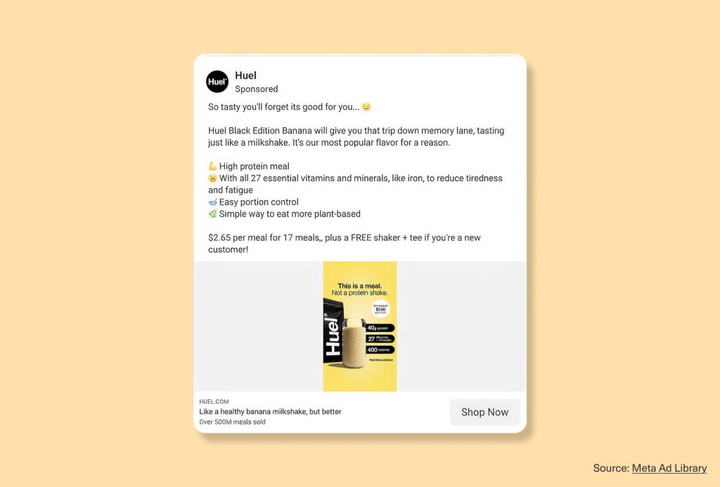
Huel’s ad works because it makes the product feel both practical and enjoyable. The opening line, “So tasty you’ll forget its good for you,” leads with taste. Then the copy follows with clear benefits like high protein, essential vitamins and minerals, and easy portion control.
It covers real ground without reading like a spec sheet, and that’s a big part of why it holds up as one of the better Facebook advertising examples in food and wellness.
What you can apply: Knock down the biggest objection first. A few clean bullets, honest claims, and a strong visual can carry the rest of the decision.
4. ElevenLabs
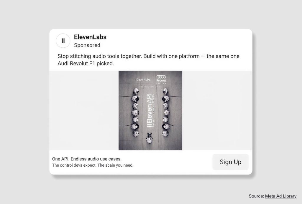
The ad opens on a frustration its audience feels constantly: “Stop stitching audio tools together.” That speaks straight to developers and teams building audio products who are tired of duct-taping separate services into one workflow.
Then it earns trust with a recognizable proof point, the platform being chosen by the F1 team named in the creative. Problem first, credibility second, with no attempt to explain every feature along the way.
What you can apply: Pair a sharp pain point with proof people will recognize. For technical products, you rarely need to spell out the whole feature set. Name the frustration, make one clear promise, and point to a customer or use case your audience respects.
5. Booking.com
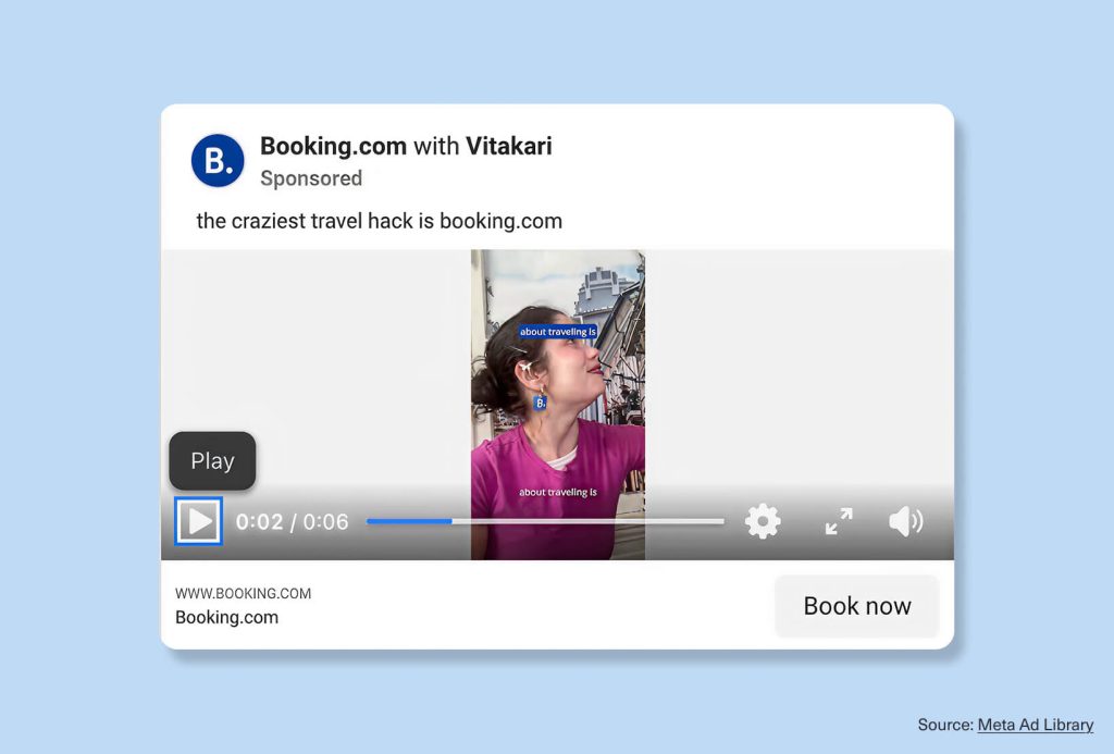
Booking.com hands the mic to a creator, and it pays off. “The craziest travel hack is booking.com” lands like a tip from a friend rather than a polished travel spot, so it slips into the feed instead of interrupting it.
The idea underneath is simple: better options, less effort. The short video, the creator partnership, and the clear “Book now” all keep the next step obvious. As far as Facebook video ad examples for travel go, it’s a clean one to learn from.
What you can apply: Use creator-style content when you want the ad to feel more personal and less polished. For travel, lifestyle, and app-based brands, a casual “hack” or recommendation angle can make the product feel useful right away.
6. Dollar Shave Club
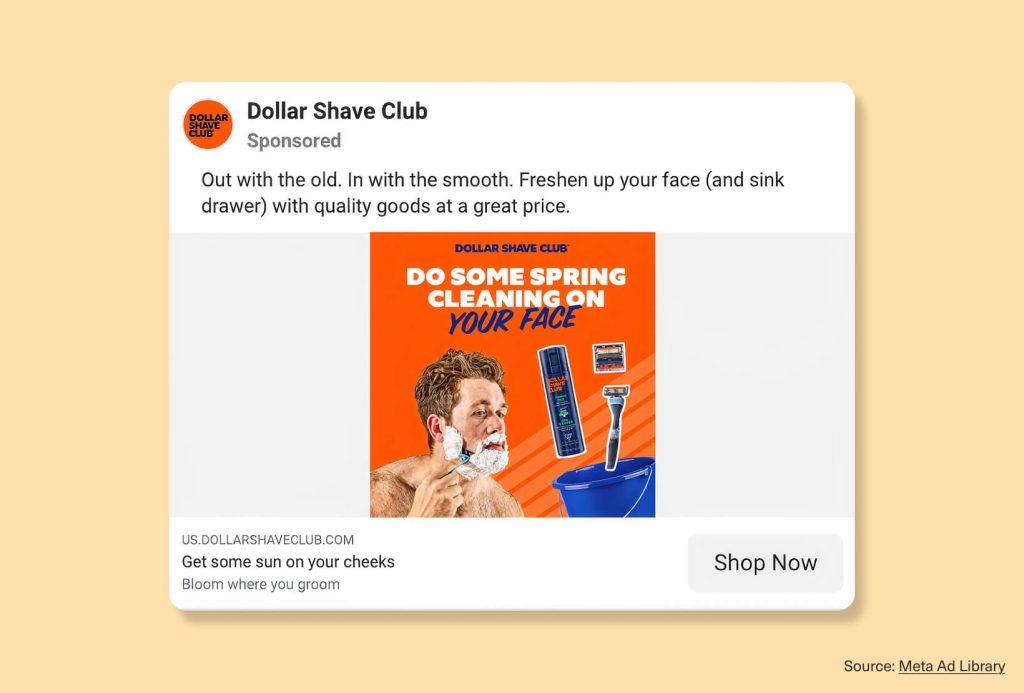
Dollar Shave Club ties a basic grooming product to a moment everybody knows. “Out with the old. The smooth” borrows the spring-cleaning idea, and the bold orange layout with “Do some spring cleaning on your face” drives it home.
You get the whole concept in about two seconds. Among Facebook ad design examples for personal care, it’s a lesson in the headline and the visual pulling in the same direction.What you can apply: Hook your product to a timely moment when there’s a natural fit. Seasonal angles make an everyday item feel fresh, especially when the headline and the design are built around one idea.
7. Canva
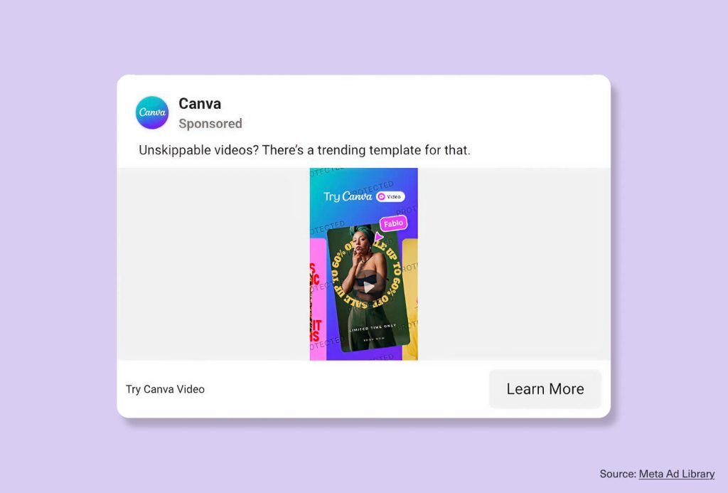
Canva taps into something its audience is already chasing: “Unskippable videos? There’s a trending template for that.” That talks directly to creators and marketers who want better video without starting from a blank page.
The creative is bright and instantly readable. The CTA “Learn More” suits the teach-you-something tone. It belongs in any short list of Facebook ad creative examples worth saving, mostly because it sells an outcome rather than a feature.
What you can apply: Connect your product to a goal your audience already has. Canva isn’t bragging about a tool here. It’s showing how that tool helps people make content that feels current and far less painful to put together.
8. Purple
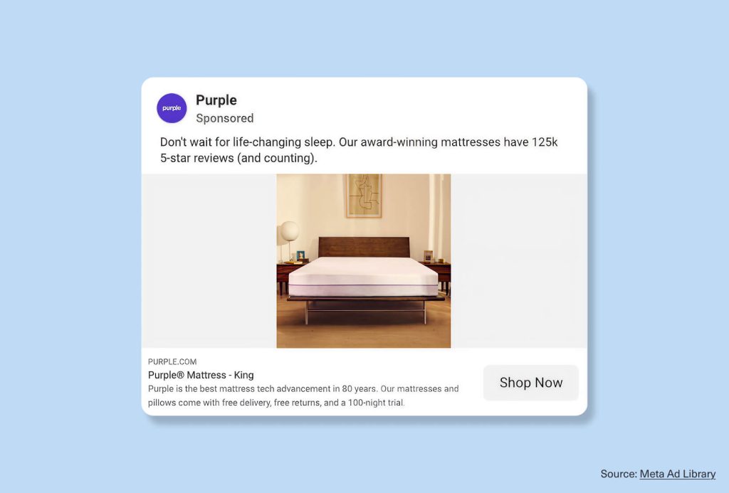
Purple leads with a number that’s hard to argue with: “125k 5-star reviews.” Instant credibility, and “life-changing sleep” names the feeling people are buying.
The mattress sits front and center, then the risk comes off the table with free delivery, free returns, and a 100-night trial. For a big-ticket category, that combination of proof and reassurance makes it one of the stronger Facebook ad copy examples in home goods.
What you can apply: Use social proof to take the edge off hesitation. With higher-consideration buys like mattresses or furniture, reviews and a no-risk trial make the decision feel safer. Keep the visual clean so the product stays the hero.
Facebook ad best practices
The best ads work because they make the message easy to understand.
Here are the biggest takeaways:
- Start with one clear hook.
A good hook can be a problem, a proof point, a question, or a direct benefit. - Use simple visuals.
Strong Facebook ad design examples usually have one clear focal point. Avoid clutter when people are scrolling fast. - Make the CTA match the intent.
Use “Shop Now” for ecommerce, “Learn More” for education, and “Start Free Trial” for software or subscriptions. - Write for fast scanning.
The strongest Facebook ad copy examples use short lines, clear benefits, and simple words. - Show proof when you have it.
Stats, testimonials, reviews, and customer behavior can make an ad feel more trustworthy. - Test multiple creative angles.
Your audience may respond to different messages. Try product benefits, offers, social proof, creator-led videos, and lifestyle outcomes. - Match the format to the idea.
Use Facebook carousel ad examples when you need to show several products or features. Use Facebook video ad examples when motion, story, or demonstration makes the idea stronger.
More Facebook ad ideas for your next campaign
Use these angles as a starting point:
- A problem-solution ad that names a daily frustration
- A product benefit ad that shows one strong feature
- A discount ad with a clear offer
- A testimonial ad that builds trust
- A comparison ad that shows what changes after using the product
- A creator-led video that feels natural in the feed
- A carousel ad that shows multiple products, use cases, or benefits
- A stat-led ad that gives people a reason to believe
- A seasonal ad tied to a current shopping moment
Final thoughts
The strongest Facebook ad examples in 2026 are clear, quick, and easy to act on. Use them as inspiration, but don’t copy them directly. The better approach is to study why they work, then apply those lessons to your ow