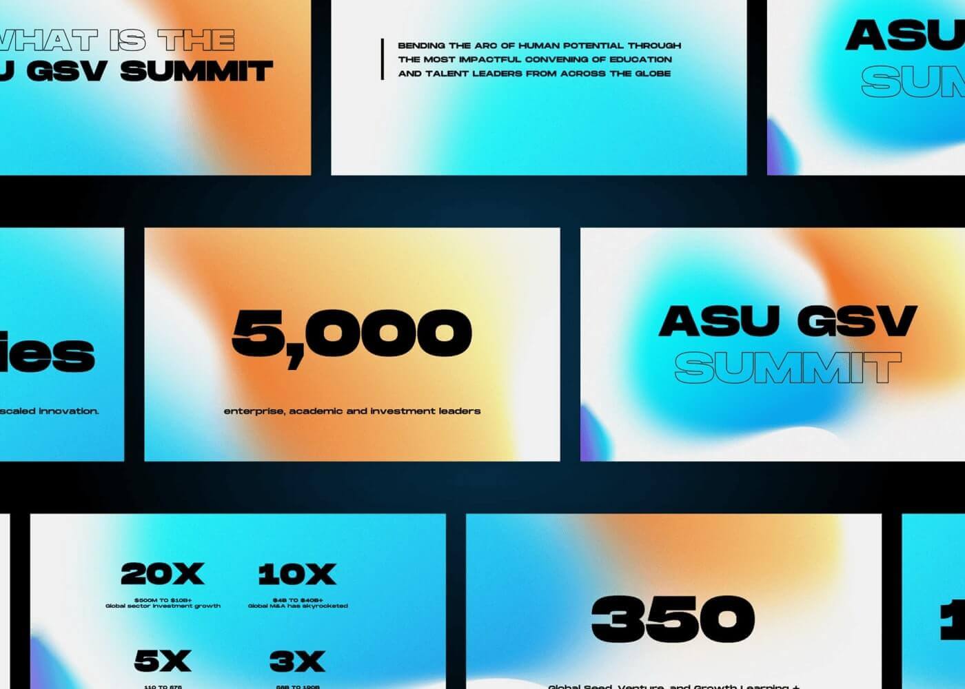
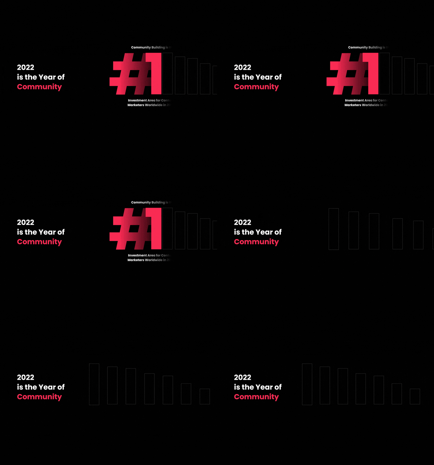
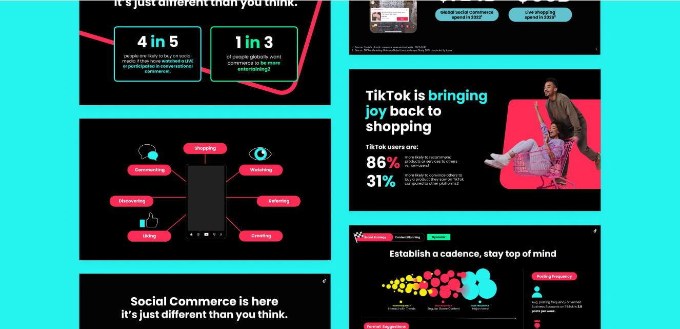
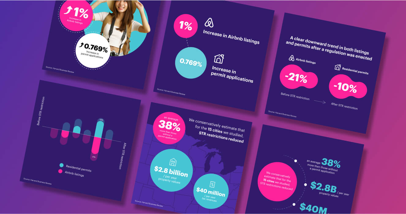
For data to be effective, the viewer needs to be able to understand the information quickly and easily. The best way to do that? Data visualization.
Simply put: presenting data in visual form rather than text and numbers alone.
Humans process and respond to visual forms of data 60,000 times faster than plain text, so why wouldn’t you visualize your data when you’ve got vital insight to share?
What is data visualization?
Data visualization is a way of visually organizing data and statistics in a compelling format, so that the viewer can process the relevant information quickly.
It’s a form of storytelling that takes numbers, statistics and trends to offer quick insights that support and benefit your business.
You can use data visualization to study and share:
- Comparisons
- Distribution trends
- Spatial patterns based on location
- Changes over time
- Flow and/or direction from one point to another
- Relationships between data
- And more
Why is data visualization useful for your business?
Every company, large or small, has data to share with their customer, internal teams, or external stakeholders.
By using data visualization, you allow the viewer to understand the importance or significance of the data so that they can make an informed decision. And using simple and logical data design will help you connect with your audience and communicate key messaging for your business.
Media giant Spotify uses data visualization regularly to connect with their customers by producing personalized reports based on individual listening patterns. They take unique data and make it fast and easy to digest, prompting users to learn more about their listening habits (and share them with their peers).

Whatever the data is that you’re collecting, visualizing it is business intelligence.
You can:
- Spot trends and anomalies instantly
- Create customer loyalty and trust through visual statistics
- Quickly share vital business data
- Simplify detailed figures
- Share mass information quickly
- Make detailed information accessible to more people
Types of Data Visualizations
There are hundreds of creative ways to visualize your data. Some of the key options are:
- Charts and timelines
- Graphs
- Maps and heat maps
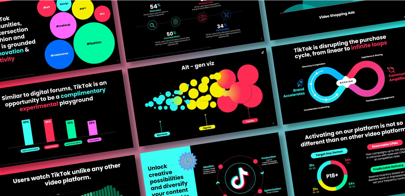
- Bubble charts
- Venn diagrams
- Animations
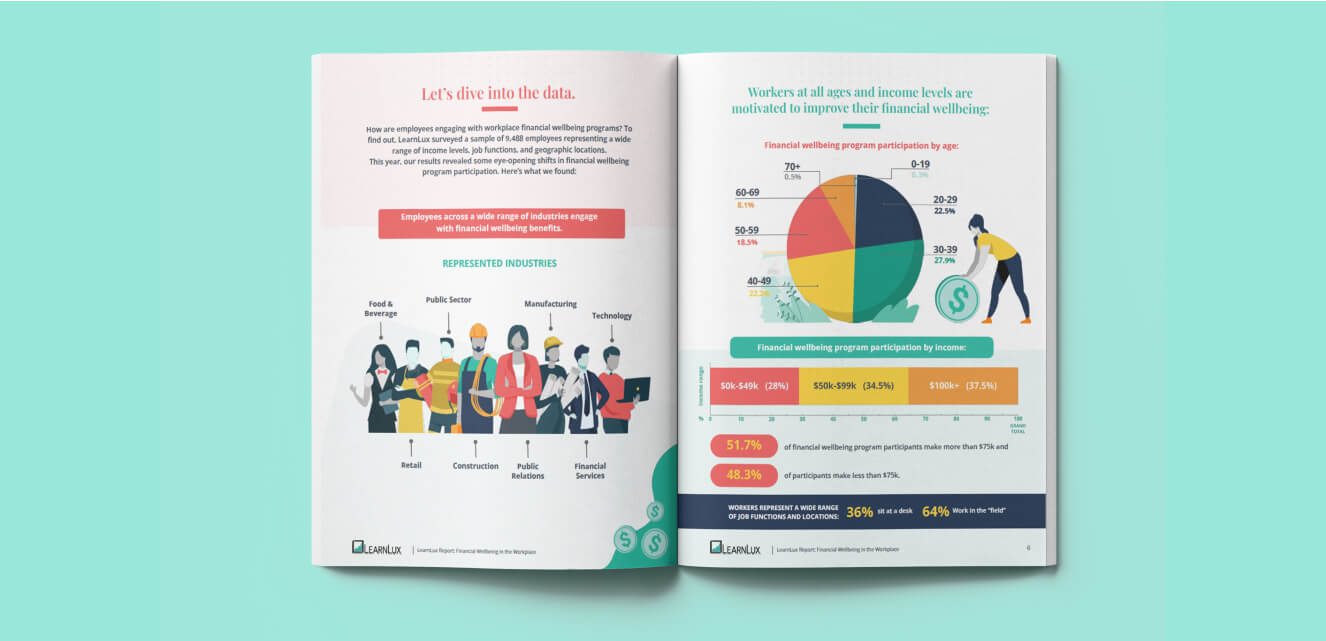
- Illustration and infographics
- Tables
- Design graphics (like directional arrows and icons)
Depending on the need for your data, you have limitless creative opportunities to showcase the statistics any way you wish. But the two main formats include: static and interactive.
- Static data visualization: flat, single image/vector graphics that remain as they are presented. Eg, they don’t move or change.
- Interactive data visualization: can move or change, as the viewer is able to manipulate and adjust the data they are seeing.
Data visualization best practice
When it comes to designing your own visual data, there are some key things to keep in mind in order to produce a successful data set:
- Choose the right type of visualization (a graph, chart, heat map…) for the data that you are sharing.
- Develop your visualizations based on your business goals and objectives. What key information do you need to get across? Does the information need to be analysed or is it purely to present facts in a digestible way?
- Provide context for the data when needed. This could be a summary, intro, or snippets of text among the visuals.
- Ensure that all information and data used is correct, easy to read and understand. Can you simplify? Can you use color to differentiate statistics?
- Don’t over-design! Less is more when it comes to complicated data. You want the viewer to be able to absorb the information quickly, so keep additional design flourishes to a minimum and use legible colors and fonts.
- Guide the viewer through the data using design and direction. You’re telling a story with the data, think about the viewer’s journey and implement a design that supports it.
- Can you make the data fun? Gamifying the data can be a great way to engage and make information land with the viewer. You could do this through animation or through creative graphic design.
Data Visualization Tools
When it comes to producing effective visual data, there are many data visualization services out there at your disposal. Here are three to get your started:
Datawrapper is an online platform that turns your inputted data into visual format. With both free and paid plans available, you can choose from hundreds or responsive chart templates.
Databox is another digital platform that takes your data and makes it easy to understand through visual charts and graphs. One benefit of Databox is that you can integrate over 70 platforms, like Google Analytics and HubSpot, to access the data you already have.
If you’re in need of quality custom data visualization, outsourcing to a world-class design team like Design Force is a great choice. Branded design in all forms is highly effective at engaging and connecting with your audience. We’ll take your impressive statistics and turn them into a visual file so your business can impress and convert, again and again and again.
Examples of successful Data visualization
Interactive Data Visualization examples:
This clever interactive map from The British Museum and Google allows the viewer to skip through time in order to find iconic artifacts across the continents.
By sliding the scale across the bottom and choosing the visible countries, the viewer can easily see the impact on health, carbon footprint, population and more. The use of simple shapes and color makes this easy to absorb.
Uber Pick Up Times via The New York Times
By changing the number of cars, the viewer can quickly see how faster pick-up times lead to more drivers idly waiting unused (and unpaid!).
Static Data Visualization examples:
World’s most valuable brands (2018)
Using simple circles and color coding, you instantly see the companies with the largest valuation in USD, and can determine that tech companies are the biggest players.
A great example of user-facing data, Apple uses data visualization to share user fitness statistics using bar charts, ‘activity rings’, and color-coding.
To summarize:
Data visualization is a powerful way to share vital information about your business, both internally and externally.
To do so successfully, make sure to select the right type of visual tool for the data you have and keep the design simple, engaging and easy to read.
If you’re looking for help to bring your data to life professionally, get in touch with Design Force today, or book a demo to jump right in.


