

Here’s the deal: design composition isn’t just about making things “look nice.”
It’s about orchestrating chaos into harmony, where every element—from the headline to the tiniest icon—has a purpose and sings in perfect visual harmony.
Whether you’re crafting a sleek website, a scroll-stopping social media post, or a jaw-dropping poster, understanding the principles of design composition is your secret weapon to creating work that doesn’t just catch the eye—it keeps it.
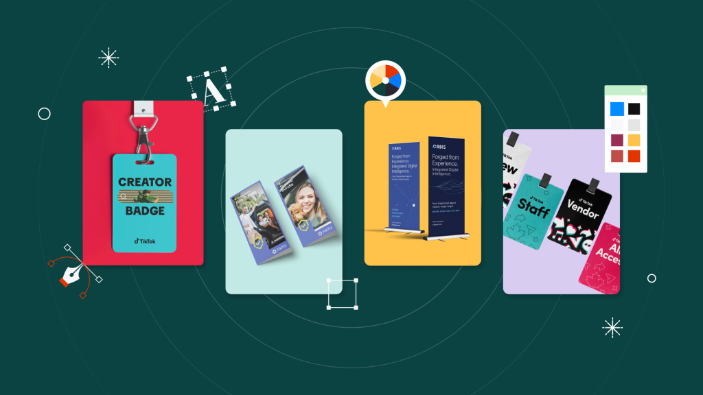
In this article, we’ll break down the core principles, dive into graphic design techniques to level up your layouts, and explore real-world examples to spark your creativity. Ready to compose your next masterpiece? Let’s go.
What is design composition?
Think of design composition as the choreography of graphic design. It’s the meticulous (and sometimes magical) arrangement of elements to create harmony: a visual balance in design and a visual story that just works.
When done right, design composition grabs attention and makes your audience feel something—whether it’s inspired, curious, or ready to hit that “Buy Now” button. But when it’s off? It’s like walking into a room where everything’s out of place—confusing, overwhelming, and uninviting.
Imagine a messy, cluttered flyer with no clear focal point vs. a beautifully arranged poster with a bold headline, striking imagery, and clean text alignment. Which one do you think grabs attention and communicates effectively? Exactly. Composition is the key to taking your designs from “meh” to “wow.”
7 core principles of design composition
Let’s get to the juicy stuff—the principles of design composition. These are your go-to tools for creating designs that feel polished, intentional, and irresistibly engaging.
1. Balance: The yin and yang of design
Balance is all about distributing visual weight so your design feels stable. You’ve got two options here:
- Symmetry:
Perfect for when you want a clean, classic look. Think wedding invitations or formal event posters
- Asymmetry:
The cool, modern cousin of symmetry. It’s bold, dynamic, and perfect for edgy brands or energetic campaigns
✨ Design Force tip:
When experimenting with asymmetry in design, try offsetting a bold, large element with smaller, lighter elements. This creates a feeling of balance without being predictable—perfect for modern, edgy designs.
2. Visual hierarchy: Show them where to look first
Visual hierarchy is like giving your audience a map for their eyes. Use size, placement, and contrast to guide attention to the most important elements.
Think of a landing page where the headline shouts, the call-to-action whispers (but firmly), and the supporting visuals tie it all together.
✨ Design Force tip:
Use size and contrast as your secret weapons for visual hierarchy. Start by designing your headline at double the size of your subhead, then scale down your body text. Bonus points for pairing this with a pop of color for the CTA.
3. Contrast: Make it pop!
Contrast is your best friend when you need to create emphasis. Whether it’s a splash of color, a bold font, or a size difference, contrast ensures your key message doesn’t get lost in the mix.
✨ Design Force tip:
Think beyond color—contrast can mean mixing textures, shapes, or even movement. For example, pair a sleek sans-serif font with a handwritten script to give your design more personality.
4. Repetition: The rhythm of design
Repetition creates consistency and reinforces your message. This is essential for branding and UI design, where recurring elements like icons or patterns build familiarity and trust.
Think of a mobile app interface with repeated button styles and iconography as an example.
✨ Design Force tip:
Build rhythm into your layouts by repeating design elements like icons, shapes, or even colors in unexpected places. This keeps your design cohesive while surprising the viewer in delightful ways.
5. Emphasis: The star of the show
Every design needs a focal point. Emphasis ensures the most important element stands out—whether it’s a product, a headline, or a call-to-action.
Like a product feature highlighted with oversized, bold typography or a glowing halo effect.
✨ Design Force tip:
To make your focal point pop, surround it with plenty of breathing room (a.k.a. white space). This creates instant emphasis without needing flashy effects. Sometimes less is more.
6. Unity: Make it feel like one big happy family
Unity ties your design together so every element feels like it belongs. It’s all about consistency—colors, fonts, spacing, you name it.
Need an example? A brand identity system that uses the same typeface and color palette across all touchpoints.
✨ Design Force tip:
Create unity by sticking to a limited color palette (3-5 colors max) and using consistent typography across your design. Consistency ties everything together and makes your work feel professional and polished.
7. Proportion and scale: Size matters
Proportion and scale are the unsung heroes of harmony. They help you create contrast and ensure that no element feels awkward or out of place.
Consider a hero image that’s large enough to command attention but balanced by smaller supporting text.
✨ Design Force tip:
Use oversized elements strategically—like a hero image or bold typography—to grab attention. Then balance it out with smaller, detailed elements that draw the viewer in for a closer look.
Techniques to improve your composition
- Gestalt principles: The psychology of design
Use proximity, similarity, and closure to group elements and create visual relationships.
Example: A logo that cleverly uses negative space to form a hidden image or word.
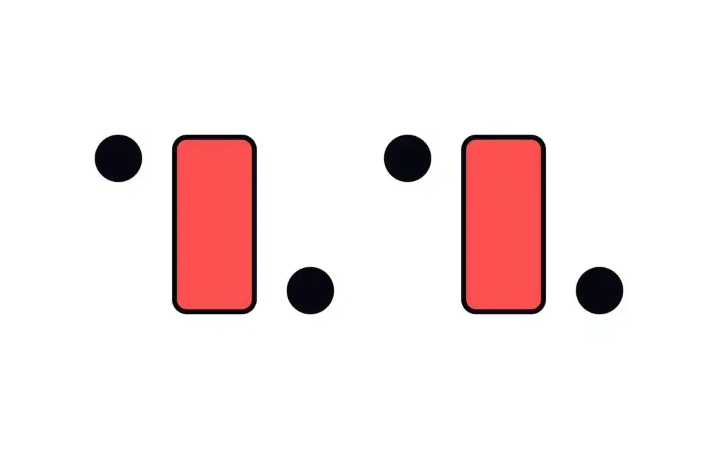
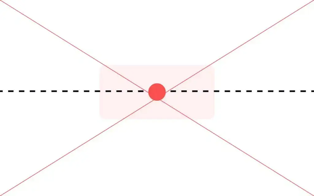
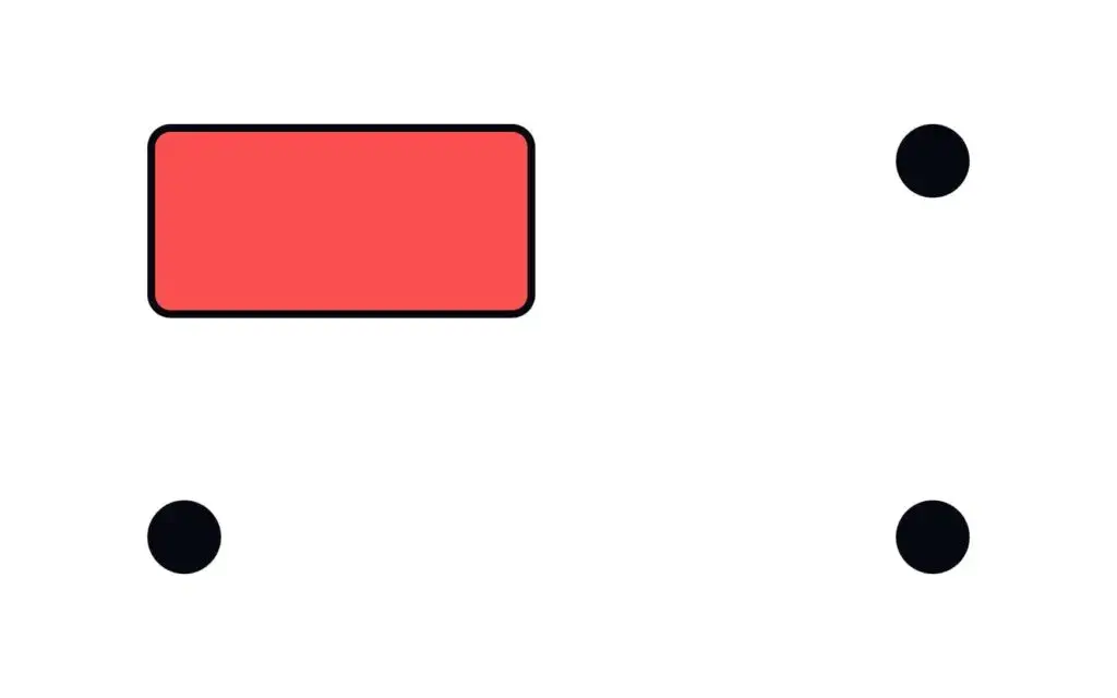
- Geometric vs. visual centers: The sweet spot
Aligning elements to the visual center (slightly above the geometric center) creates a more natural and balanced look.
Example: A logo placed slightly above center on a business card for visual harmony.
Geometric center
Visual center
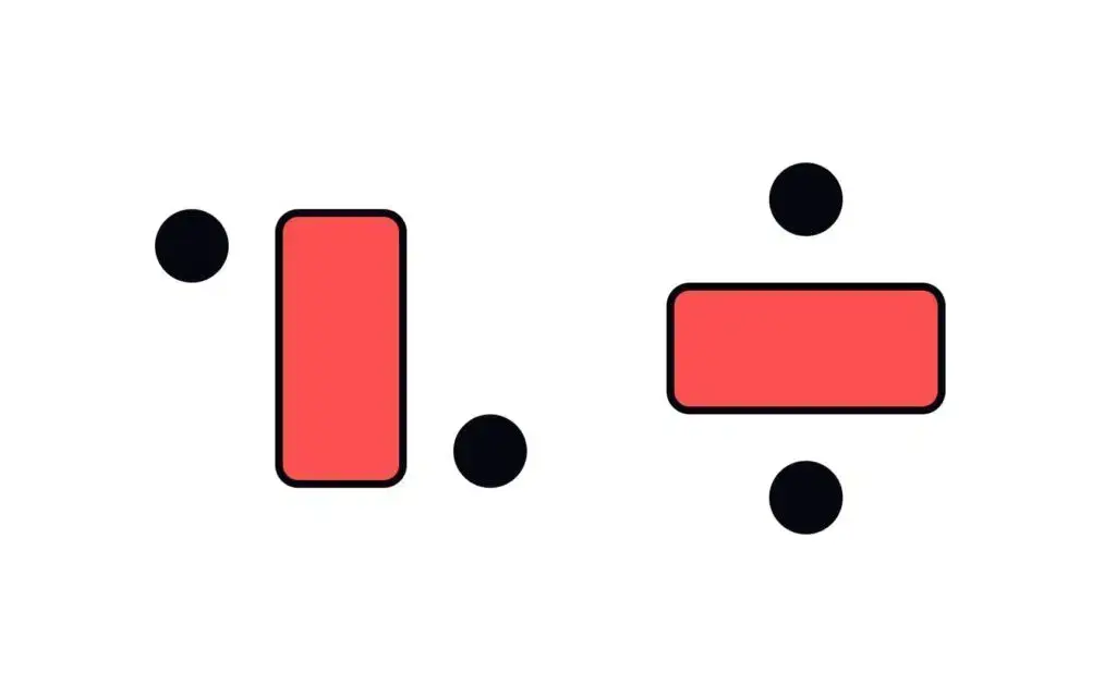
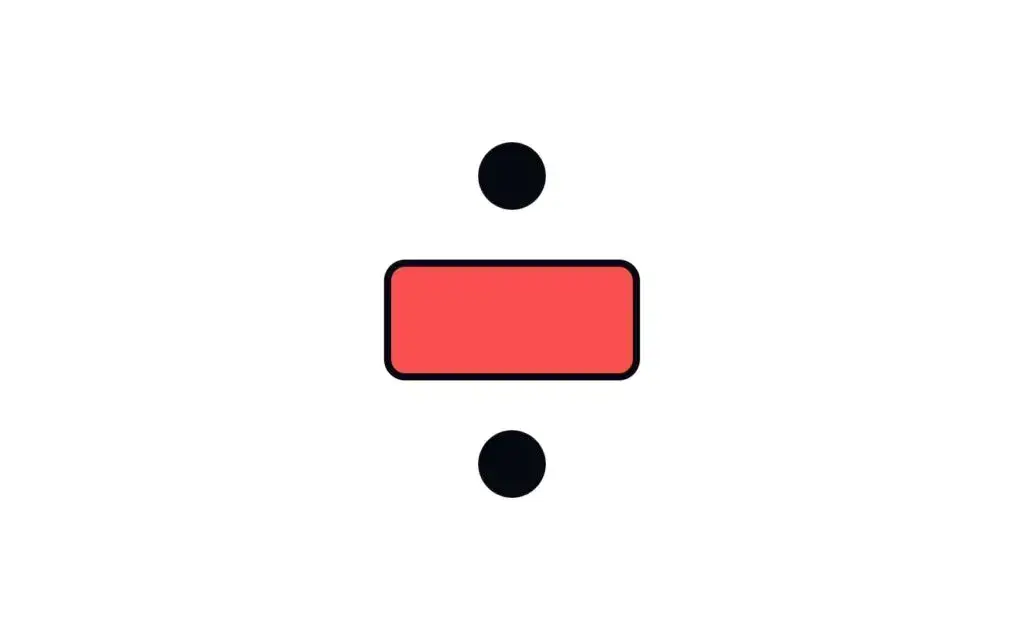
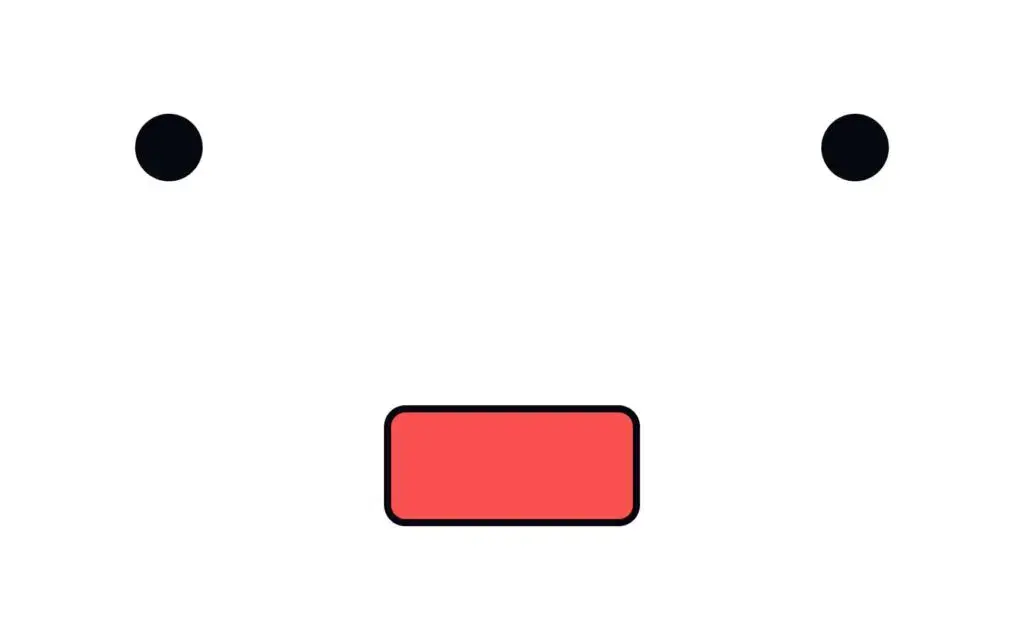
- Static vs. dynamic compositions: Choose your vibe
- Static compositions are structured and stable—perfect for corporate brochures
Static composition
- Dynamic compositions are energetic and bold—ideal for sports campaigns or youth-focused designs
Dynamic composition
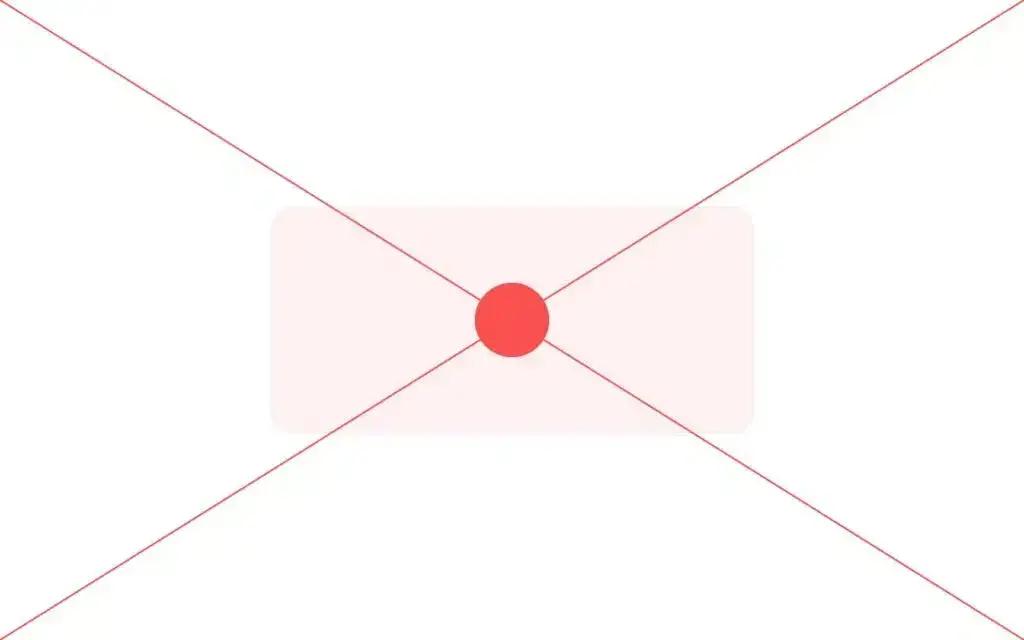
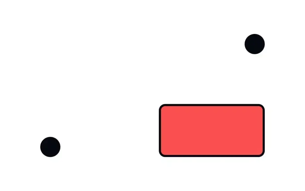
- Open vs. closed compositions: Frame it or let it flow
- Open compositions feel free and expansive, as if elements could flow beyond the frame
Open composition
- Closed compositions are contained and self-sufficient
Closed composition
Example: A magazine spread with overlapping imagery (open) vs. a framed event poster (closed).
Real-world examples of effective design composition
- Apple’s minimalist product displays
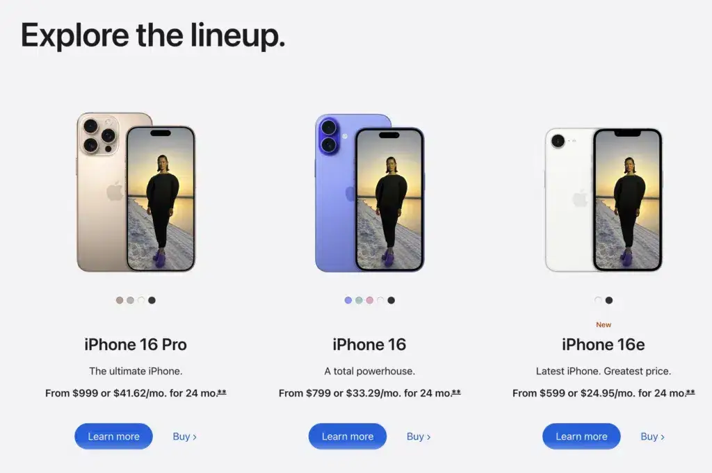
Apple is the ultimate master of balance and emphasis. Walk into any Apple Store, and you’ll notice clean, uncluttered layouts where every product takes center stage. Their use of symmetry creates a sense of calm and order, while the clever placement of lighting and subtle shadows adds depth.
For example, their product pages online often feature a hero image of the latest iPhone against a white or neutral background. This approach emphasizes the product’s sleek design, while the minimal text ensures nothing distracts from the main focus. Apple’s designs are proof that sometimes simplicity is the boldest statement you can make.
- Nike’s bold campaigns:
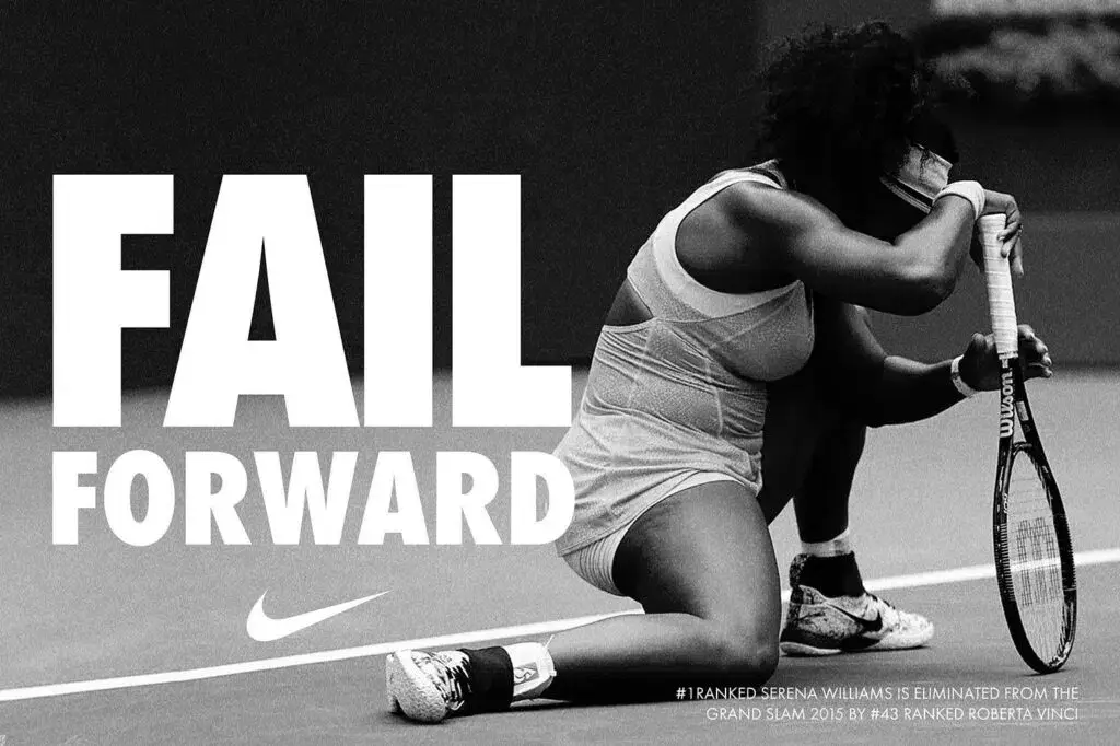
Nike’s advertising campaigns are a masterclass in dynamic composition and asymmetry in design. Their visuals are infused with energy, movement, and emotion—all of which perfectly align with their brand identity of performance and boldness.
For example, many of their campaigns feature athletes captured mid-motion, with elements like angled text, bold color splashes, and overlapping imagery. These dynamic compositions engage the viewer and evoke an immediate sense of action. Nike also uses contrast masterfully, pairing dark backgrounds with striking neon elements to highlight their products or slogans.
- IKEA’s catalog layouts
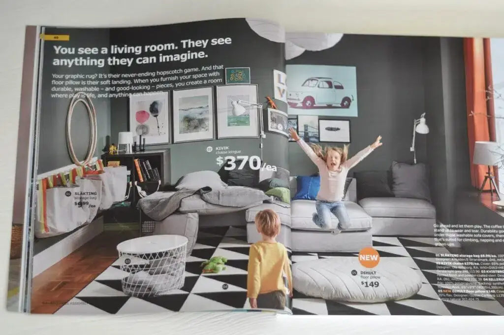
If you’ve ever flipped through an IKEA catalog, you’ve experienced their impeccable use of visual hierarchy and repetition. IKEA understands that their audience is looking for practicality, so they design layouts that guide readers effortlessly through the content.
Each page typically highlights a focal product with larger images at the top, followed by smaller supporting images and details below—a clear demonstration of visual hierarchy. Meanwhile, they use repetition in their color palettes, furniture arrangements, and typography to maintain consistency across every spread.
IKEA also plays with open compositions, often featuring lifestyle scenes that feel expansive and inviting, making it easy for readers to imagine these setups in their own homes. Their catalog is as much a visual guide as it is an inspiration board.
Tools and tips for practicing design composition
Practicing design composition doesn’t require a fancy setup—just the right tools and a willingness to experiment. Here are some tried-and-true tools and practical tips to sharpen your skills and push your creative boundaries.
Tools you’ll love
- Figma:
This collaborative design tool is perfect for experimenting with layouts, prototyping, and testing visual hierarchy.
Its intuitive interface and ability to share designs with teammates make it a favorite for UI/UX projects.
✨ Design Force tip:
Use Figma’s grid systems to practice creating balanced layouts with precision.
- Adobe Illustrator:
The ultimate powerhouse for creating scalable designs. Illustrator gives you full control over shapes, typography, and alignment, making it ideal for refining proportions and scale.
✨ Design Force tip:
Experiment with its pen tool and alignment guides to craft intricate, polished compositions.
- Procreate:
Sometimes, getting back to basics is the best way to spark creativity. Procreate is perfect for sketching out ideas on the go, whether it’s a rough concept for a dynamic composition or exploring how asymmetry might play in your design.
✨ Design Force tip:
Its layering system allows you to iterate quickly without losing your original ideas.
Bringing it all together: Compose designs that captivate
Great design composition doesn’t happen by accident. It’s a mix of strategy, creativity, and a dash of courage to try something new. By mastering the principles and techniques we’ve shared here, you’ll create designs that don’t just look good—they feel right.
So, what are you waiting for? Go experiment, break some rules (after you master them), and create something unforgettable.
Want more tips, tricks, and design inspiration? Stay ahead of the curve and subscribe to Design Force for expert insights, creative strategies, and the tools you need to create designs that truly stand out.