Hint: It’s not about trends
Every standout website has one thing in common: it refuses to play copycat.
The homepage for a rising SaaS brand shouldn’t feel like a minimalist art portfolio, and a DTC ecommerce juggernaut shouldn’t borrow UX cues from a nonprofit. Because the best website designs in 2026 aren’t about chasing trends—they’re about building trust, clarity, and action for each unique audience.
Great website design is contextual. It’s the difference between a perfectly tailored suit and a one-size-fits-all hoodie. What works for one industry might trip up another. In this article, we’ll break down the top web design in 2026 by industry, spotlight why these designs work, and show you what you can borrow (without resorting to tired templates).
What makes a website one of the best?
Let’s get practical. “Best” isn’t about the glossiest visuals or the most avant-garde animation. The best website designs in 2026 hit a sweet spot:
- Clarity
(users understand what you do, instantly) - Speed
(blazing load times, especially on mobile) - Mobile usability
(no pinching, zooming, or squinting) - Trust
(proof, security, and authenticity) - Brand distinctiveness
(not another “me too”) - Conversion flow
(the path from interest to action is frictionless)
A beautiful site is pointless if users can’t figure out what you offer or where to click next.
Design Force tip:
Use these criteria as your North Star—because design without purpose is just decoration.
Why the best websites look different by industry
Every industry has its own audience quirks and trust triggers.
SaaS buyers want product clarity and proof, not mystery. E-commerce shoppers crave frictionless browsing and confidence at checkout. Service buyers need reassurance and a no-nonsense path to an inquiry. Nonprofit supporters? They need emotional clarity and the easiest path to action.
Great web design is a shape-shifter. It adapts to the way your audience thinks, shops, or donates. If you’re only following trends, you’re missing the plot. Achieving top web design status is about meeting expectations, not just making statements.
SaaS websites: Clarity + product storytelling
The best SaaS website inspiration examples aren’t about flashy visuals—they’re a masterclass in clarity. They explain the product in seconds, lead with value, and move users swiftly from “what is this?” to “how do I get started?”
You’ll notice a pattern: problem → solution → proof, all wrapped in crisp product visuals.
Sites like Figma set the tone with UI-led storytelling and instant clarity. Notion makes positioning look effortless, layering proof and playful product breadth. Linear keeps messaging tight, structure clean, and product clarity high.
Best lesson:
If your SaaS site doesn’t communicate its offer in a heartbeat, the design is holding you back.
Risk to avoid:
Overdesigned hero sections that look impressive but communicate nothing.
Feature highlight:
Pricing explainers, interactive product walkthroughs, and UI previews that make the software feel real—like holding the product in your hands.
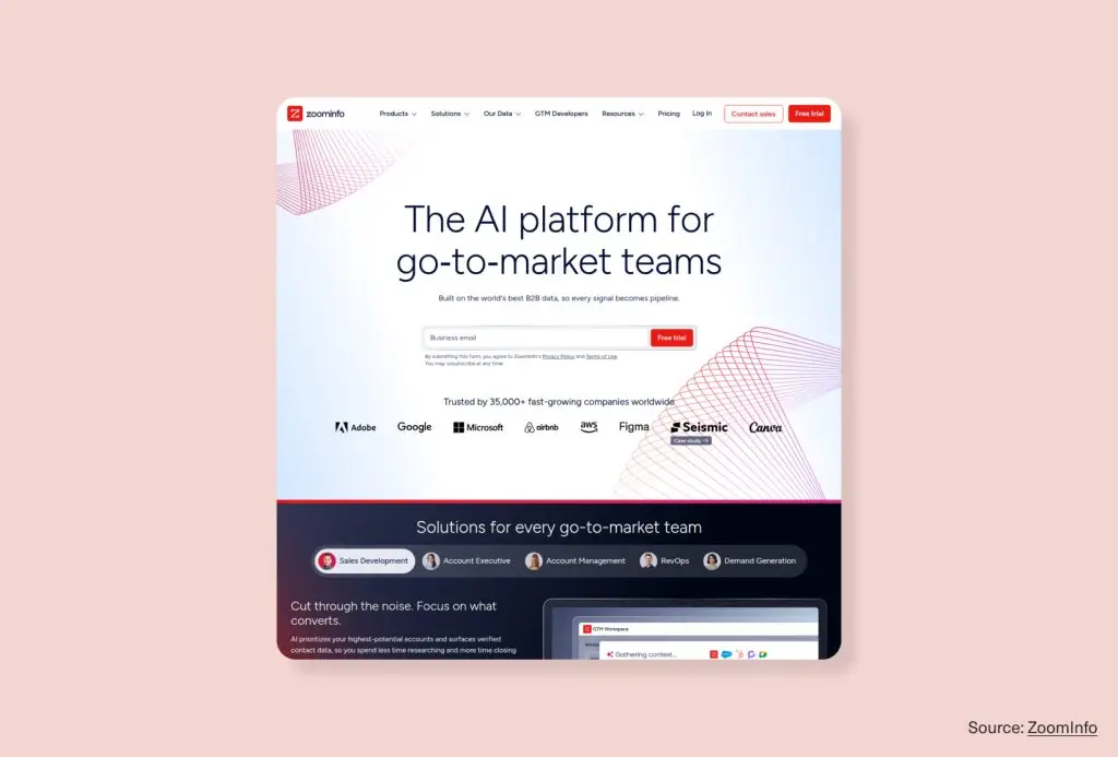
Source: ZoomInfo
E-commerce websites: Merchandising + trust + speed
The best e-commerce website design is all about helping users shop, not just admire. Great sites make browsing effortless, comparison easy, and trust visible at every step. Mobile usability and speed are non-negotiables.
Allbirds nails product clarity and materials storytelling, giving shoppers confidence from the first scroll. Warby Parker blends commerce and service, making it simple to try, buy, or book. Glossier delivers brand-led ecommerce with navigation so simple, you’ll never get lost.
Best lesson:
Good merchandising is good design. If a user can’t quickly find, trust, and buy a product, branding alone won’t save you.
Risk to avoid:
Category pages that win design awards but lose sales due to hidden info or friction.
Feature highlight:
Sticky add-to-cart buttons, visible reviews, and clear shipping/returns reassurance.

Source: Warby Parker
B2B / service websites: Credibility + lead-gen UX
For B2B and service brands, it’s not about having the most words—it’s about building instant trust and a clear path to inquiry. Leading professional service website design structures combine authority and usability.
Pilot leads with service clarity and “why this matters” framing. IDEO flexes credibility through positioning and case studies, while Deloitte Digital brings enterprise structure and proof to the forefront.
Best lesson:
Visitors want reassurance, not an information dump. Make the proof obvious, the path to contact easy, and the offer unmistakable.
Risk to avoid:
Corporate clichés, vague headlines, and testimonials buried three clicks deep.
Feature highlight:
Homepage trust stacks (positioning, proof, testimonials) and a sticky, inviting CTA.

Source: Pilot
Agency / creative websites: Personality + portfolio flow
Creative agencies and studios need to show taste and point of view—fast. Converting portfolio website examples feel original, but never at the expense of usability. They let the work shine, make browsing projects easy, and communicate a distinct perspective.
Pentagram leans into a portfolio-first structure, making project browsing a breeze. Instrument balances polish and clarity with a clear service narrative. PORTO ROCHA delivers bold visual personality while keeping the portfolio experience readable and memorable.
Best lesson:
Structure supports personality. Experimental layouts are fine—just don’t make users work to see the work.
Risk to avoid:
Overly clever design that buries projects or slows the flow.
Feature highlight:
Filtered portfolios, smart project indexes, and case-study browsing that feels like a creative adventure.

Source: PORTO ROCHA
Personal brands / portfolios: Memorable but simple
Personal websites work best when they combine memorable identity with simple navigation. The best sites for creators, strategists, or soloists make a strong first impression, quickly explain who they are, and focus the content.
Jessica Hische oozes personality and clarity, showing off her creative identity in every pixel. Ali Abdaal makes content, credibility, and funneling feel seamless. Tobias van Schneider brings an editorial vibe with a simple, confident point of view.
Best lesson:
A focused site with a point of view beats a flashy site with no substance.
Risk to avoid:
Overbuilding—trying to make a personal site look like a Fortune 500 homepage.
Feature highlight:
Clear intro blocks, selected work, and simple “about” or “contact” paths.

Source: Ali Abdaal
Nonprofit / mission-led websites: Emotion + clarity
Nonprofit website design is all about connecting emotion to action. The best sites communicate their mission with urgency, make it easy to donate or get involved, and balance storytelling with clarity.
charity: water leads with mission clarity and visible donation paths. Kiva makes participation simple with action-oriented design.WWF handles mission, education, and support options at scale without losing focus.
Best lesson:
Your mission has to be felt immediately—and acted on easily.
Risk to avoid:
Dense storytelling that buries the “donate” or “help” button.
Feature highlight:
Low-friction donation flows, impact blocks, and clear “ways to help” modules.

Source: Kiva
What each industry can steal from the others
Here’s where the creative cross-pollination happens:
- SaaS brands can inject creative personality from agency sites
- Service businesses can borrow trust-building clarity from e-commerce
- E-commerce brands can learn the art of product storytelling from SaaS
- Nonprofits can use conversion logic from B2B and service sites
- Personal brands can add proof structures from professional services
The smartest sites don’t copy another industry wholesale—they borrow patterns with intention, remixing what works for their audience.
How to choose the right design direction for your brand
Not sure where to start? Here’s a quick framework:
- What does your audience need to know first?
- What action matters most on your site?
- What proof do users need before they trust you?
- How much personality supports the goal, and how much distracts from it?
The most successful, memorable website designs emerge from audience needs, offer clarity, and business goals. Not just what’s trending on Dribbble.
Fit over flash, strategy over sameness
The best website designs in 2026 aren’t defined by a single style or trend. They’re defined by fit—how well a website’s design supports the unique needs, behaviors, and goals of its audience and business. Whether it’s a SaaS homepage, ecommerce store, professional service platform, creative portfolio, or nonprofit site, the strongest designs combine clarity, trust, and brand intention.
Don’t chase what looks good—understand what truly works in your category, then adapt it with intention to your own brand story.
Ready for a website that fits your audience, industry, and conversion goals, not just the latest design fad
Design Force creates custom websites that balance strategy, brand, and performance. Reach out, and let’s build a site designed for how your business *actually grows*.