

Most brands don’t have a “design problem”—they have a system problem
You can spot it a mile away: the brand with a slick logo and a kaleidoscope of mismatched colors, fonts, and graphics that don’t quite add up. Here’s the real talk—visual identity isn’t just a logo. It’s the complete visual language that your audience learns to recognize, trust, and remember you by, whether you’re in their feed or on their phone’s home screen.
In this article, we’ll dig into what your identity really means (spoiler: it’s not just a logo), why it matters more than you think, and how to build a visual identity system that stands up to the whirlwind of real-world touchpoints. We’ll show you the core building blocks, walk you through a repeatable process, and give you design-led, actionable advice (with examples) to make your brand unmistakably you.
What is visual identity? (+ what it isn’t)
Let’s clear the air: your brand’s identity is the recognizable design system that expresses who your brand is—visually, everywhere. Think of it as your brand’s signature style. It’s not just a color palette or a typeface, but a holistic system that guides how you show up across every touchpoint, from social posts to your product UI.
Now, let’s break it down:
- Visual identity:
The visual system—color, type, layout, imagery, iconography, motion—that makes your brand recognizable everywhere - Brand strategy:
The “why”—your purpose, positioning, and the unique space you want to own - Brand identity:
The full package—voice, values, messaging, and visuals - Brand guidelines:
The playbook that documents and enforces your entire identity system, ensuring consistency from team to team
So why the confusion? Blame logo-first thinking and the endless cycle of brand refreshes that focus on surface-level tweaks instead of building a true system. A logo is like a signature, but your brand identity design is the entire wardrobe, mood, and style that makes you instantly recognizable—even with the logo hidden.

Why visual identity matters (even more than you think)
A strong identity isn’t about being pretty; it’s about being remembered. When your audience is bombarded by endless brands, it’s your visual distinction that sticks in their mind.
Here’s why it matters:
- Recognition:
Humans are wired for visual memory. If your system is consistent, people know it’s you at a glance - Trust:
Consistency signals reliability. A cohesive brand identity tells your audience you’ve got your act together - Perception:
Your visual choices frame you as premium, approachable, innovative, classic—you name it
In a digital-first world, visuals often speak before words. Think of the scroll test: can someone recognize your brand in half a second, even if they don’t see your logo? Or do you blend into the sea of SaaS gradients and fintech blues? Distinctive systems win—it’s the difference between “just another app” and “that brand I love.”
✨ Design Force Tip:
When in doubt, test your brand without the logo. If it still feels like you, you’re onto something real.

Start with strategy inputs (before you design anything)
Audience and context: Who are you speaking to?
Before you touch a pixel, nail down who needs to recognize you. What feels credible, trustworthy, or aspirational to them? Your visual identity should feel like a secret handshake—instantly communicating “this is for you” through subtle cues.
Pro move:
Build audience moodboards. Not “what we like” boards, but “what our audience connects with” boards. It’s not about your favorite shade of blue—it’s about what your users find inviting, inspiring, or bold.
Positioning as a design filter
What are you trying to be known for? Your brand positioning should directly influence your visual identity design.
- Calm expert?
Use a restrained palette, editorial typography, and generous whitespace - Bold challenger?
Lean into high-contrast colors, oversized type, and punchy layouts
Translate strategic words into visual traits. If your positioning is “innovative and accessible,” your design system should reflect that—think bright, open, and clean.
Category codes vs. brand codes
Every industry has visual “codes” (think green for finance, gradients for SaaS). These help people understand you fast. But standing out means developing brand codes—those unique touches (a color pop, a custom icon style) that are yours alone.
The magic happens when you balance both: familiar enough to be understood, distinctive enough to be remembered.
The building blocks of a visual identity system
A successful visual identity system is like a jazz band: every component has its part, but together, they create a vibe that’s unmistakably yours.
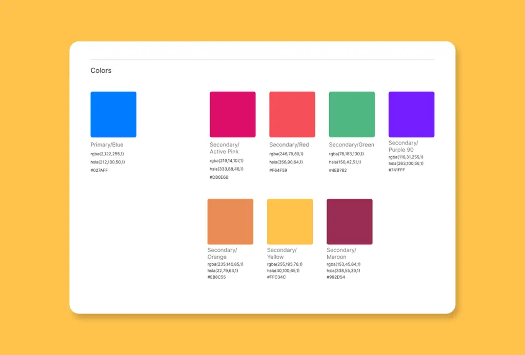
Color system
- Primary palette:
The hero colors everyone associates with you - Secondary palette:
Supporting actors for variety and depth - Functional colors:
For buttons, states, and accessibility
Avoid color as decoration. Use color to signal emotion and reinforce your positioning—think energetic orange for a challenger, soothing blue for a trusted advisor.
Always check your contrast and set clear rules for when (and how) each color appears.
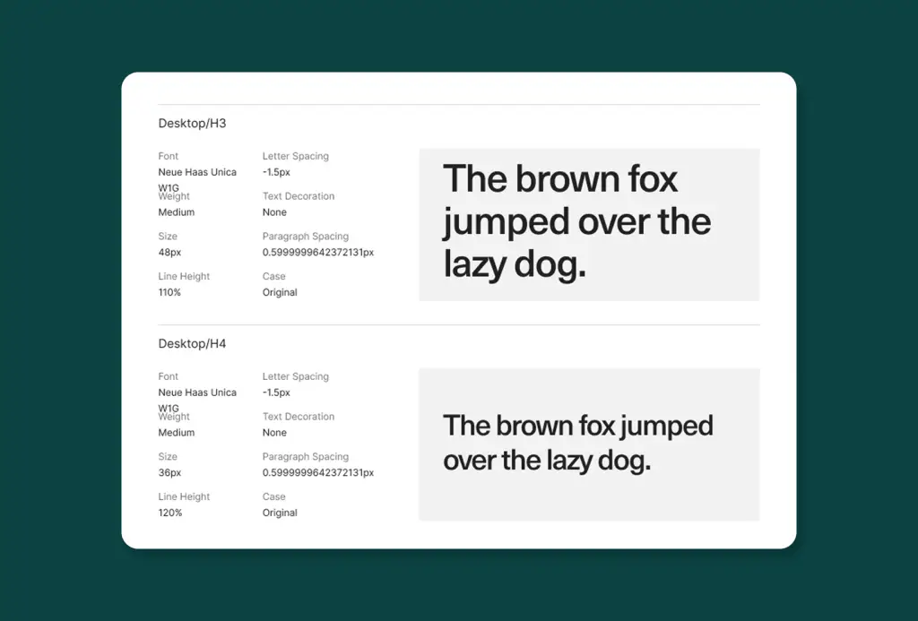
Typography system
Your type choices set the tone. Are you approachable, authoritative, quirky? Your typography says it before your words do.
- Display type:
Headlines, big statements - Body type:
Readability is king - UI/mono:
For code, data, or digital products - Rules:
Scale, hierarchy, line height, weights
A tight typographic system creates rhythm and makes your content instantly legible and ownable.
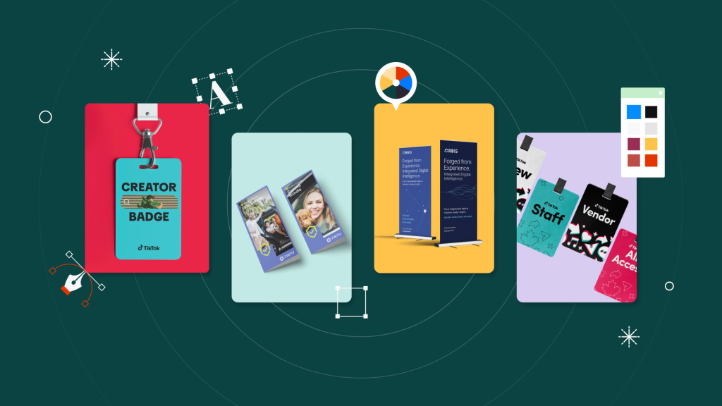
Logo + mark system
Gone are the days of one static logo. A robust visual identity design includes:
- Wordmark:
Your name, styled with intent - Symbol:
An icon or graphic mark - Combination mark:
Both, working together - Responsive versions:
From full lockup to favicon - Clear space and sizing:
Make sure your logo breathes
A flexible logo system ensures you look sharp on everything from billboards to app icons.
Layout + composition
Layout is the silent workhorse of your visual identity system. Grids, spacing, and alignment create the underlying structure that holds everything together.
- Grid philosophy:
Your approach to rhythm and order - Templates:
For social tiles, web sections, slides - Consistency:
The “system look” often comes more from layout than logo
When done right, your layout style becomes as recognizable as your logo itself.
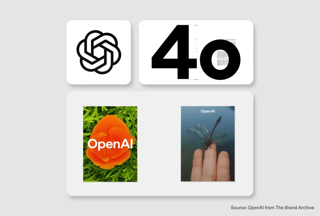
Imagery + art direction
Photography, illustration, iconography, even motion—these are the storytellers of your brand.
- Photography:
Style rules for lighting, tone, cropping - Illustration:
Consistent line weight, color usage, and subjects - Iconography:
Stroke width, corner radius, fill style - Motion:
How things move, fade, bounce, or glide
Set clear rules for art direction so every visual asset feels like it’s speaking your brand’s language.

Design tokens / UI foundations
If you’re product-led, a visual identity system should map directly to design tokens—those atomic pieces (color, radius, spacing) that keep your product and marketing singing in harmony.
How to build a visual identity (a repeatable process)
Here’s the Design Force repeatable process; think of it as your creative roadmap:
- Audit what exists
Gather all your current assets and hunt for consistency gaps. Where does the system break down? - Competitive scan
Map your competitors’ visual identities. Where do you look the same? Where can you zag? - Define 3–5 visual principles
Choose core principles (bold, warm, precise) to set the tone for every visual decision - Explore directions
Create 2–3 distinct routes for your system. Push the boundaries, then refine - Systemize
Build out your components (color, type, imagery, layout) and create templates for real-world use - Document guidelines and handoff
Write clear, concise, usable brand guidelines. Think live docs, not just pretty PDFs - Roll out across touchpoints
Apply your system to the website, product, social, and everywhere your brand lives
✨ Design Force Tip:
Systemize as you go. The earlier you build templates, the less you’ll scramble later.
Test it in real touchpoints (because identity lives in the wild)
A visual identity system isn’t proven in the boardroom, it’s proven in the wild. Put your system through its paces:
- Website hero and pricing page:
Does it feel on-brand without the logo? - Social templates:
Can you spot your posts in a crowded feed? - Decks/one-pagers:
Is your story visually consistent from slide one to the last? - Product UI:
Are the tokens and visuals in sync? - Packaging/app icon:
Is your brand unmistakable at thumbnail size?
Run these stress tests:
- No-logo recognition:
Remove the logo—do you still feel you? - Competitor thumbnail:
Line up your assets with competitors and squint. Do you stand out? - Consistency stress test:
Hand your system to 5 different creators. Does it hold?
Common mistakes that break your brand identity
Don’t let your brand fall into these classic traps:
- Logo-first identity:
A great logo can’t save a weak system - Trend-led decisions:
Chasing the latest look without a strategic filter leads to dated, inconsistent visuals - Too many styles:
Unclear art direction results in visual branding with an identity crisis - No templates:
If everyone’s improvising, your brand quickly unravels - Guidelines as pretty PDFs:
Gorgeous, but if no one uses them, what’s the point? - Inconsistency across channels:
Product and marketing must be in sync, or trust erodes
Visual identity examples (+ what makes them work)
Let’s spotlight a few brands that nail the system, not just the logo:
- Notion:
Calm, modular design with flexible blocks, monochrome palette, and subtle iconography—instantly recognizable, anywhere

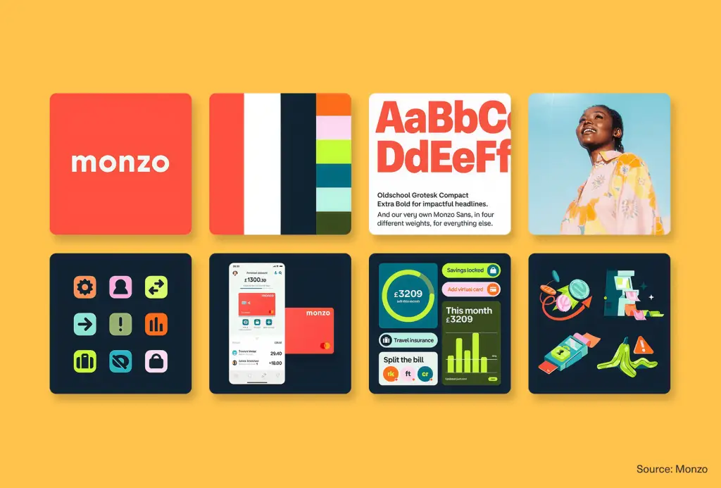
Monzo:
Friendly color pops (that hot coral!), crisp layouts, and consistent UI elements set this fintech apart
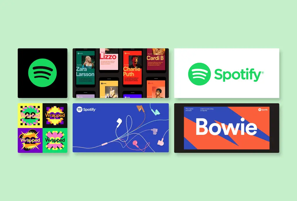
- Spotify:
Bold green, dramatic use of black, dynamic motion, and a typographic voice that feels both playful and premium
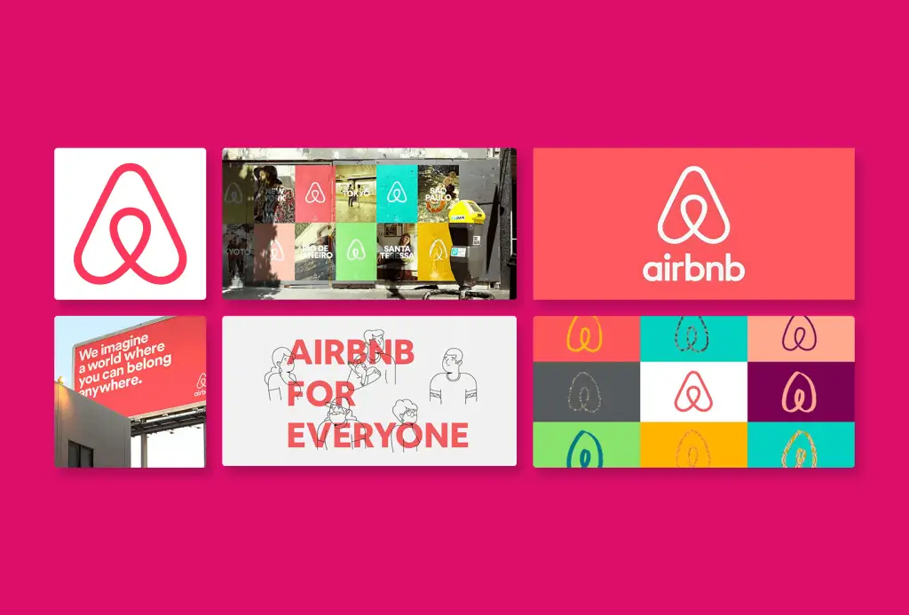
- Airbnb:
Warm photography, human-centric imagery, and clean layouts create a sense of belonging that’s reflected in every asset
- Oatly:
Expressive hand-drawn type, wild layouts, and a unique voice make every carton and post unmistakably Oatly

The common thread? Each brand’s identity system is built for real-world touchpoints, not just a style guide slideshow.
Make your mark with a brand identity system, not just a logo
Here’s the bottom line: visual identity is a system, not a single asset.
The best brand visual identity designs are strategic, consistent, and built to thrive wherever your brand shows up. If you want to be recognized, remembered, and trusted, you need a system that’s designed for real use, not just for awards.
Want more strategic branding and design frameworks? Subscribe to the Design Force blog for actionable guides on identity design, positioning, and brand building. Let’s make your brand impossible to miss, and even harder to forget.