
The top website designs in 2026 feel more intentional than experimental.
Brands are using less visual noise and putting more emphasis on clarity, structure, and control. That’s one reason these websites stand out.
Let’s look at some of the patterns on some clever website designs in 2026, and learn how to apply those same principles to your own.
1. Clarity at first glance
The best websites make an impression right away. Within a few seconds, a visitor should be able to understand what the brand does, who it’s for, and where to go next.
A lot of them lead with headlines that sound polished but say very little. Others put so much emphasis on the visuals that the actual message gets lost.
The strongest sites avoid that disconnect. Good landing page design follows the same logic: one clear action, no competing messages. Every part of the page has a job to do, and each component supports the same idea—from the headline and supporting copy to the visual and CTA.

Notion’s current homepage is a strong example, though in a quieter way. The headline reads, “Think together.” Just two words.
Under it, the line “The most meaningful things aren’t built alone” adds warmth and context. Then the video carries the idea further, making the product feel human before the page says anything about features. Nothing pulls attention away from that core message.
2. Motion that supports the message
Motion is still one of the defining qualities of modern website design. A subtle scroll reveal can introduce content at the right moment. A micro-interaction can make the experience feel more responsive.
In some cases, motion can explain an idea faster than a block of text. What the top website designs in 2026 avoid is motion with no real purpose.
You can see the same principle in many of Awwwards’ recent Site of the Day winners. The best animations create hierarchy, guide attention, and make new information easier to process—similar to the graphic design trends we’re seeing right now.
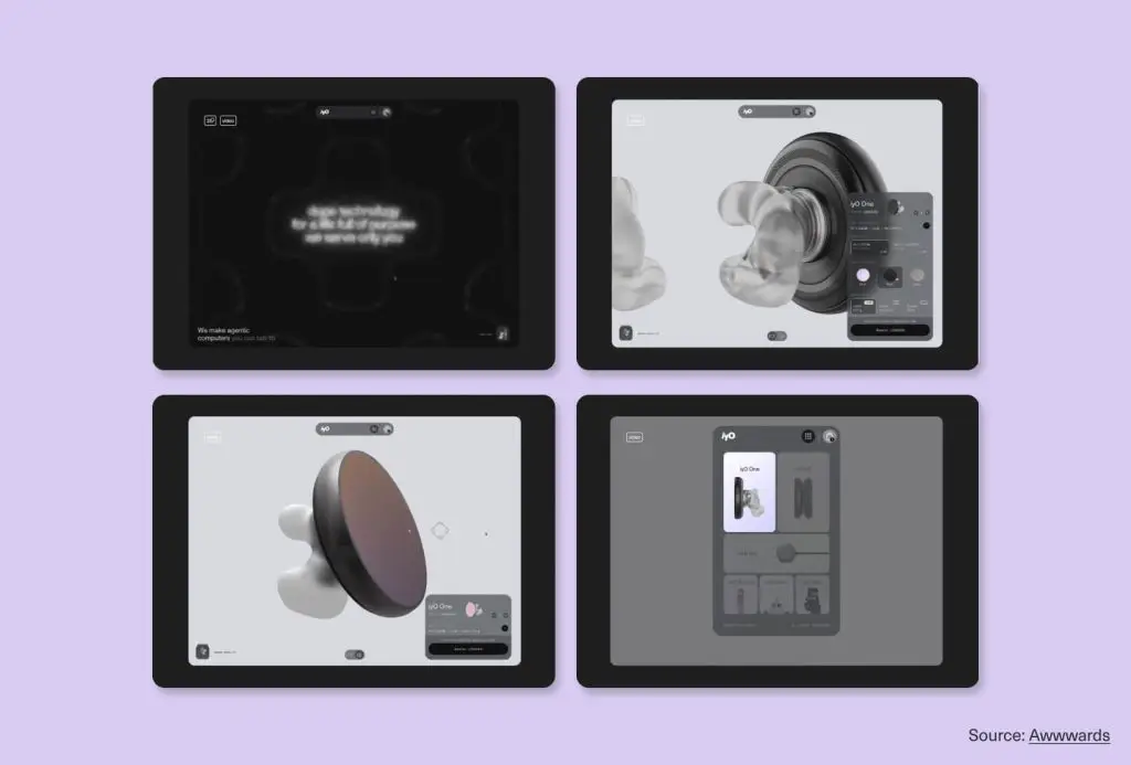
The iyO site is a strong example of motion used to tell the story. It creates an immersive 3D product experience with interactive elements that make the hardware feel real and responsive. As users navigate the site, animations show how it works and reinforce the idea behind it.
Even with a near-black, single-color palette, the site stays engaging because every animated detail supports the same core message. That level of focus is a big part of what makes the experience stand out.
3. A recognizable visual identity
A great website should still feel recognizable even without the logo. That’s one of the clearest signs of a strong visual identity (check how to build a visual identity here), and it’s something the top website designs in 2026 get right.
That kind of recognition comes from a full system working together: typography with personality, a color palette used consistently, a clear approach to imagery or illustration, and layouts that feel intentional instead of off-the-shelf. Building that cohesive brand identity starts well before the website.

Aesop offers a different kind of website design inspiration, with a warmer and more editorial approach. The pacing feels calm, the visuals feel natural, and the copy reads more like a well-edited magazine. Even without the logo, the brand still comes through clearly. That’s what makes the identity so effective.
4. Simpler choices work better
The best sites do not overwhelm people with options. They make the next step feel obvious. That usually comes from simpler navigation, a clearer page flow, and CTAs that do not compete with each other.
On most pages, there is one main action, and the design guides people toward it naturally. This is one of the most reliable ways to improve website conversion without changing the offer itself.
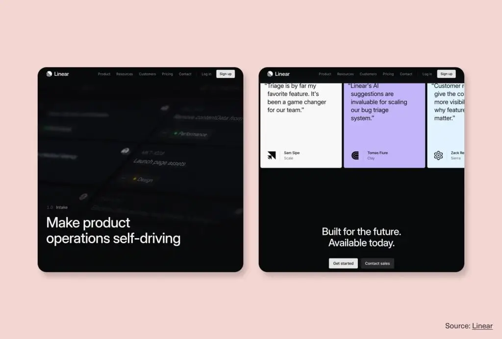
Linear’s Intake page is a strong example. It opens with one clear headline, “Make product operations self-driving,” then moves through the product in a steady, logical order. Each section introduces a feature with a short explanation and a screenshot. There are no extra sidebars, pop-ups, and competing calls to action in the middle of the page.
The main CTAs only appear at the end, once the page has explained the product and supported it with customer quotes. By that point, the next step feels clear. The whole page is structured like a strong argument, with each section building on the one before it.
5. Trust is part of the design
The best websites do not treat trust as something to add at the end. They build it into the experience from the start.
Instead of placing testimonials for the bottom of the page, strong sites place credibility throughout their website. Case study details appear next to product claims. Results are seamlessly integrated into the page as the story unfolds, so trust builds naturally as people scroll.
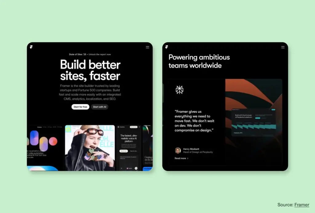
Framer’s homepage does this well. Right in the hero section, the copy says it is trusted by leading startups and Fortune 500 companies. That message lands before any feature explanation begins. Just below that, a scrolling gallery of real websites built in Framer shows the quality of the product before the page has to explain it.
Even the testimonials feel more purposeful than a standard quote block. Each one is tied to a real person or company with a specific outcome. That makes the proof feel credible.
This is also where custom website design makes a real difference. It gives brands more control over where proof appears, so trust can support the journey at the exact moment it is needed.
6. Mobile quality matters just as much
Designing a mobile-first website design is what separates sites that hold up from sites that just technically resize.
The strongest sites keep their brand feel intact on smaller screens and make interactions simpler without losing meaning. Calls to action are easy to find, but the experience doesn’t feel pushy or cluttered.
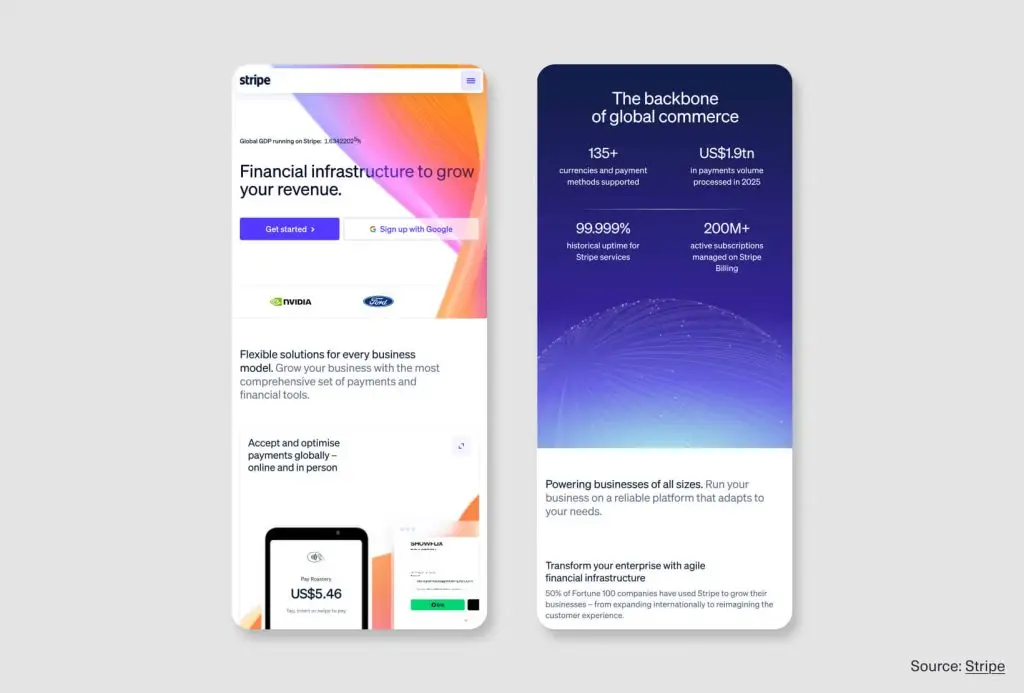
Stripe is a strong example of this done well. Its headline, “Financial infrastructure for the internet,” feels just as clear on mobile as it does on desktop.
The typography, gradient treatment, and product visuals all carry over without losing impact. The site stays polished and consistent across devices, which matters even more for a brand selling complex products.
7. Learn from the best, then look at your own site
The top website designs in 2026 have been useful because they show how clarity, identity, and trust can come through in very different ways.
Each example shown is a principle, not just a visual style. Notion stands out because it explains a complex product quickly. Linear is worth studying for its clarity and control. Framer’s motion works because it helps communicate the product, not because it looks impressive on its own.
That’s what makes good website design inspiration so valuable. It helps you look past surface-level choices and ask better questions about your own site.
In many cases, the strongest website redesign ideas come from understanding the thinking behind them.
Before making major changes, it helps to ask a few honest questions:
- Is our value clear within the first few seconds?
- Does the site feel distinct, or could it belong to a competitor?
- Is the next step obvious?
- Does proof appear early enough to build trust?
- Does the mobile experience still feel like our brand?
- Does the site reflect the quality of what we offer?
A lot of brands don’t need to start over. They need a site with clearer messaging, stronger structure, and a better overall experience. That’s often where a well-executed website redesign makes the biggest difference. The numbers behind that are worth knowing.
Conclusion
The top website designs in 2026 stand out because the thinking behind them is stronger. They don’t rely on louder visuals to make an impact. The best ones get attention quickly, make the next step clear, express a distinct point of view, and build trust smoothly.
That logic works across industries. Clear messaging matters first. A strong identity gives the site shape. Proof should appear where it helps people move forward, not as an afterthought.
The best websites are built to communicate well, guide people smoothly, and support conversion. That is what makes them worth studying—and worth building.
If this was useful, the next one will be too.
We publish practical guides on branding, design, and building a stronger online presence for teams that care about quality. Don’t miss anything and subscribe to the Design Force blog and receive monthly insights in your inbox.