The defining theme in graphic design trends in 2026? Imperfect by design.
While AI-generated visuals flood every channel with flawless gradients and algorithmically optimized compositions, the brands breaking from polish are the ones earning attention.
These design trends 2026 We analyzed what’s gaining real traction across brand, packaging, and digital creative to bring you the nine worth paying attention to. For marketing and creative teams, the message is clear: authenticity is now a design decision, and the brands that take it seriously are pulling ahead.
Below are nine 2026 design trends worth knowing, with real brand examples putting each one to work right now.
1. Human-First Design
After years of corporate minimalism and AI-polished output, design is getting its hands dirty again. Brands are making deliberate choices in visual storytelling that couldn’t have been generated or a layout that reflects a point of view. You can tell a person made a judgment call at every step, and that specificity is what makes it stand out.
Design Force Tip
Human-first design starts in the brief. Rather than specifying the end result, describe the feeling you’re after: warm, considered, made-with-care. Give your team some room for creative freedom rather than executing a formula.
Brand Inspiration: Who Gives A Crap

The toilet paper eco-brand is one of the best examples of human-first design done with intent. Hand-drawn typography, cheeky doodles, and deliberately awkward layouts make the brand feel genuinely human.
2. Tactile & Sensory Textures
Tactile design is having a real moment right now. People want to feel something in a world that’s gone almost entirely flat and digital, so designers are using texture to do what touch can’t on a screen. The effect is visual work that feels physically real, even on a screen.
Design Force Tip
Texture use such as grain overlays, paper-like backgrounds, material renders, and analog scan elements can create real tactile warmth. This is especially relevant to direct-to-consumer brands trying to communicate craftsmanship through channels where the product can’t be touched.
Brand Inspiration: Trelli Health

Trelli Health shows how tactile texture works in digital design. The brand uses full-bleed macro photography of natural ingredients (ginger root skin, dense grass, wheat mid-motion) to create depth and layering that feels tactile.
3. Expressive Typography
In 2026, typography in graphic design isn’t just carrying information. It is the design. Letters stretch, shrink, sway, overlap. Designers are mixing styles and layering influences in ways that feel genuinely expressive rather than systematic.
Design Force Tip
Expressive type only works when it’s rooted in the brand’s actual voice. Before going adventurous, anchor the decision in an emotion: urgency, playfulness, intimacy, irreverence. Know what feelings you want to convey first and let the typographic execution follow.
Brand Inspiration: Bose

The Bose wordmark does a lot of the heavy lifting, creating a sense of forward momentum, like it’s moving with sound. It also brings the same energy as the surrounding imagery. The moving figure and intense reds and oranges make it feel loud, fast, and full of momentum.
4. Glassmorphism 2.0
The frosted glass aesthetic that flooded design portfolios in 2021 is back. However, its 2026 form is an entirely different thing. The first wave was largely decorative, while its successor is being used as a genuine design layer.
Design Force Tip
Use glassmorphism as a supporting detail, not the core design. Focus first on layout and hierarchy. The effect should help organize the interface, not fight for attention. Keeping the background simple and the colors restrained makes the glass look cleaner.
Brand Inspiration: Apple
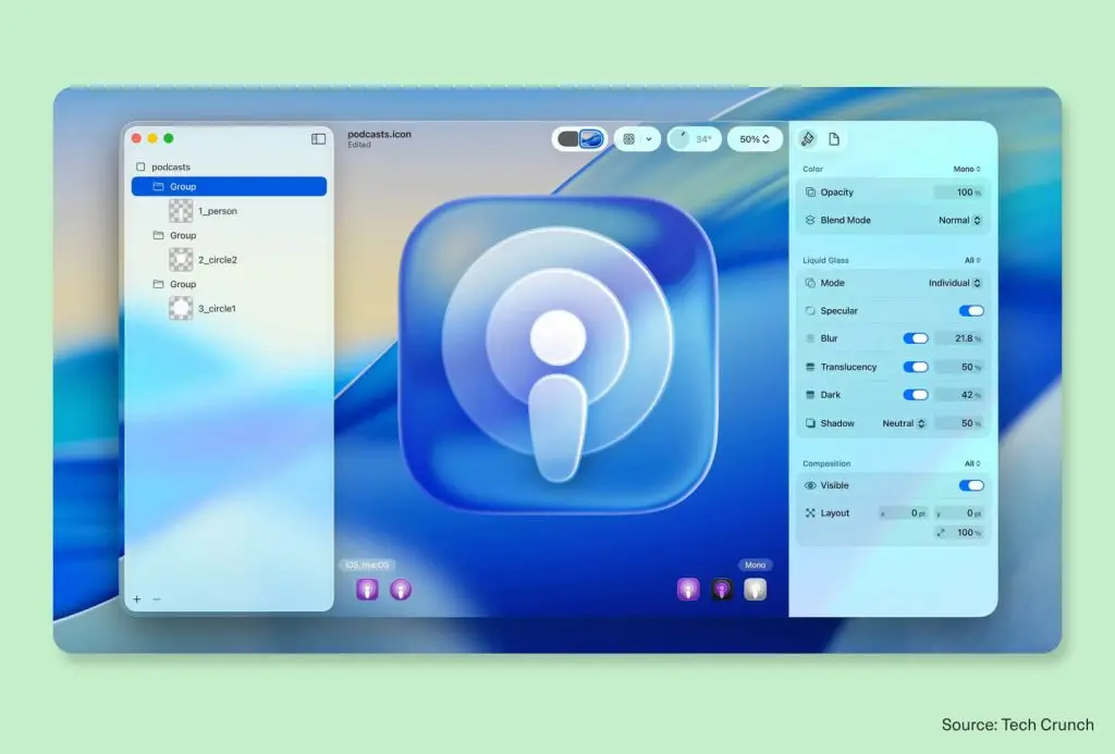
Apple made this trend hard to ignore. At WWDC 2025, it launched Liquid Glass across iOS 26, macOS Tahoe, and watchOS 26. Older glass-style interfaces mainly relied on fixed blur effects. Liquid Glass goes further by behaving more like actual glass, shifting with light, motion, and its environment in real time.
5. Naive Design
Human-first design keeps the designer’s skill visible. Naive design goes a step further and hides it entirely. Think wobbly outlines, uneven fills, proportions that ignore the rules, scrawls that could have come from a phone call doodle. Even when it looks loose or unrefined, there’s usually clear control behind it.
Design Force Tip
Naive design requires real creative conviction, otherwise it just looks careless. Be specific about which elements should carry the rough treatment (illustrations, hand-lettering or layout textures) and which should stay clean (type hierarchy, product information, CTAs).
Brand Inspiration: Jolene Bakery

The London bakery’s visual language is warm, slightly anarchic, and clearly made by a real person. Every wobbly line reads as care rather than incompetence, and the result is a brand that feels intimate and local. And that’s a hard thing to manufacture.
6. Heritage & Legacy Design
More brands in 2026 are looking backward to move forward. Heritage and legacy design draws from historical visual languages, from Victorian letterforms to architectural motifs and craft-era color systems and reinterprets them for today.
Design Force Tip
Heritage design works best when it’s grounded in something real and specific. Give your team the source material first. The historical reference should be clearly present but expressed in a way that works across modern channels.
Brand Inspiration: Royal Albert Hall

Royal Albert Hall’s rebrand in late 2025 showcased a new wordmark that drew on the venue’s Victorian heritage through subtle sign-painted cues. The masthead wraps around the building’s domed silhouette. The Hall’s signature red was standardized with Victorian letterforms and 1960s poster graphics that holds up across print, digital, and broadcast.
7. Maximalism & Mixed Media Collage
Maximalism isn’t new, but its 2026 form is more intentional than recent iterations or creative trends. Designers are blending photography, illustration, collage, and 3D elements to create layered visuals that feel unexpected and full of personality.
Design Force Tip
Every element should mean something. Brief your team with a clear creative territory: what feeling should the maximalism produce? Joyful chaos, nostalgic warmth, energetic abundance? Start with the answer to that question.
Brand Inspiration: Dior

For its Spring/Summer 2022 campaign, Dior used a full mixed-media collage language. Each poster is a hand-assembled composition: cut-out models surrounded by botanical illustrations, abstract color blocks, and torn paper scraps. The background is deliberately papery, so each element feels pinned rather than placed.
8. Lo-Fi / Retro-Tech
A specific type of nostalgia-driven design has broken through in 2025 and 2026 that goes beyond general Y2K revival. It’s more granular and more literal: spreadsheet UI elements, early browser chrome, pixel fonts, CD-ROM textures, CRT monitor aesthetics.
Design Force Tip
Brief your team on the specific era you’re drawing from, whether it’s the early web, CRT interfaces, or VHS texture. The goal is to evoke the feeling of the era, not to reproduce its limitations.
Brand Inspiration: Spotify Wrapped 2025

After criticism of its “AI slop” look in 2024, Spotify moved toward physical-media references like mixtapes and burned CDs. The campaign, described as a “visual mixtape,” combines texture with both analog and digital cues to capture the spontaneous feel of music fandom. Elements like scratchy textures, retro holographic effects and tight grids give it a more distinctive visual identity.
9. Dopamine Colors
Color is one of the fastest ways a brand can create an emotional response. In 2026, more brands are leaning into that fully. Dopamine color palettes are bold, saturated, and high-energy. The goal is immediate impact: you see the color before you read a word, and you already feel something.
Design Force Tip
Before refreshing anything, audit how color is actually showing up across your channels. Inconsistency erodes brand recognition faster than most teams expect.
Brand Inspiration: Starface

Starface built its entire identity around a single neon yellow, and it paid off. Where every other skincare brand was using neutral palettes, they went the opposite direction and transformed a pimple patch into a fashion statement.
Make These Trends Work for Your Brand
The common theme in all nine of these graphic design trends in 2026 is intentionality. Human imperfection only works when it’s purposeful.
The brands doing this well are starting with a sharper question: What does our audience need to feel, and which creative tools will get them there? The trends provide the vocabulary. Your brand provides the brief.
Whether your team is going for a rebrand, a campaign refresh, or simply trying to produce more consistent, on-brand creatives at scale, Design Force can help.
Our fully managed design subscription gives you access to dedicated teams across user experience, digital, and brand design assets. Book a call to find out how we can help you bring these design trends 2026 to life, at the quality your brand requires.