
Aesthetics play a crucial role to improve your website conversion rate, as 75% of consumers base their judgment of a site’s credibility on its overall aesthetics.
No matter how good you think your product might be or how well you think you are selling it with your copy, you would only get a fraction of the conversions that you should be getting if your site’s user experience (UX) design is unappealing and rife with issues.
There are certainly layers of complexity to completely understanding UX design as a concept, but you don’t need any advanced degrees to apply its principles. Here are five web design hacks even beginners can put into practice to improve conversion rate on website:
1. Button Up Your Buttons
It’s already common knowledge to use bold colors for CTA buttons to grab people’s attention, and to use familiar shades that humans generally associate with positive and negative connotations. Green is a go signal, so we use it for “buy” buttons, while red is stop, so we use it for “cancel” buttons.
If you want to know how to improve your website conversion rate, let’s go beyond doing what’s tried and tested in the industry. Instead of having buttons that are similar in all but color, you can nudge users to the action you want them to take with even more visual differentiation between buttons.
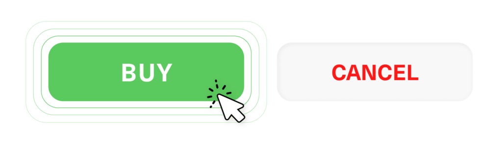
For example, your buy button can be a bright, solid green button with a strong CTA phrase in clear white text, while your cancel button is only in muted red text and doesn’t have a colored background at all.
2. Erase Your Errors
Nothing shreds the credibility of a website more than errors popping up left and right. It can be anything from typos and grammar mistakes to broken links and images that don’t load. Websites that are riddled with errors look unprofessional and make people doubt if they should spend their time or money.
What’s even worse is if your site errors frustrate users to the point that they just leave and never come back. 88% of online consumers are less likely to return to a site after a bad user experience, and 90% leave because of poor site design.
How to improve website conversion in the face of all these errors? Do some housekeeping with your site by proofreading your copy, fixing your broken links, and updating your images. Create a custom 404 design for internal pages that no longer exist, and include suggested pages that might be relevant or a search bar so that users can keep engaging with your site instead of just leaving.
3. Highlight with White Space
A seemingly obvious way of dividing sections for your pages would be to simply add lines in between the different sections. This is one of the overlooked ways on how to improve website conversion. However, keep in mind that while this can work in clearly segmenting a page, it can look busy when there are too many elements on screen. The better solution would be to use white spaces.
White or negative space is basically any part of a page that has no elements. It might seem like a waste to not use up every inch of the user’s screen with more info or fancy graphics, but the truth is more white space increases comprehension by 20% and 80% of readers prefer more white space than less white space.
Using white space helps you direct users’ focus to what you want them to pay attention to, whether it’s a limited-time free trial or an exclusive offer for signing up to your newsletter.
4. Signal Security
We’ve touched on trustworthiness in web design in implicit terms but it also helps greatly to be explicit about how your site can be trusted. This is especially the case for websites with online stores where people have to give their personal information and use their credit cards to make purchases.
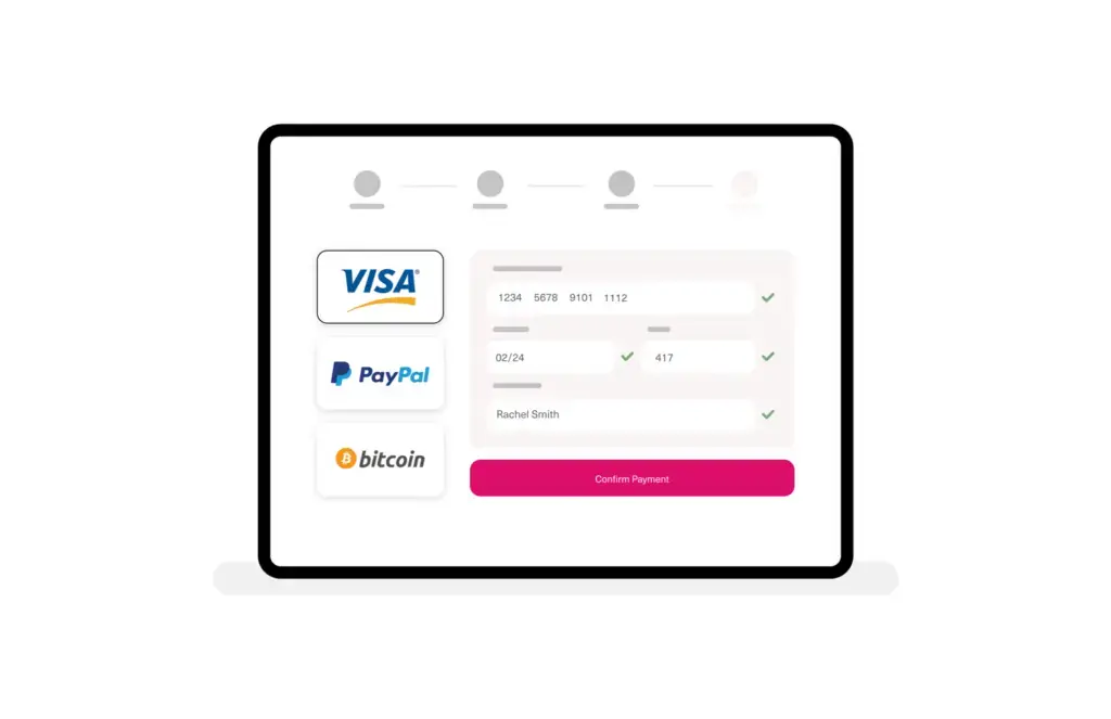
Customer testimonials, aggregate user ratings, industry awards and affiliations, security badges, and even contact information can all be considered as “trust signals”. Having these elements front and center showcases to your visitors that your site is legitimate, therefore making it one of the most important tips to increase website conversion rate. By assuring them that their data is secure, they are more likely to take an action like making a purchase or scheduling a demo.
5. First and Last Impressions Last
People tend to have a better memory of the first and last things in a series than they do of whatever might be in the middle. In psychology, it’s called the serial position effect. Applying this to your website with certain design elements can yield great results.
For the last in our list of website conversion tips, take, for example your landing pages. You can place a CTA right at the top so that it’s one of, if not the first thing people see to immediately grab their attention. For lengthy content, meanwhile, it’s always a good idea to have a CTA at the very end when users are fully informed and perfectly primed to take action.
If you want to get professional UX design to improve your website conversion rate, contact Design Force today. We have an expert team of web designers that can elevate your site’s user experience for maximum engagement.