
Branding with emotion isn’t sentimental, it’s strategic
People don’t remember what you said—they remember how your brand made them feel.
That’s the magic at the heart of emotional branding: designing a consistent emotional experience that shapes trust, preference, and loyalty. Not just sentimental fluff, but a strategic and creative process that transforms brand perception into something people carry with them.
In this article, we’ll break down what brand emotion is, why emotion should be treated as a design outcome, and share a practical framework to help you define and design your brand’s “felt sense.”
Because in the end, great brand experience isn’t just what you show; it’s what people feel, again and again.
What emotional branding actually means
Emotional branding is the intentional, reliable emotional response your brand creates. It’s the sum of your visual identity, brand voice, product experience, and those micro-moments in between. Brand emotion isn’t just about what you say in your messaging; it’s how you show up visually, how you sound, and how you make people feel at every touchpoint.
Humans are wired to decide and remember based on feeling. That’s why calm, safe brands like Headspace and bold, rebellious brands like Liquid Death can both win, as long as they’re consistent.
What matters is that your brand emotion is clear, intentional, and never muddled.
Emotion is designed, not just claimed
You can’t simply declare, “We’re trustworthy” or “We’re innovative.” You have to design for trust, innovation, or whichever emotion you want to own. Every visual choice, every word, and every interaction becomes a signal in your brand experience.
- Visual cues:
Color palette, typography, layout, and imagery - Language cues:
Clarity, warmth, confidence, and personality in brand storytelling - Experience cues:
Onboarding, support tone, microcopy, and speed of response
Design Force tip:
If your premium brand uses cluttered layouts or inconsistent tone, the disconnect chips away at brand perception. Make sure what you promise matches what you deliver, everywhere.
Build your ‘Brand Emotion Stack’
Here’s a simple framework to keep you focused: The Brand Emotion Stack.
- Primary emotion:
The one you want to own and be recognized for - Supporting emotions:
Two secondary feelings that add nuance - Guardrails:
Avoid the “everything bagel”—trying to be everything leaves your brand feeling like nothing
Try these prompts with your team:
- “After interacting with us, people should feel ___.”
- “The opposite of our brand should feel ___.”
- “If our brand were a person at a dinner party, it would be ___.”
Some example stacks:
- Calm + (Clear, Reassuring)
- Bold + (Playful, Confident)
- Premium + (Minimal, Precise)
Define your stack and let it guide every design and content choice. That’s how your brand emotion becomes repeatable and recognizable.
Translate feelings into design signals
Now it’s time to make those emotions tangible across every aspect of your brand identity design.
A. Visual identity
- Color:
Warm neutrals for approachability, deep blues for authority, bright hues for energy - Type:
Humanist for friendliness, geometric for tech vibes, editorial for premium polish - Layout:
Spacious for calm, dense for urgency, balanced for clarity - Imagery:
Real people for authenticity, polished product shots for premium - Motion:
Subtle transitions for ease, bold animation for excitement
B. Brand voice and messaging
- Short, confident sentences create clarity
- “We do” signals certainty; “We think” feels tentative
- Humor and empathy should match the feeling you want to evoke
C. Experience and touchpoints
- Onboarding that welcomes, not overwhelms
- Error states that comfort, not confuse
- Support that’s speedy and human
To help you see things clearly, use a quick cheat sheet like this to keep your brand’s emotion on track:
| Feeling | Design Signals | Avoid |
| Calm | Soft palette, open space, gentle copy | Loud colors, jargon, dense layouts |
| Bold | High contrast, assertive headlines, kinetic motion | Hesitant language, bland visuals |
| Premium | Minimalism, crisp photography, deliberate pacing | Clutter, inconsistency, cheap stock |
Design Force tip:
Audit your top five touchpoints (homepage, email, social, product screen, pitch deck). Do they all feel like the same brand? If not, it’s time to realign.
Brands that nail emotional branding
A few brands that truly embody their chosen emotion:
1. Mailchimp
Quirky, supportive
Playful illustrations, surprising micro-interactions, warm and clear copy that makes email marketing approachable

2. Everlane
Honest, modern
Clean design, transparent pricing, straightforward storytelling that builds trust and a sense of ethical connection

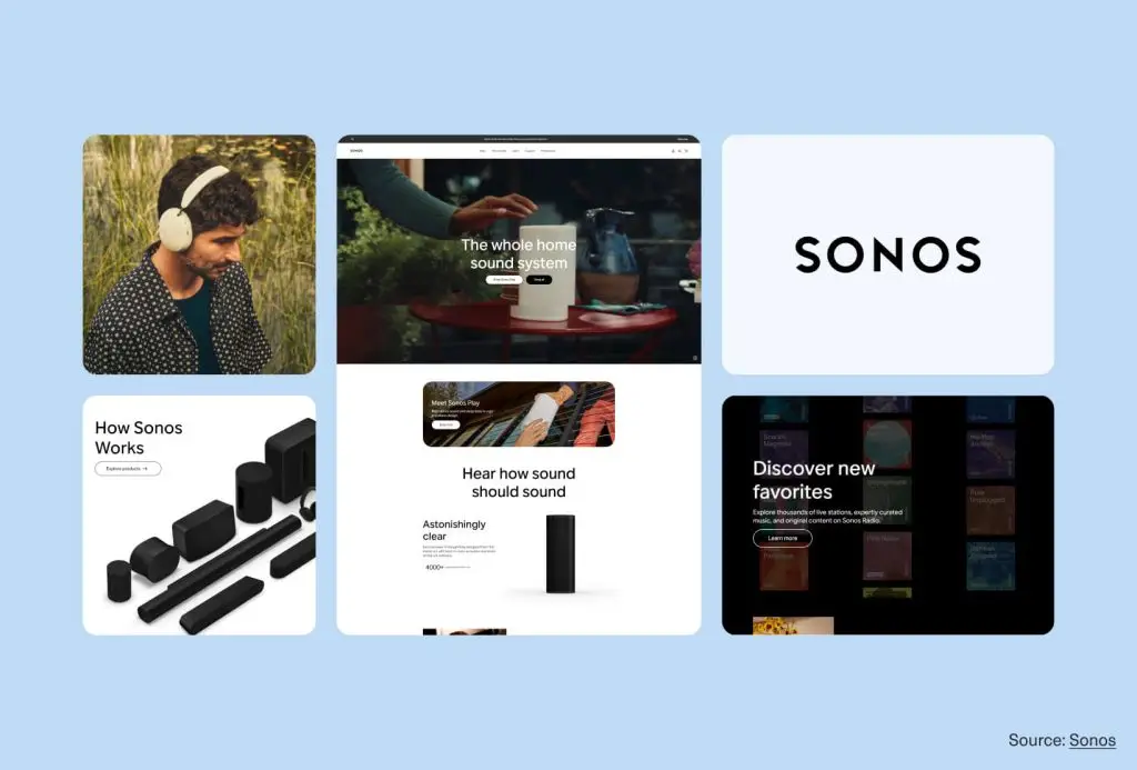
3. Sonos
Immersive, dynamic
Vibrant photography, simple interfaces, energetic brand language that celebrates the joy of sound
4. Bombas
Caring, community-driven
Bright colors, heartfelt giving mission, inclusive messaging that makes comfort feel like a shared mission

Each one expresses its brand emotion at every level, never leaving it to chance.
Design for feeling, not just recognition
Emotional branding is what elevates your brand from nice to preferred. When you define the feeling, translate it into every visual and verbal choice, and keep it consistent across touchpoints, you create a brand experience people actually feel—and want to return to.
The goal isn’t to be emotional for its own sake; it’s to be intentional, so your brand becomes part of your customer’s emotional memory.
Want more strategic branding and design frameworks?
Subscribe to the Design Force blog for practical guides on identity, voice, and brand experience.