Why whitespace is your design’s secret weapon
Whitespace isn’t just “empty” real estate—it’s the secret weapon behind designs that feel bold, focused, and remarkably clear. When used with intent, negative space in design breathes life into your layouts, elevating every headline and image while giving your audience the clarity they crave.
In this article, you’ll get a clear definition of negative space, discover the benefits of negative space, grab actionable whitespace in design tips, and see inspiring real-world examples. Let’s unlock the magic of minimal design techniques and strategic space and composition.
What is negative space?
Negative space in design—sometimes called whitespace—is the intentional “empty” area that surrounds and separates elements on a page or screen. It’s not just background; it’s the breathing room that lets your content stand out and your message shine through.
There are two main types of negative space:
- Micro-space:
The small gaps between letters, lines of text, or closely grouped UI elements. - Macro-space:
The larger open areas around images, content blocks, or entire sections.
Imagine two layouts:
- Cramped:
Every inch is filled with text and images, making your eyes dart around for a focal point. - Spacious:
Ample whitespace guides your focus to the headline and call-to-action, letting your brain process each element comfortably.

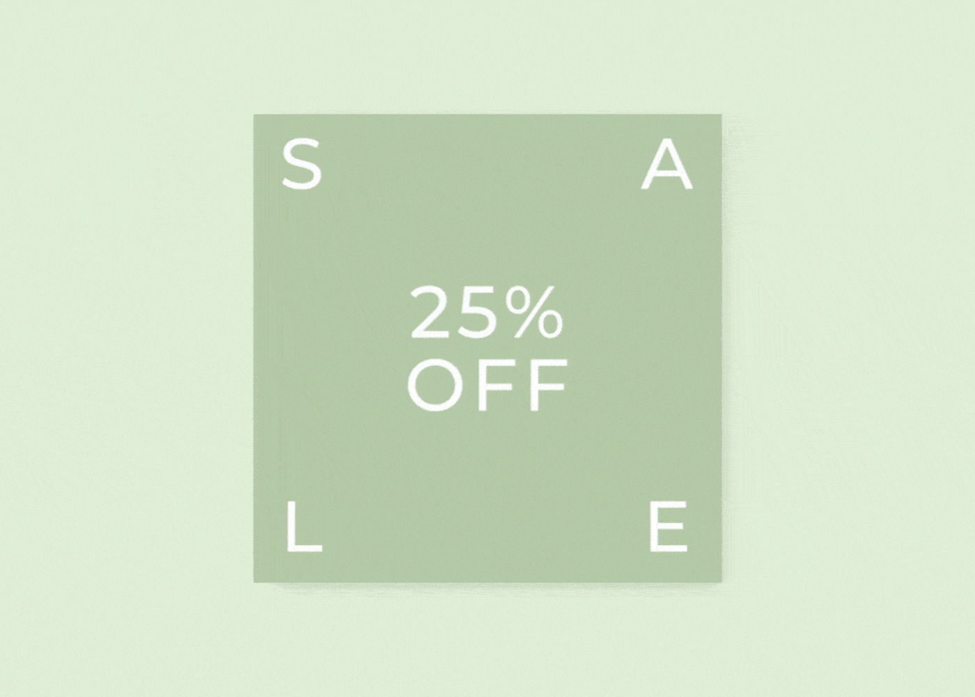
That’s the power of negative space—it’s as vital to space and composition as the visuals themselves.
The benefits of negative space
Why are designers obsessed with whitespace in design? Because the benefits of negative space go beyond aesthetics:
- Improved readability:
Text and visuals don’t compete for attention. Each element gets room to breathe, making complex information easier to digest. - Enhanced hierarchy:
Use space to group related elements and separate sections, naturally drawing the eye to what matters most. - Sophisticated aesthetic:
Minimal design techniques, powered by negative space, convey a modern, high-end look that feels intentional—not accidental. - Emotional impact:
Whitespace creates calm, clarity, and even a sense of luxury. When used well, it can make your design feel inviting and effortless.
Design Force tip:
Don’t think of negative space as “empty.” Think of it as active—a tool that shapes the user’s experience and amplifies your design’s message.
Quick tips for using negative space
Ready to put whitespace to work? Here are five actionable ways to integrate negative space in design for better results:
- Start with a grid
Use columns and modules to structure your layout, then deliberately leave gaps between content blocks. Grids give you control over both micro- and macro-space. - Balance elements
Resist the urge to fill every corner. Before adding something new, ask, “Does this need to be here, or could space do the talking?” - Mind your margins
Generous margins on pages, artboards, or cards provide instant elegance and improve legibility—especially on mobile. - Emphasize calls to action
Surround key buttons, headlines, or forms with extra space. This draws attention and increases click-through rates. - Scale and alignment
Adjust the size and alignment of your elements to maintain breathing room while keeping the composition cohesive. Sometimes, simply aligning objects or increasing padding elevates the whole design.
Design Force tip:
After finishing a layout, step back (or zoom out) and squint—if the key message doesn’t stand out, add more whitespace until it does.
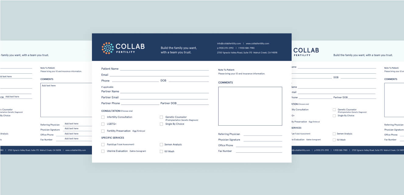
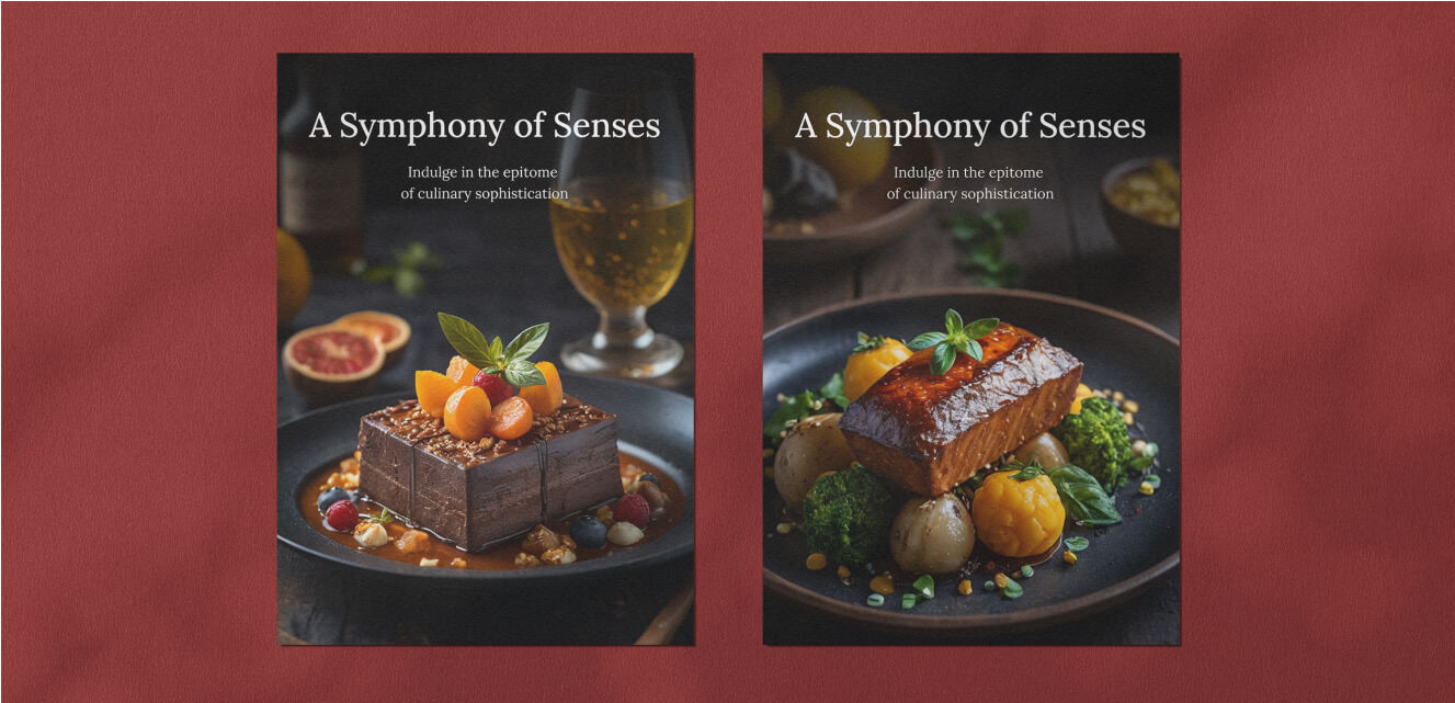
Real-world examples of negative space done right
Still unsure how negative space works in practice? Take a cue from these masters of minimalism:
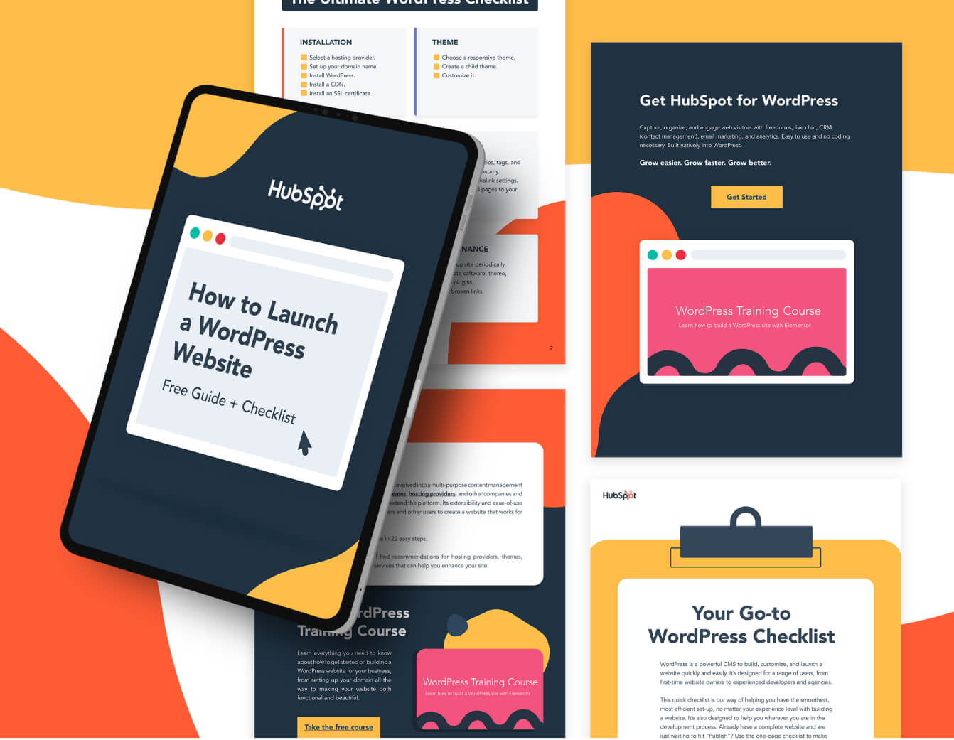
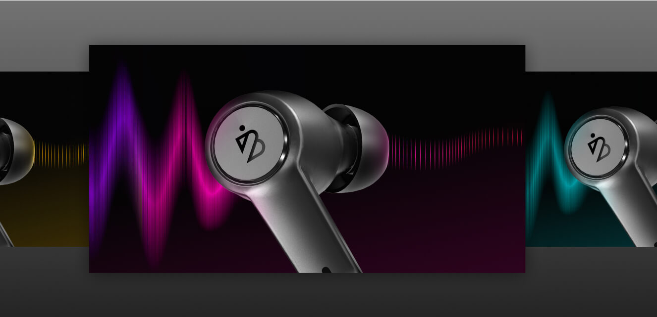
Apple product pages
Notice how images of devices float in generous space, with concise copy and clear calls to action. Every detail is intentional, and the whitespace makes the products shine.

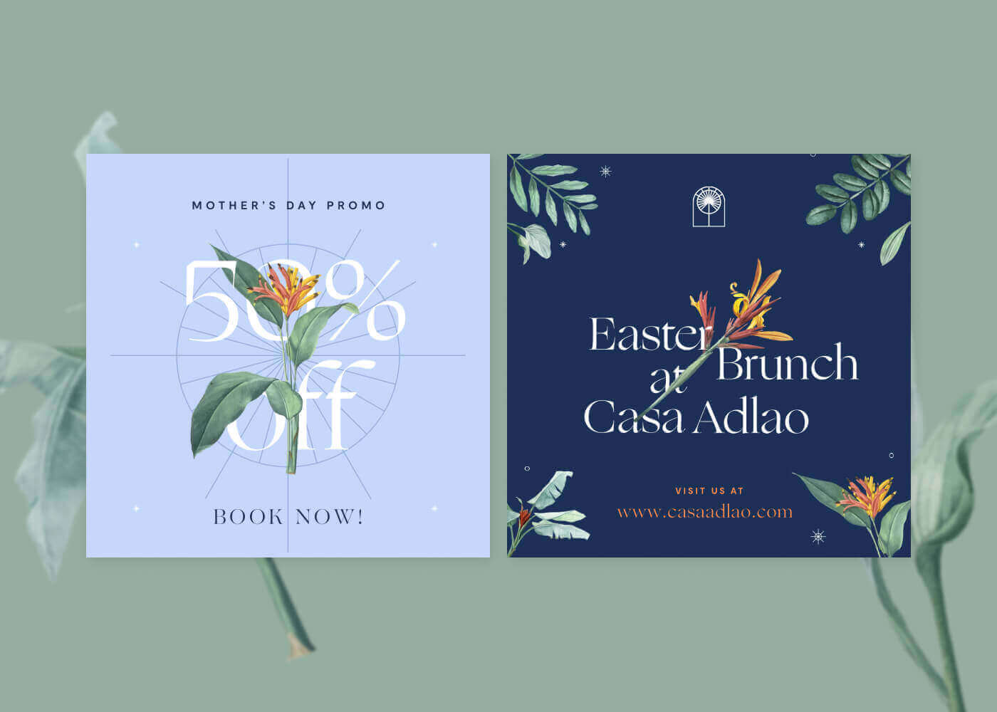
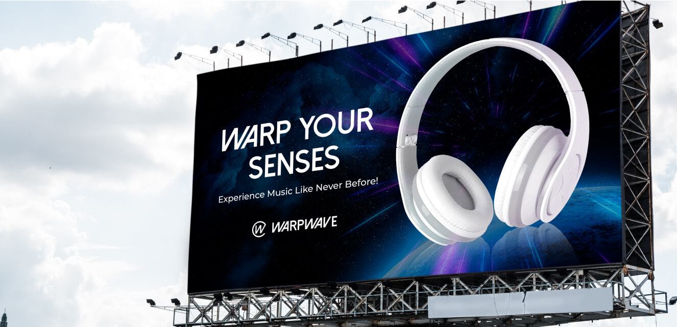
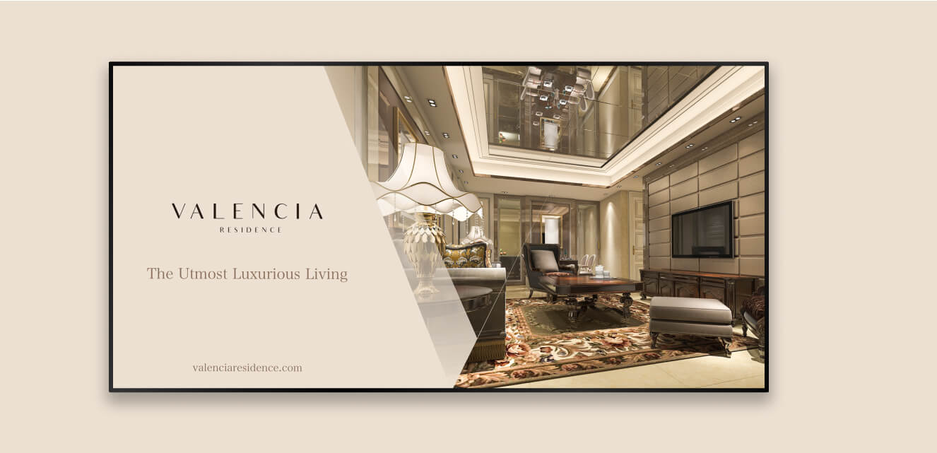
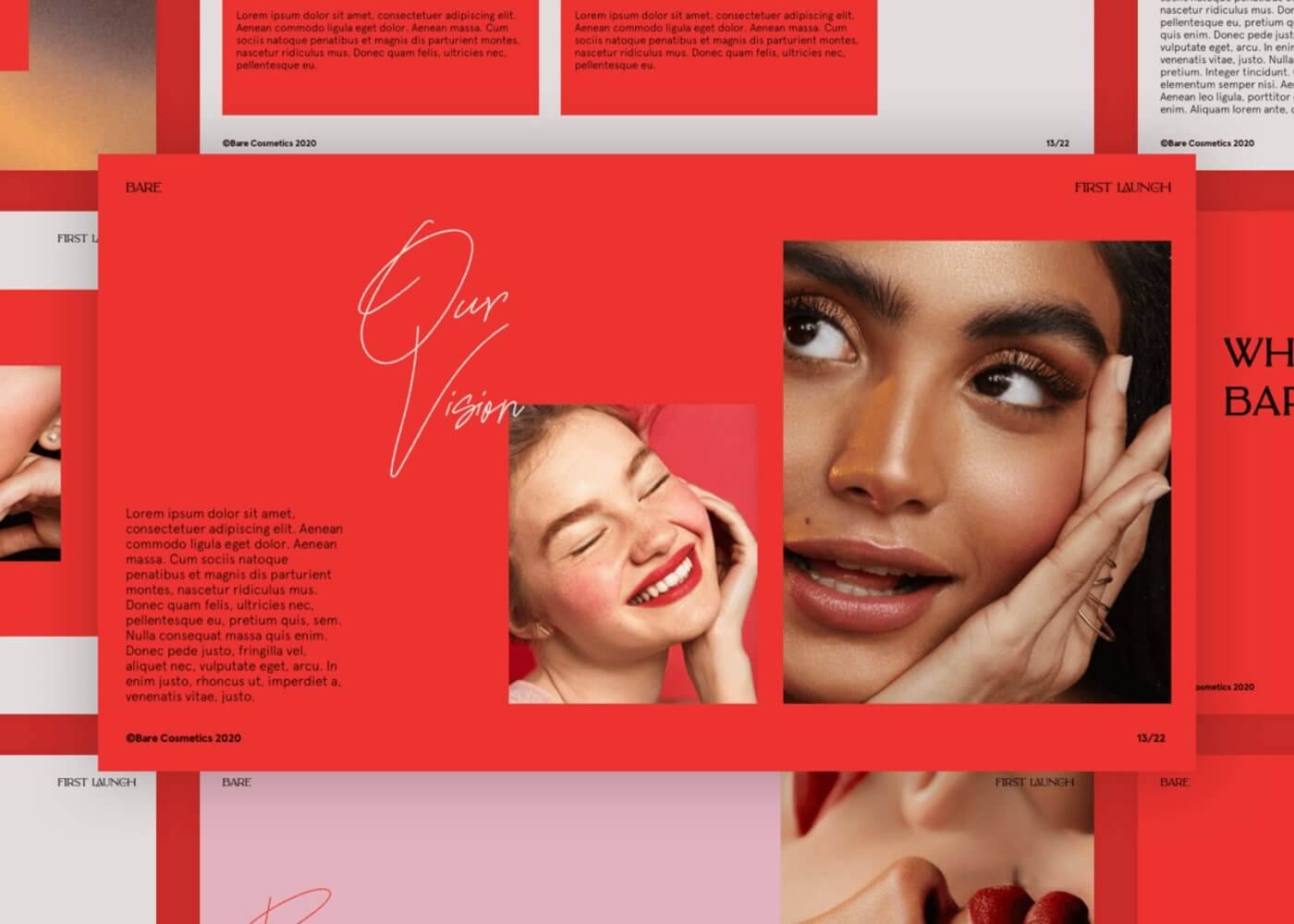
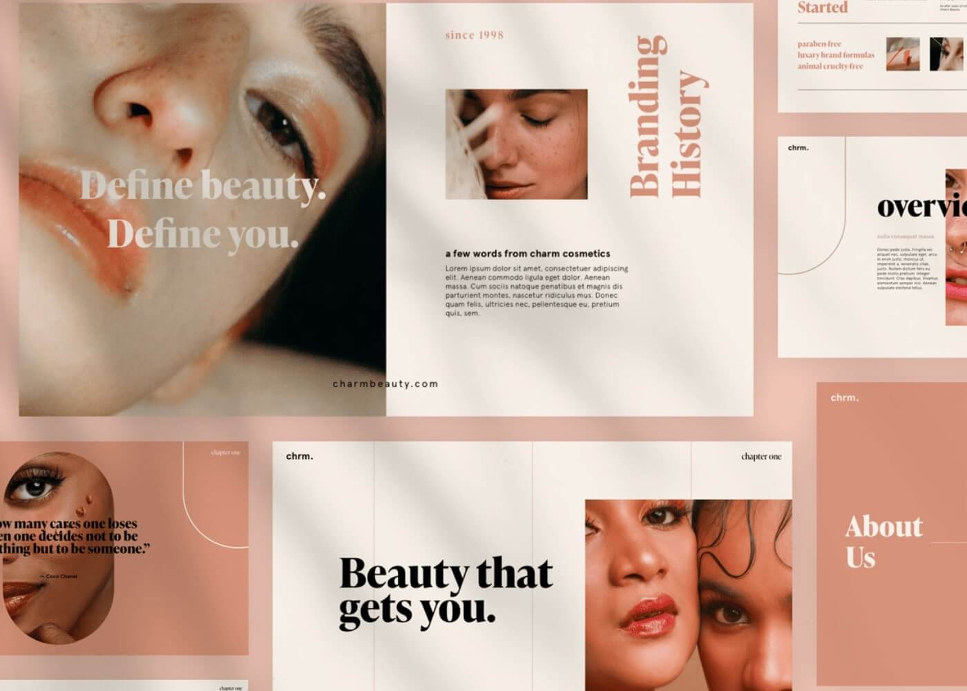
High-end magazine ads
Luxury brands often use full-page imagery framed by wide white borders, paired with minimal text. The negative space directs the viewer’s gaze straight to the logo or product.

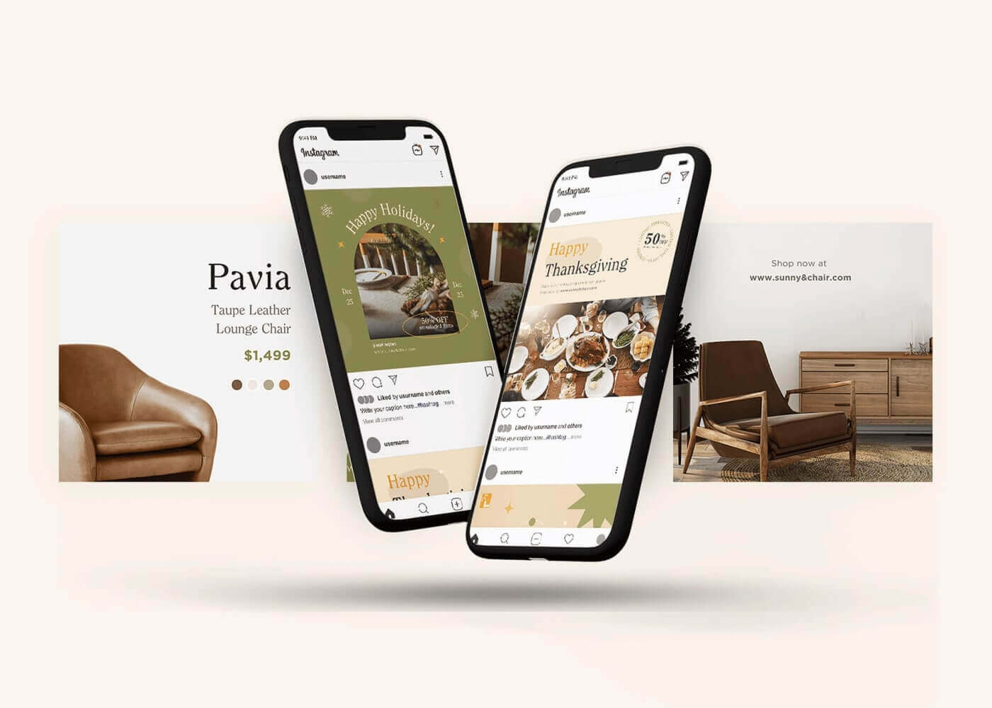
Mobile app interfaces
Well-designed apps use cards and list items spaced apart to avoid tap errors and reduce cognitive load. The result? Interfaces that are intuitive and easy on the eyes.

Each of these examples proves that strategic whitespace in design is a hallmark of clarity, usability, and brand confidence.
Make space your next design move
Negative space is not wasted—it’s strategic design magic that improves clarity, hierarchy, and user experience. If you want your designs to look (and feel) more refined, start using whitespace as intentionally as color or typography.
📍Here’s your challenge: on your next project, remove one non-essential element and increase the surrounding space. Watch how quickly your layout transforms from cluttered to clear.
Subscribe to the Design Force newsletter for more bite-sized design insights—and explore our Design Subscription Services to keep your creative engine running.