The invisible framework behind impactful design
Typography isn’t just about choosing a font or deciding between serif and sans serif—it’s about creating a seamless reading experience that communicates your message clearly and effectively.
Enter typographic hierarchy: a great design hero hiding in plain sight.
Whether you’re crafting a website, designing print collateral, or creating a slide deck, mastering the hierarchy of your typography is essential to guide your audience through the content and ensure your message lands.
In this article, we’ll explore the techniques behind applying this effectively, break down what works (and what doesn’t), and give you actionable tips to elevate your designs through type.
Understanding typographic hierarchy
At its core, typographic hierarchy is the art of organizing text elements on a page, in a way that prioritizes their importance. It’s a roadmap for your audience, a subconscious guide that tells them where to look first, what’s most important, and how to digest the information.
Without hierarchy, text becomes a wall of words—overwhelming and impossible to navigate.
Imagine reading this blog post, but the headings are the same size as the body text, and bolding or spacing is inconsistent. Or even worse, imagine this post as one long block of text. There would be no chance in skim-reading, and you’d quickly lose interest—even if the content interests you.
That’s the power of typographic hierarchy: it transforms chaos into clarity.
Key elements of typographic hierarchy
To create an effective hierarchy, there are a handful of key elements designers rely on to differentiate content and achieve a visually appealing layout that draws readers in.
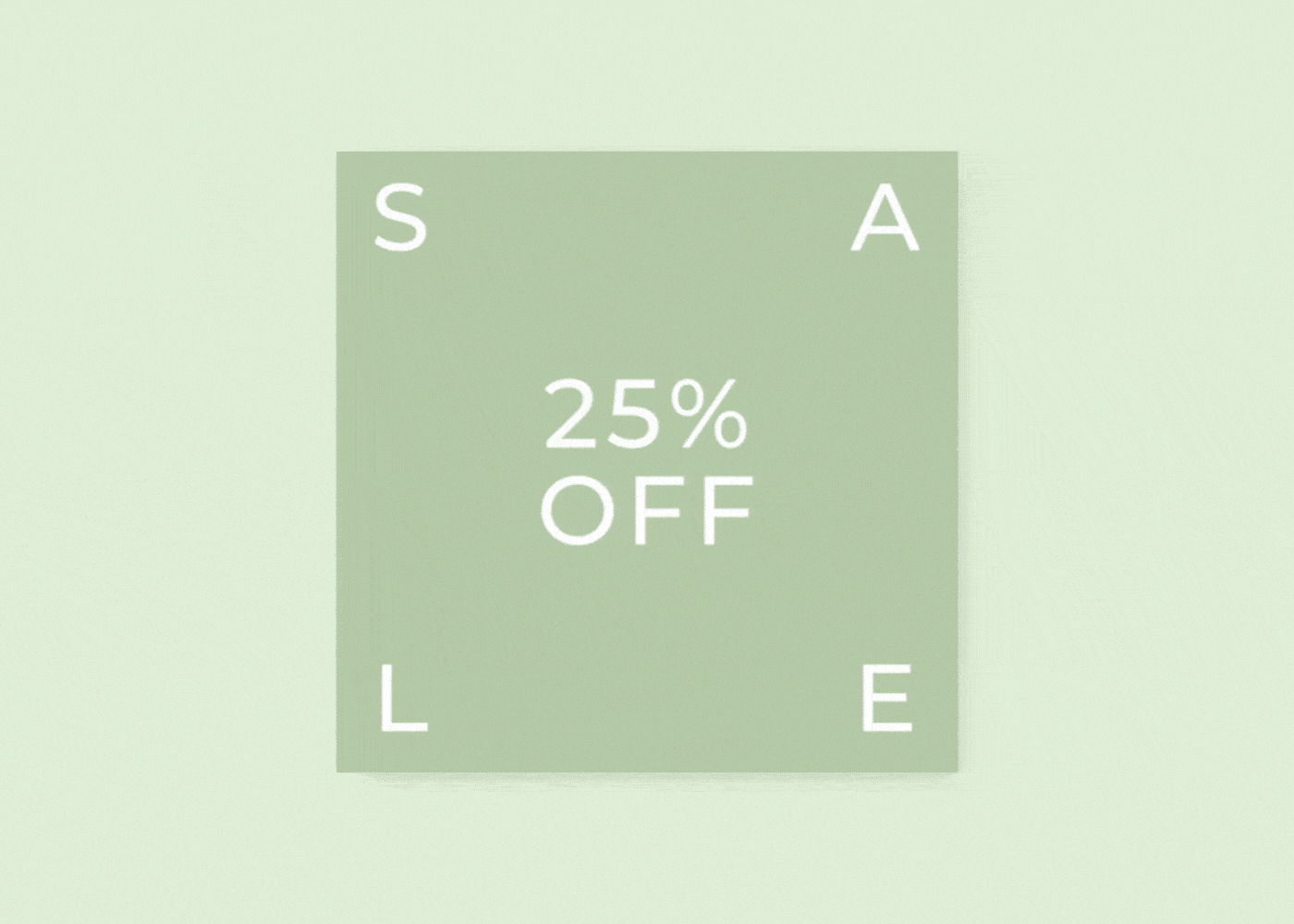
1. Font size
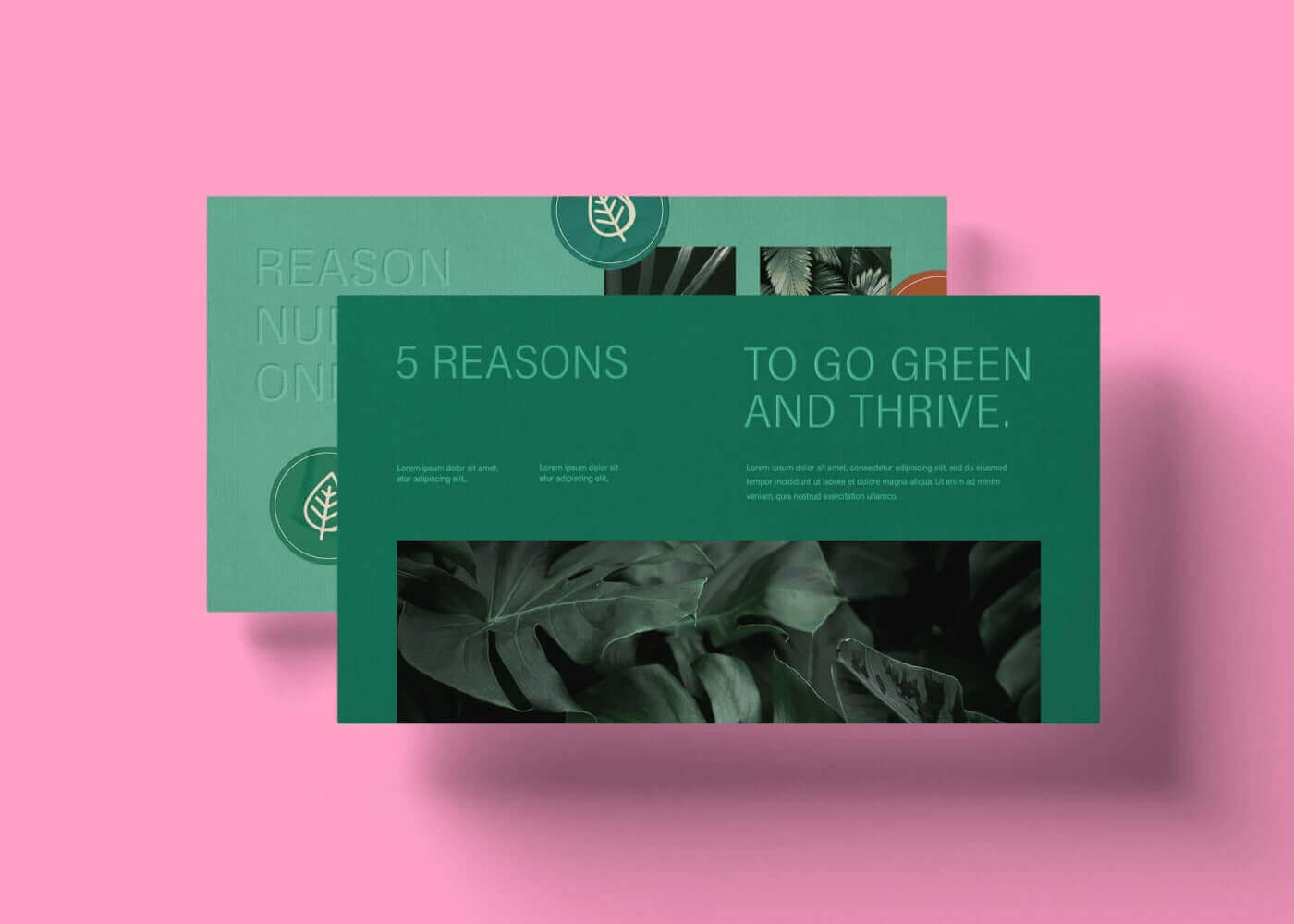
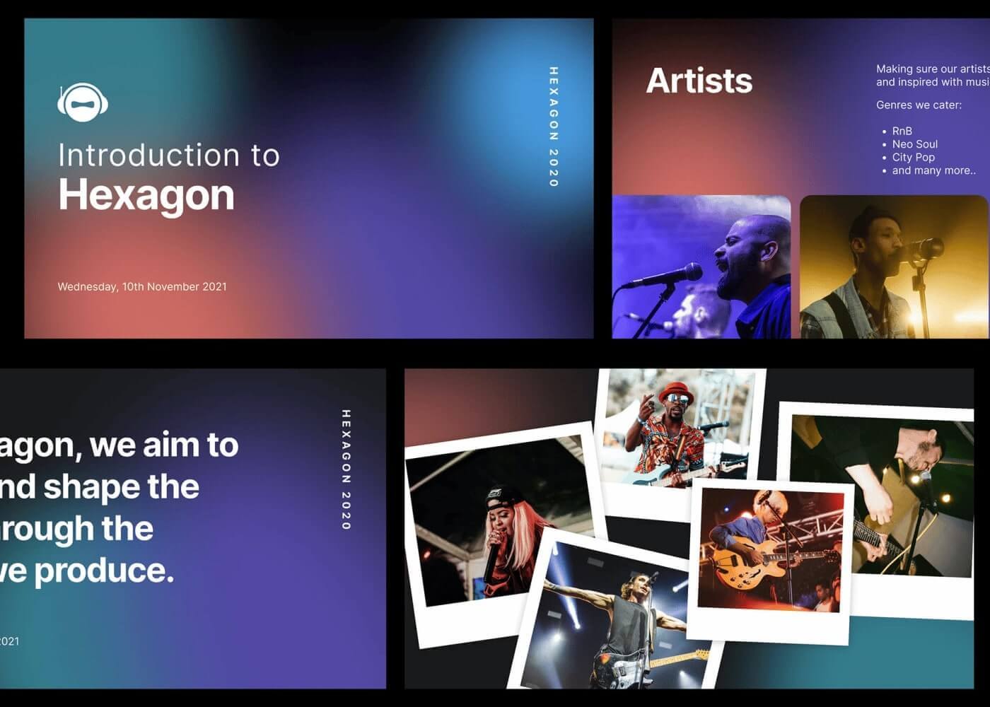
The most fundamental tool in your hierarchy toolkit is font size. Larger fonts naturally command attention and signal importance. Headlines should typically be the largest element on the page, followed by subheadings, and finally, body text.
Good example: In this blog post, the headline is large and bold, subheadings are medium-sized, and the body text is smaller but still legible.

Bad example: The same blog post, now with all text elements the same size, makes it difficult to distinguish between headings and body content.

2. Weight and style
Bold, italic, and other font styles are perfect for adding emphasis.
Bold type can be used for headings or key points, while italics can highlight important phrases without breaking the flow of the text.

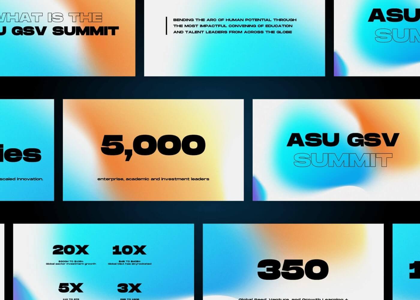
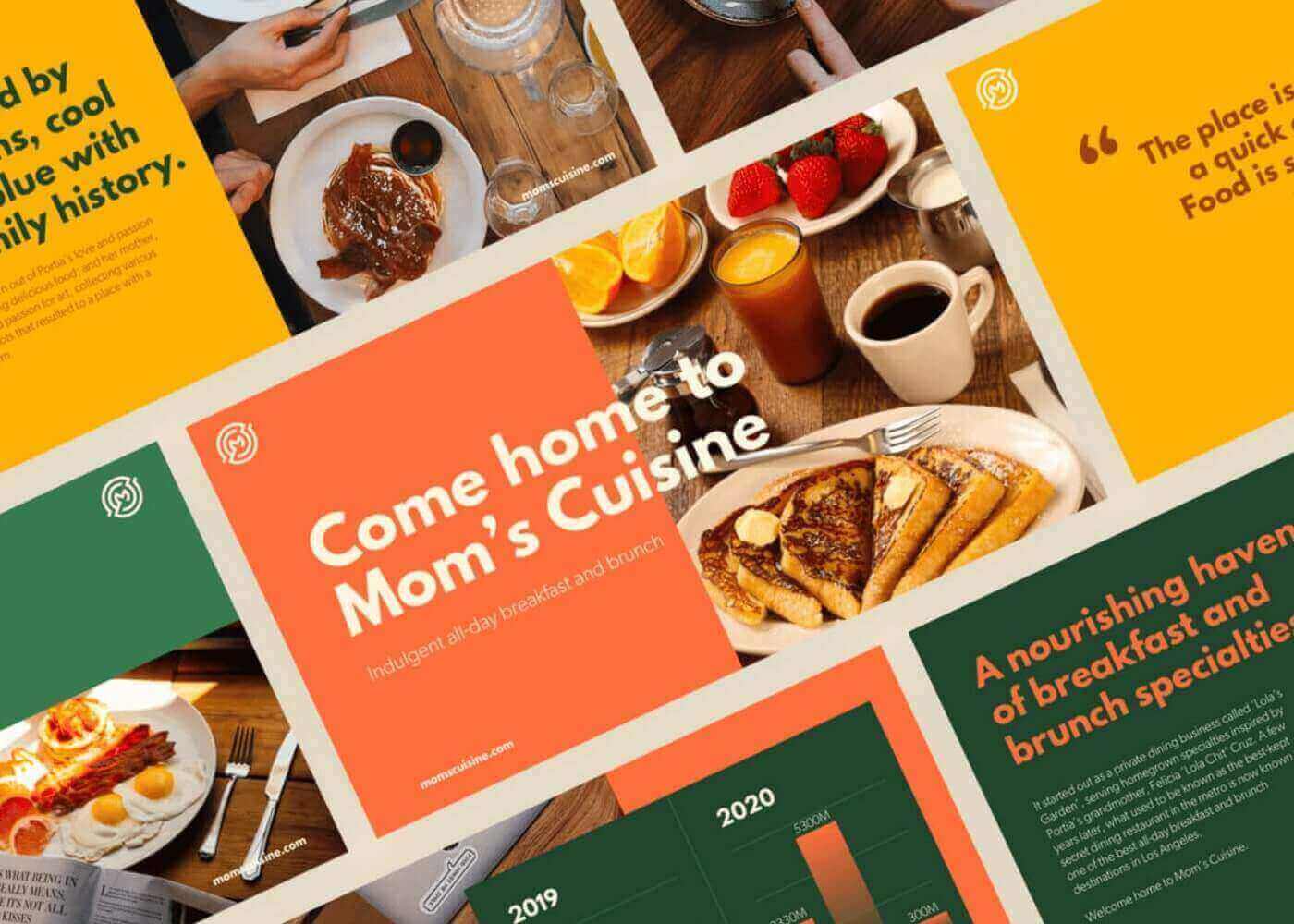
3. Color
Color isn’t just decorative—it’s functional. Using contrasting colors can draw attention to specific elements, while subtle shades can de-emphasize less critical content.
Moderation is key however; too many colors can overwhelm the design.

Techniques for creating effective typographic hierarchy
Building a clear and consistent typographic hierarchy doesn’t have to be complicated. Here are three cornerstone techniques to keep in mind:
1. Consistent structure
Establish a predictable structure for your text elements.
Design Force tip: always use the same size and weight for headings, subheadings, and body text across all pages or sections. This consistency creates a sense of order and professionalism.

2. Spacing and alignment
Shout it from the rooftops: whitespace is your friend! Proper spacing between headings, paragraphs, and sections ensures that your design feels clean and intentional.
Design Force tip: Left-aligned text is usually easier to read, while centered text works best for short, standalone elements like quotes.

3. Contrast
Contrast isn’t just about color; it’s about creating visual differences across your design.
Design Force tip: Pairing a bold headline with a light, airy body font creates contrast that keeps readers engaged.

Typographic hierarchy examples
Let’s look at two examples to see how typographic hierarchy can make—or break—a design.
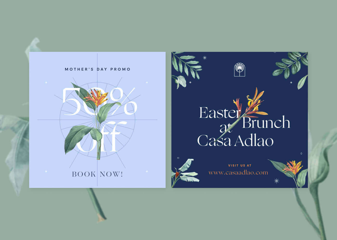
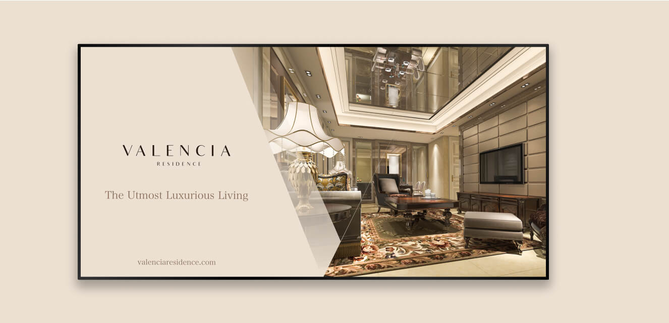
Good Example:
This Get Response landing page has a bold, oversized headline that grabs attention, medium-sized subheadings that provide context, and smaller, well-spaced body text for details. The design uses a single accent color for emphasis, creating a cohesive, professional look.

Bad Example:
This cluttered flyer has all its text fighting for your attention. The contrast here is too high, and the mixture of font, weights and styles make it impossible to tell what’s important. It’s crowded, overwhelming, and completely missing the mark.

Practical applications of typographic hierarchy
Typography plays a role in virtually every design medium. Here are a few tips for applying hierarchy across different contexts:
- Web design: Use clear headings and subheadings to break up content, especially on mobile devices where space is limited.
- Print media: Leverage font size and weight to differentiate between titles, subtitles, and body copy. Don’t forget about whitespace!
- Presentations: Keep slides simple—use one headline and minimal body text per slide to avoid overwhelming your audience.
Put your typography to work, the right way
Mastering typographic hierarchy is more than just a design skill—it’s a communication tool.
By organizing your content thoughtfully, you can make sure your audience gets the message loud and clear. Whether it’s through font size, weight, color, or spacing, each element plays a role in creating a design that’s not only functional but also beautiful.
Take a moment to review your current projects: Is your hierarchy helping or hurting your communication? Experiment with these techniques, and see how small adjustments can make a big difference.
Need some help? Check back to our blog for insights, inspiration, and strategies to elevate your creative work, or get in touch to get a team of skilled designers (all well-versed in hierarchy success) on hand for your next creative project.