Let’s give your e-commerce design a spring clean
With e-commerce sales booming as more and more people turn to online to shop, (the US e-commerce market is expected to reach $1.1 trillion in sales this year alone, according to Forbes) it pays to ensure you’re setting yourself up for success in the digital world.
Design plays a direct role in e-commerce sales and can (and should!) be leveraged to create an experience that drives revenue into your business. From product pages, packaging design, and banner ads to website layouts and user interfaces, it’s essential to understand the critical design elements that will impact your bottom line.
As spring and summer sales approach, we’ll explore the impact design has on e-commerce sales in this article, and discuss practical tips for improving your product pages, packaging design, and banner ads.
Why design matters in e-commerce sales
E-commerce design (or online retail design) has become an essential part of any successful business strategy. It provides customers with a unique visual experience that enhances the overall user experience. 60% of consumers surveyed by Storyblock abandoned their shopping carts due to a poor user experience, that’s a whole lot of dollars left at the door.
Design gives you the freedom to visually communicate the benefits of purchasing, speeding up decision-making for the customer while simultaneously building credibility, customer loyalty, and brand awareness for you.
Design Force tip: Use hierarchy to showcase key differentiators, color to attract the eye to your CTA (call to action) buttons, and consistent branding to enhance recognition.
Not only can you quickly and visually highlight the benefits with design, but design directly affects the overall perception of your brand. Packaging design can, in some cases, become as iconic as the product itself – just think of Apple or Tiffany – whereas website design becomes an extension of your brand identity, assuring customers that they’re in the right place.
Design Force tip: How do you want our customers to feel when they receive your product in the mail?
Key design elements that impact e-commerce sales
Product images: how to create high-quality images that sell
Low-resolution images or slow loading speeds can make or break the sale of your product or service. At the point of purchase, customers need to see what they’re spending money on before handing over their dollars, so keep these tips in mind:
- Use white space and include images of the product only on a clean, clear background
- Include multiple angles to avoid any unnecessary surprises
- Get creative with composition without skewing the product. Aim to keep the product front and center
- Color correct to ensure the color shown is accurate to the color they’re buying
- Include high-quality photography of the product in use
Design Force tip: The Drip found that 3D product images not only help customers visualize the product, but they increase conversion by 250%!
Call-to-action buttons: how to create compelling CTAs that drive conversions
CTA buttons may be small, but they should be as carefully designed and considered as any other part of your e-commerce sales page.
- Pick one clear CTA to avoid confusing the customer
- Use a bold, contrasting color. Ideally, one that’s within your brand palette, but that stands out on the page
- Choose a legible font and make sure the point size is easy to read
- Make the button bigger than other elements to draw the eye
- Ensure your buttons are responsive to mobile devices
- Keep your CTA button above the fold (so customers don’t need to scroll to find it)
Navigation: the importance of intuitive navigation and user flow
Regardless of your customer’s tech abilities, they should be able to easily navigate your website and check out without a hitch.
- Consider the order of importance within your navigation. What’s the logical, intuitive journey a customer will take?
- Keep it short, sweet, and as clear as possible. Overcomplicated or extensive navigation will overwhelm your customer
- Prioritize important information, like contact routes, pricing, and product details
- Use breadcrumbs. These navigation trails make it easier for your customers to find their way around your website
- Design the navigation in the same place on every page
- Ensure your navigation is mobile-friendly. A hamburger menu can be useful, here
Packaging design: best practices for creating packaging that enhances the brand experience
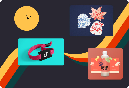
E-commerce design extends into physical packaging, too, which should be eye-catching and aesthetically on-brand, but it also needs practical information to support your customers.
- Keep branding true to your overall brand identity. Packaging is an extension of your brand experience, consistency increases perception and loyalty
- Consider the materials you design with. How will they feel? Do they protect the product?
- Design your packaging in a way that celebrates your brand values. Is it obvious that customers can recycle the box?
- Use packaging design to tell a story about your brand and product. This can create an emotional connection with customers and help build brand loyalty
- Keep it practical. Don’t forget to design vital, trust-building product information into the layout
Banner ads: tips for creating eye-catching and effective banner ads that drive clicks
Banner ads are a popular and effective way of online advertising, but not all are created equal. For the best return on investment, consider these points:
- Keep banner ads clear and concise. Too much information is a turn-off. Prioritize the key benefits that answer why the customer should click through to buy
- Include your effective CTA to give customers a specific action step
- Use on-brand yet contrasting colors and enticing typefaces to draw in the attention of potential customers. Your banner needs to stop them from scrolling
- Consider using animation to capture their attention
- Showcase the product! You’d be surprised how many times we see this vital element missed…
Ready to design your way toward increased e-commerce sales?
When you use effective design strategies to your advantage, businesses like yours can boost the user experience, drive sales, and build oh-so-important customer loyalty (taking your business to the next level).
As your business scales, keeping up to date with the latest design trends – you can do that right here, on our Insights Blog – will help you continue to innovate and improve your design to stay ahead of the competition. But if you need a helping hand to keep things consistent and on-brand, we’re here for you.
Our subscription model has become a favorite among the likes of TikTok and HubSpot, as it gives flexible, scalable access to a global team of top-notch designers with years of experience in designing for e-commerce. Great if you have a peak season approaching and don’t want to hire a full-time designer.
Book a free 15-minute demo to see what we can do for you.
