

Every great design starts with a game plan
Every standout design, whether it’s a bold website, a polished icon set, or a seamless app, starts with more than just inspiration. It’s about having a solid game plan.
At the core of every creative strategy are the essential design elements—the foundational tools and tactics that give your ideas structure, clarity, and visual punch. These are your “design elements”, the basic design components that transform fleeting sparks of inspiration into finished work that commands attention and communicates with purpose.
Master these, and you’re not just making something that looks good, you’re crafting experiences that connect, inspire, and deliver results.
In this article, we’ll crack open the playbook, demystify the seven core elements of design, and show you how to put them to work in real-world projects. Whether you’re fine-tuning your fundamentals or leveling up your creative play, this is your guide to building visual impact. One smart move at a time.
Design elements: the building blocks of every winning move
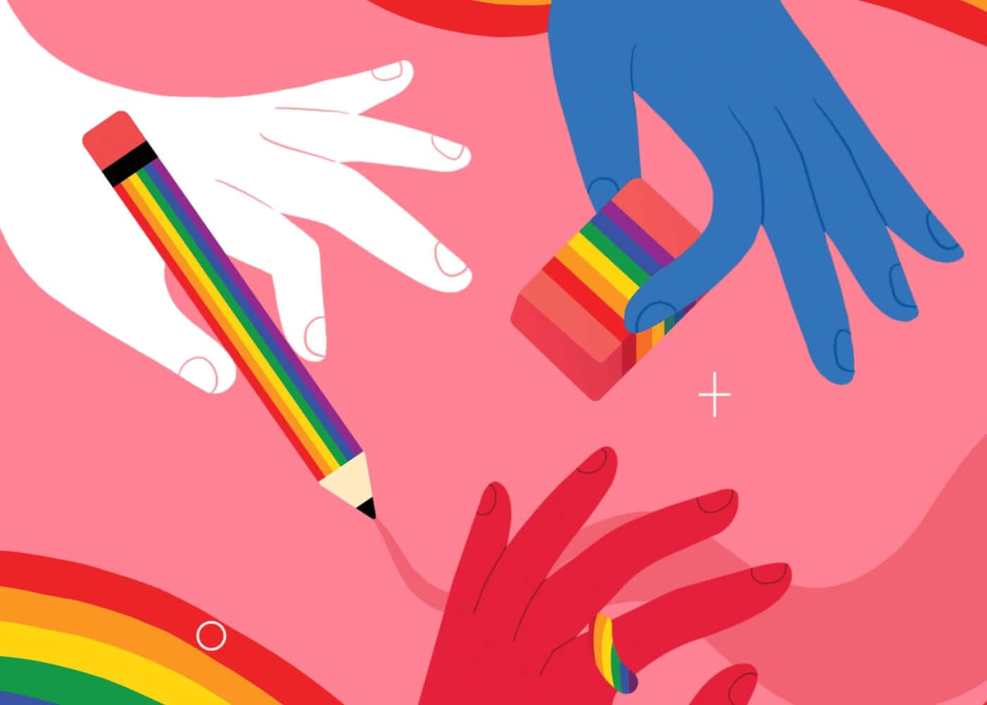
Think of design elements as the tried-and-true plays in your creative playbook. These are the visual elements (line, shape, color, texture, space, form, and typography) that form the backbone of every composition, from digital interfaces and print layouts to branding and illustration.
When you understand and combine these elements with intention, you unlock the power to guide a viewer’s eye, set the mood, and create hierarchy—all while making your work look effortless. Overlook one, and your project might feel flat or confusing. Nail them all, and you’ll deliver work that’s clear, compelling, and memorable.
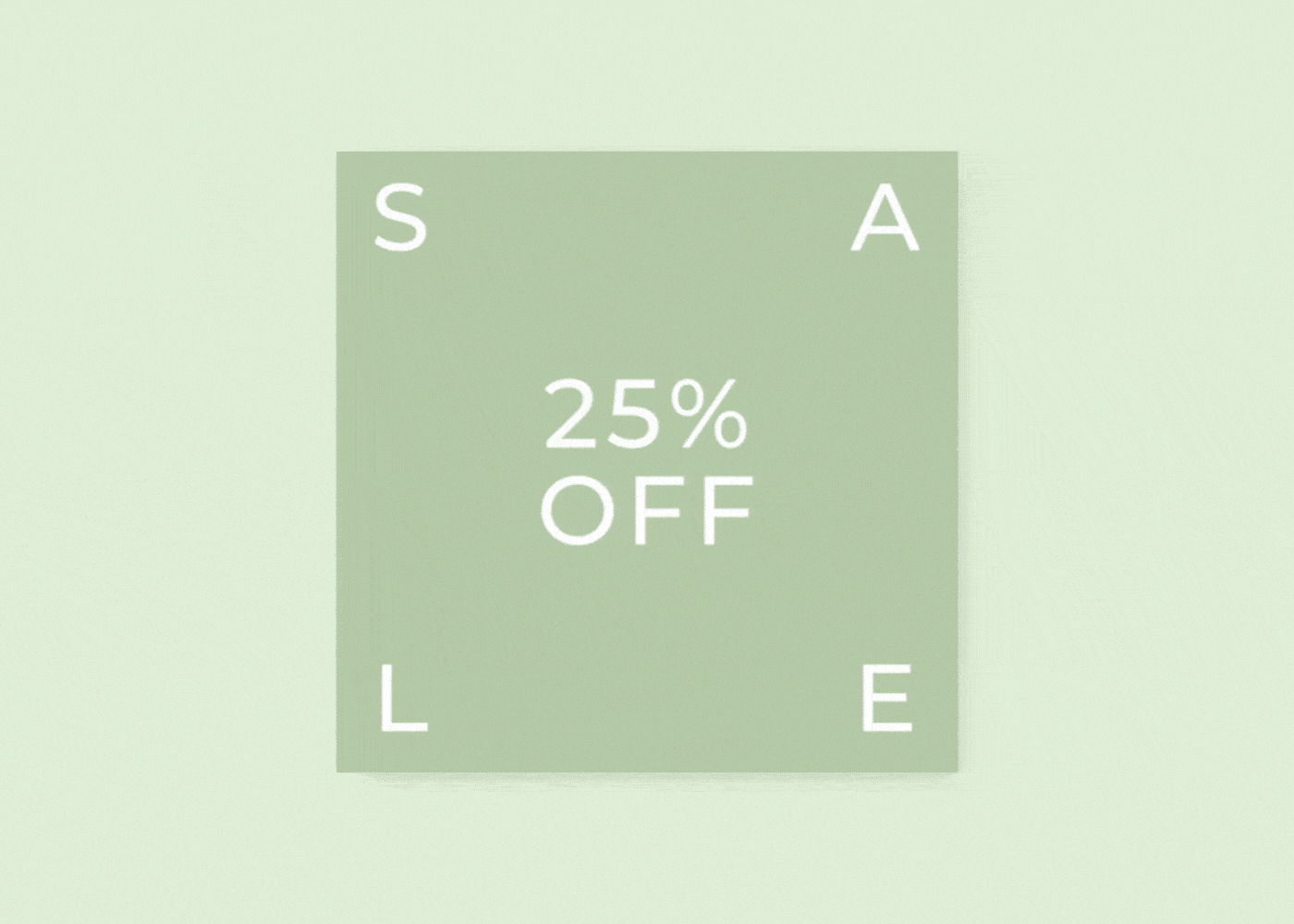
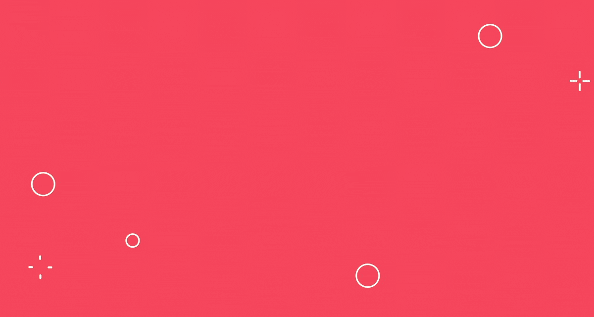
Quick playbook visual:
- Missed play:
A layout without clear hierarchy or spacing—confusing, forgettable. - Winning play:
Every visual element working together—clear flow, strong focus, crisp message.
The seven core design elements: Your playbook in action

Let’s open up the playbook and break down each essential move in your creative arsenal. For each, you’ll find practical explanations, design element examples, and actionable ways to apply them to your own projects.
Line: Setting direction and energy
Lines are the unsung MVPs in graphic design fundamentals. They define shapes, divide space, suggest movement, and guide the viewer’s eye. Think of them as the arrows in your playbook diagrams.
Lines can be bold and direct, subtle and implied, straight or curved, thick or thin. This variety makes them incredibly versatile.
- Straight lines:
Imply order, stability, and structure—perfect for grids, layouts, and navigation. - Curved lines:
Add movement, flow, and organic energy; great for playful or creative brands. - Implied lines:
Created by alignment or repetition (like a row of images or dots) to guide the eye without drawing a literal line.
Design Force tip:
Use lines to direct attention. Whether you’re leading users to a call-to-action button or guiding them through a multi-step process.

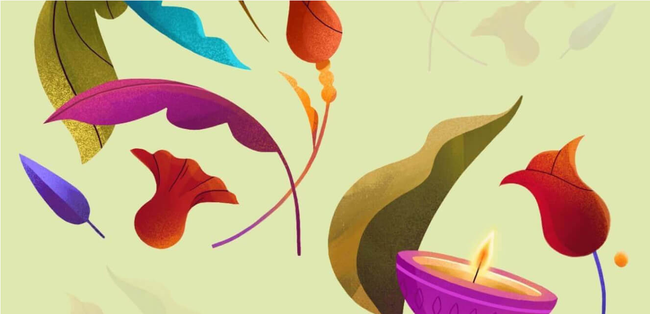
Shape: Defining the playing field
Shapes are where lines come together and magic happens. They give structure, anchor visual elements, and create recognizable symbols within a composition.
Shapes come in two main flavors:
- Geometric shapes (circles, squares, triangles):
Suggest clarity, order, and reliability.
Essential for icons, logos, and interface elements where precision matters. - Organic shapes (blobs, leaf forms, abstract curves):
Feel natural, spontaneous, and approachable.
Add a sense of creativity, warmth, or playfulness—great for illustrations, backgrounds, or brands aiming for a human touch.
Design Force tip:
Don’t be afraid to mix shape types to balance clarity with creativity. Geometric shapes can provide structure, while organic shapes add energy and warmth.

Color: The energy boost
Color is the emotional engine of your design playbook. It’s built from hue (the color itself), saturation (intensity), and brightness (lightness or darkness). Color sets the mood, draws attention, and carries deep cultural or psychological associations.
Key color strategies:
- Hue:
The base color—like blue, green, red. - Saturation:
How vivid or muted the color appears. - Brightness:
The lightness or darkness of the color.
Design Force tip:
Build a purposeful palette. Use complementary colors for contrast and pop, or analogous colors for harmony and sophistication. Always check color accessibility for inclusivity.

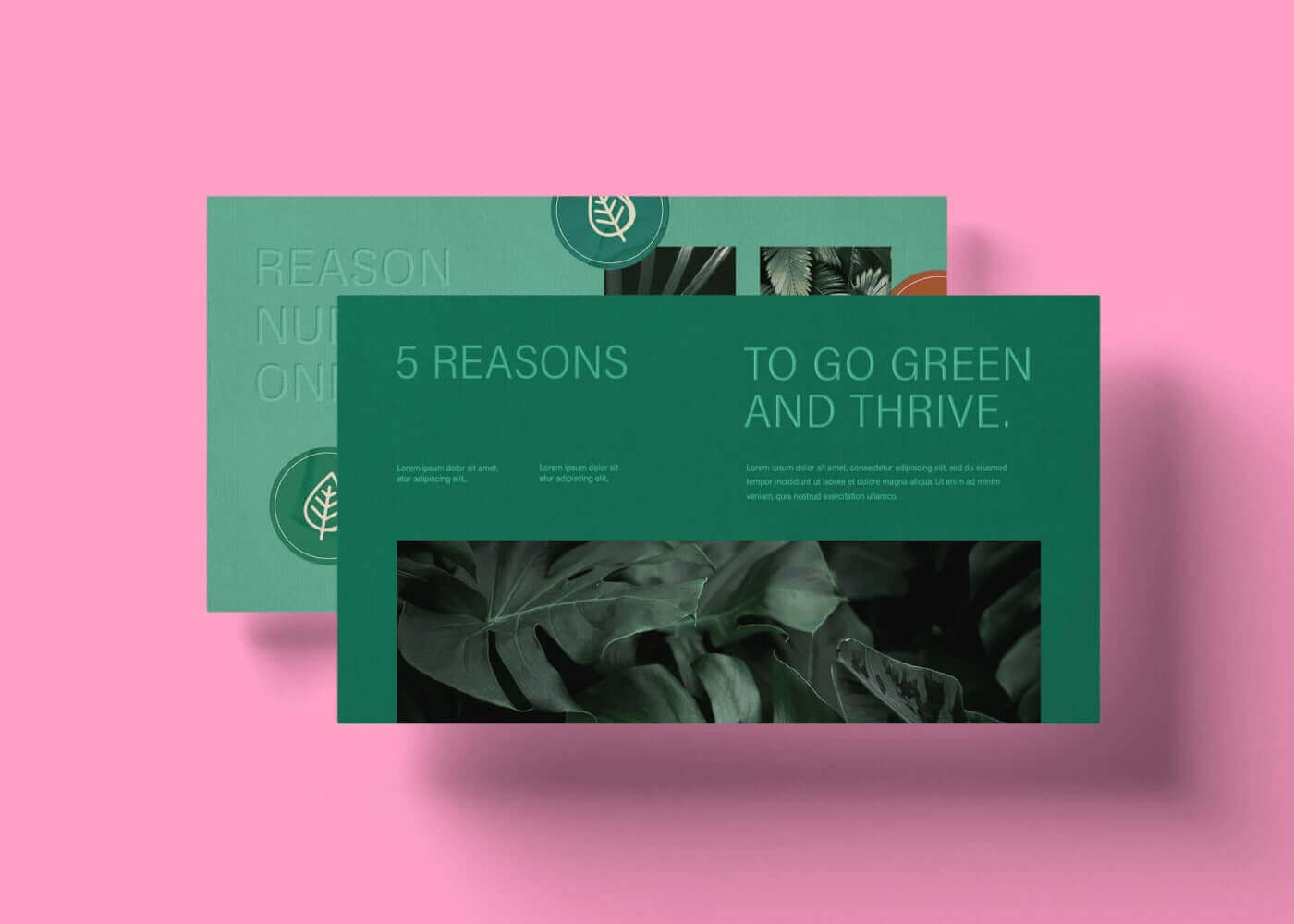
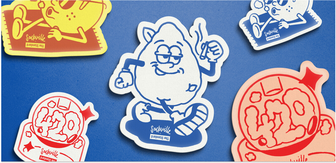
Texture: Adding depth to your game
Texture bridges the digital and the tactile, making flat compositions feel real and engaging. It can be physical (tactile, as in print design) or visual (the appearance of texture on a screen).
Ways to use texture:
- Subtle overlays:
A faint paper grain in a website background, or a linen effect on a presentation slide. - Bold effects:
Gritty, hand-drawn brush textures for a handcrafted, artisanal vibe.
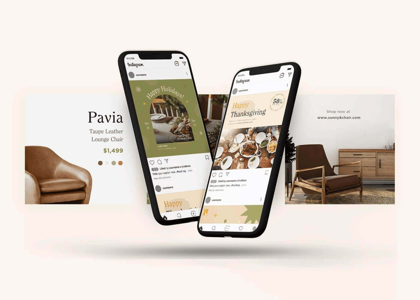
Design element examples:
- E-commerce websites with subtle fabric textures in product backgrounds for a sense of quality.
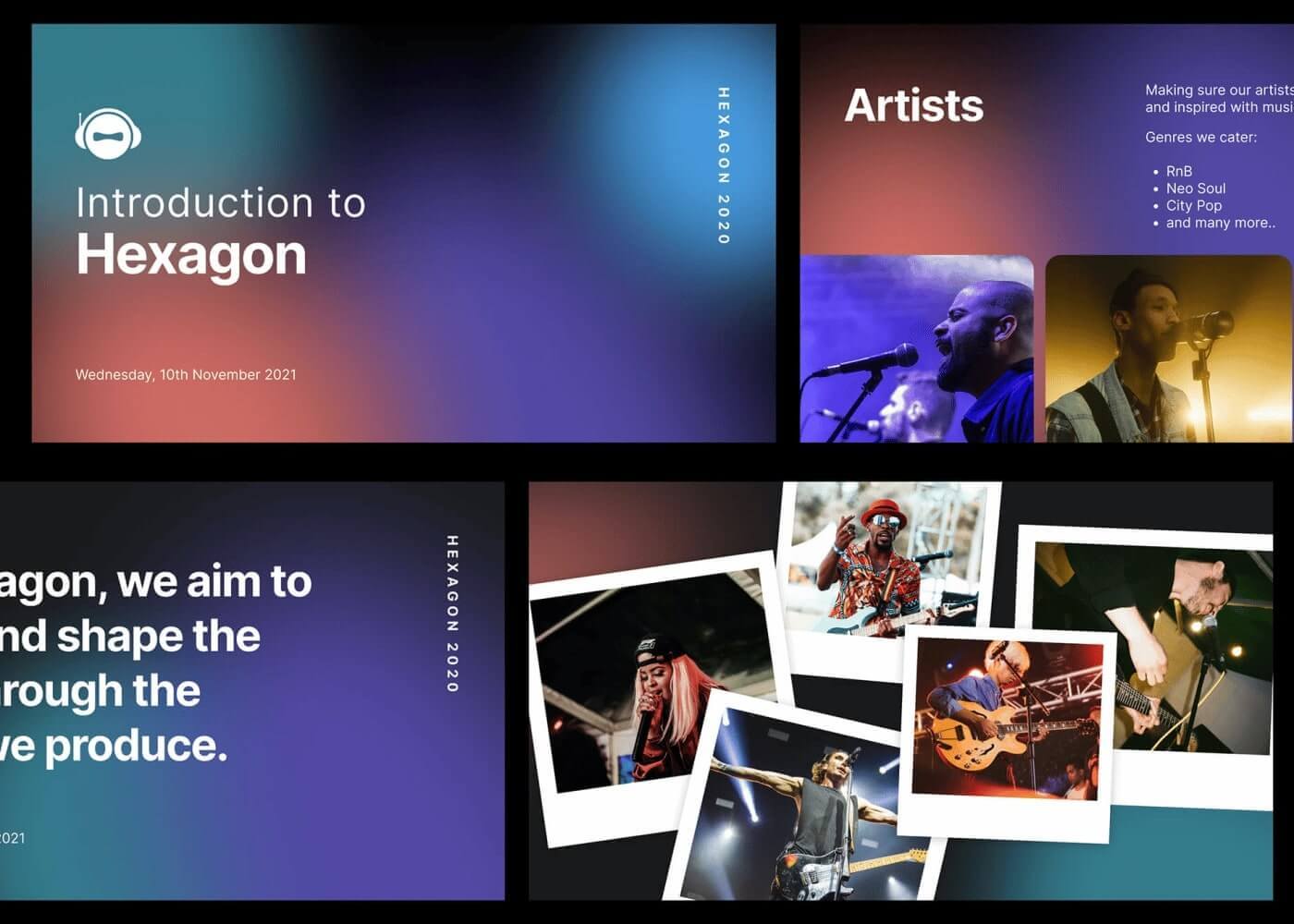
- Music festival posters with layered, distressed textures to evoke excitement and authenticity.
Design Force tip:
Use texture to add depth and interest, but don’t let it overwhelm the content. Subtlety is often more effective, especially on digital screens.

Space (white space): Creating breathing room
Space, especially white space, is the unsung hero of impactful design. It’s the area between and around elements—giving your design room to breathe, increasing legibility, and focusing attention where it matters most.
Types of space:
- Positive space:
The areas occupied by content (images, text, buttons). - Negative space (white space):
The empty areas, which actually do a lot of heavy lifting in clarifying and organizing information.
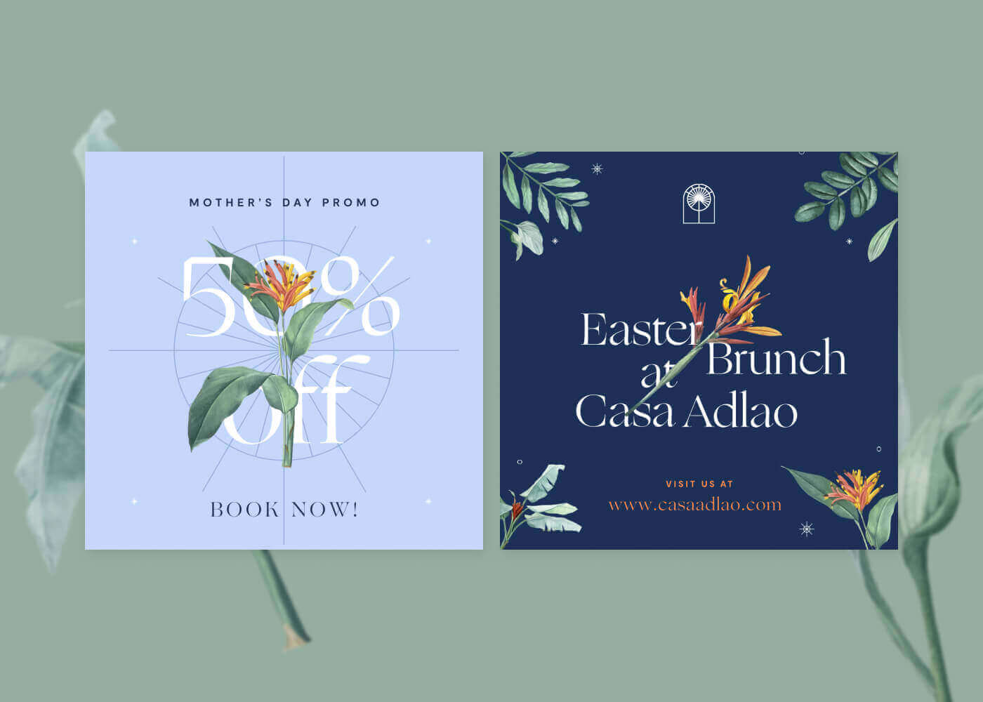
Design element examples:
- Minimalist posters with generous margins that make the headline pop.
- Landing pages that use ample spacing around CTAs for higher engagement.
Design Force tip:
When in doubt, add more white space. It helps every other visual element stand out and prevents your design from feeling cluttered.

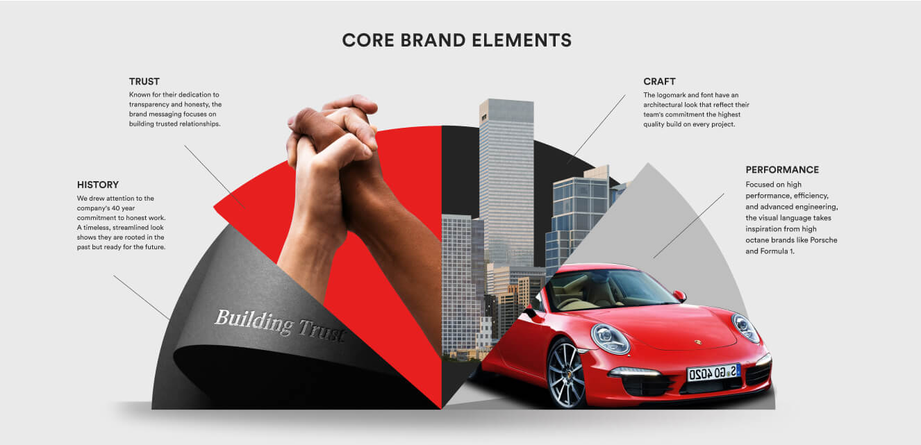
Form: Adding a third dimension
Form is how you turn two-dimensional shapes into three-dimensional objects, adding depth, volume, and realism. You create form through shading, gradients, and perspective, making visuals feel tangible and inviting.
Where to use form:
- Product mockups:
Shadows and highlights create a sense of realism and make products “pop” off the page. - App icons:
Subtle gradients and inner shadows give a sense of depth and sophistication.
Design element examples:
- A SaaS product’s dashboard showing widgets as raised, clickable cards.
- eBook covers with 3D title treatments to give depth and visual interest.
Design Force tip:
Use form to draw attention to key elements—just don’t let realism overshadow clarity.

Typography: The team captain
Typography is the voice of your design, setting the tone and guiding the viewer through your content. It’s more than font choice; it’s about using size, weight, alignment, spacing, and style to establish hierarchy, mood, and clarity.
Typography strategies:
- Serif vs. sans serif:
Serifs convey tradition and authority; sans serifs feel modern and clean. - Hierarchy:
Use size, weight, and style to lead the viewer from headlines to supporting text to details.
Design element examples:
- Editorial websites pairing bold serif headlines with legible sans-serif body text.
- Mobile apps using consistent type scales for navigational clarity.
Design Force tip:
Create clear type hierarchy—bold for headlines, regular for body, and distinctive treatments for calls-to-action. Don’t forget about readability and accessibility.

Building your game plan: Combining elements for impact
The best designs don’t just use elements, they choreograph them. Here’s how to call the right plays:
Balance the field
Use contrast, scale, and alignment for harmony. Grids keep your spacing consistent, while scale and color create focus.
Design Force tip:
Step back and review your design like a coach—does your eye naturally follow the intended path?
Create hierarchy
Lead your audience from headline, to image, to call-to-action using size, weight, and color.
Design element example:
A homepage layout that starts with a bold headline, flows to supporting imagery, and lands on an irresistible CTA.

Set the mood and voice
Let your visual elements express your brand’s personality—rough textures for craft brands, sleek forms for tech.
Design Force tip:
Match your play style to your “team”—your brand’s story and values.
Sharpening your skills: Tools and practice drills
Digital tools
- Figma:
Use components and style libraries for consistent elements. - Illustrator:
Experiment with the Appearance panel to layer effects and textures.
Analog drills
- Thumbnail Sketches:
Practice single-element sketches—just lines, just shapes, etc. - Mood Boards:
Gather color, texture, and form inspiration for your next “game plan.”
Design Force tip:
Mix digital and analog drills—some of your best ideas may start as quick sketches.
Final whistle: Take on the elements challenge
Mastering the elements of design turns good work into a creative highlight reel. Each week, pick one design element to focus on—experiment with bold lines, unexpected color palettes, or new textures in your next project. If you like, share your work on social media and tag us on LinkedIn, so we can cheer you on.
Ready to level up your visual game? Subscribe to the Design Force blog for more design fundamentals, practical playbook tips, and creative inspiration.


