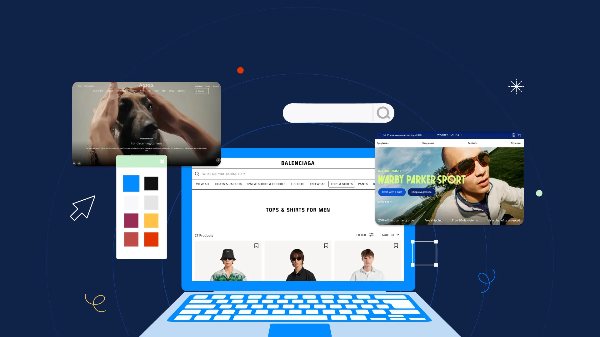

The core of good design
Every sought-after designer has a secret weapon—an unshakable mastery of design principles that make their work impossible to ignore. Because staying ahead of the game means more than just keeping up with trends. It’s about mastering the timeless design principles that form the backbone of every successful project.
Whether you’re designing for the web, branding, or the next-gen immersive experience, these principles remain your ultimate toolkit for delivering high-quality design that stands out.
This guide isn’t just about the basics—it’s about empowering you to reframe how you approach your craft. By the time you’re done reading, you’ll understand how to apply these principles with confidence, creativity, and intention. Ready to take your skills to the next level? Let’s dive in.
What are design principles and why do they matter?
At their heart, design principles are like the laws of physics for creatives—they govern how balance, movement, and harmony work in visual communication.
Why do they matter now more than ever? Because in a world oversaturated with visuals, understanding these principles equips you to create work that cuts through the noise. They help you design with clarity and impact, ensuring your audience doesn’t just look—they connect and engage.
Whether you’re working in UX/UI, motion graphics, or even AR/VR, these principles are your foundation for better, smarter, and more inspired designs.
The designer’s guide to core design principles
Let’s break down the must-know principles that will elevate your work this year and beyond.
1. Contrast: Make your designs pop
Contrast is your best friend when it comes to making elements stand out. It’s all about opposites—light vs. dark, large vs. small, bold vs. subtle.
Contrast is critical for creating user-friendly interfaces and bold branding. Think of a sleek website with a dark background that makes white typography shine. This principle isn’t just about aesthetics—it’s about drawing attention where it matters most.

Contrast
✨Design Force Tip: Use contrast to guide the viewer’s eye. Highlight calls-to-action (CTAs),
headlines, or key visuals by contrasting them with the surrounding elements.
2. Balance: Find your visual harmony
Balance brings order to chaos. It’s the art of distributing visual weight, and this year, it’s all about intentional composition.
- Symmetrical balance gives a sense of structure and stability. Perfect for corporate designs or formal layouts.
- Asymmetrical balance feels dynamic and fresh, creating visual intrigue while staying grounded.

Balance
✨Design Force Tip: A homepage with a large image on one side and text on the other achieves
asymmetrical balance that feels polished and inviting.
3. Emphasis: Command attention like a pro
Every design needs a focal point—a single element that instantly grabs attention. Emphasis helps you achieve this.
Today, when users skim more than ever, emphasis is critical for nailing your first impression. Use bold typography, vibrant colors, or central positioning to highlight the most important part of your design.

Emphasis
✨Design Force Tip: Think of a product ad where the headline screams “50% OFF” in bold red, pulling the viewer’s focus immediately.
4. Proportion: Create visual hierarchies that work
Proportion is all about sizing elements relative to one another. It’s your secret to creating visual hierarchies that guide your audience, step by step.
Screens are getting smaller (hello, wearables!) and content is more compact, so proportion ensures clarity and readability.

Proportion
✨Design Force Tip: Use larger elements to emphasize what’s important (like a headline) and smaller ones for secondary details. This keeps your designs clean and user-friendly.
Unlocking advanced design principles
Once you’ve mastered the basics, it’s time to layer on these advanced principles to truly level up.
1. Hierarchy: Lead the Viewer’s Eye
Attention spans are shorter than ever. Hierarchy is your roadmap to guide people through your designs effortlessly.
Start with the most important element—a headline, key image, or CTA—then lead them to supporting details. Use typography, spacing, and color to create a clear flow.
Think of an e-commerce product page: the product image grabs attention first, followed by the product name, price, and finally the “Buy Now” button.

Hierarchy
2. Repetition: Build consistency across designs
Repetition is the glue that holds your designs together. It’s especially important as brands strive for cohesive visual identities across multiple platforms and formats.

Repetition
✨Design Force Tip: A brand that uses the same color palette, typography, and iconography across its website, social media, and packaging creates a memorable, unified experience.
3. Rhythm: Keep designs flowing
Repetition is the glue, then rhythm is the heartbeat of your design. It’s about creating patterns and movement that guide the viewer naturally.
For instance, a blog layout with alternating text and imagery creates a rhythm that keeps readers engaged without overwhelming them.

Rhythm
4. Unity: Make your designs feel complete
Unity is what ties everything together. Designs are becoming increasingly complex (think AR interfaces or data visualizations), and unity ensures that all the moving parts work together harmoniously.

Unity
✨Design Force Tip: Stick to one or two dominant colors, a consistent grid, and a limited
font family to achieve a polished, cohesive look.
The secret sauce: Supporting design elements that supercharge your work
Pair these principles with powerful design best practices to create next-level results:
- White space: Less is more. White space gives your designs breathing room, making them more readable and modern.
- Movement: Use motion graphics or subtle animations to guide users’ attention intuitively.
- Variety: Add visual interest with textures, patterns, or unexpected color combinations—but keep it balanced.
Practical tips: How to apply these principles
Learning design principles is one thing, applying them is another. Here’s how to bring them to life in your projects:
- Sketch first
Start with rough sketches to focus on the structure before diving into details. - Audit your work
Ask yourself—does this design feel balanced? Is the hierarchy clear? - Test it
Get feedback from peers or users. A fresh set of eyes can reveal what’s working (and what’s not). - Stay curious
Study the designs you admire and identify which principles they’re using.
The time is now to master design principles
The future of design is exciting and fast-paced, but the timeless design principles are what will keep you ahead of the curve. By mastering these fundamentals and pairing them with modern tools and techniques, you can create good design that doesn’t just look amazing but connects, inspires, and drives results.
Ready to level up your skills and leave an unforgettable mark on the design world? Our Design Force blog has more expert insights, actionable tips, and creative inspiration tailored just for designers like you.
Your next breakthrough starts now. Subscribe to our website and let’s design the future together.