If you’re not using infographics yet, you’re making your marketing team work harder than they need to.
90% of the information our brains process is visual, and we absorb it 60,000x faster than text. So when you’re trying to explain your product’s ROI or break down a complex feature set, an infographic does the heavy lifting for you.
Think of infographics as the difference between data people skip and data they remember. When you’re dealing with stats, timelines, or onboarding flows, a smart and creative infographic helps make the data visualization click instantly.
What makes a good infographic?
A good infographic doesn’t just look pretty. It makes information easy to understand. The best ones help readers grasp your point in three seconds, then guide them through the details.
Here’s what to get right:
1) One clear message
The best infographics answer one question or prove one point. Before the design production starts, write down what you want someone to remember in one sentence.
2) Easy-to-scan structure
Nobody’s reading your infographic like a whitepaper. They’re scanning. Use clear headings, chunked sections, and breathing room so readers can spot what matters in seconds.
3) A clear flow from start to finish
Whether it’s a timeline, a process flow, or grouped comparison blocks, the path should be obvious. If you need arrows or section dividers to guide the eye, use them.
4) Data that’s simple, accurate, and properly sourced
Infographics only work when the numbers check out. Use the right chart type, keep labels readable, and add context like timeframes or sample sizes when it matters.
5) Visuals that actually do something
Every icon, illustration, or chart should earn its place by making something clearer. Stick to a consistent icon style and focused color palette.
Now for some inspiration! Here are 25 creative infographic designs you can borrow ideas from.
- Too Late to Start? – Funders and Founders
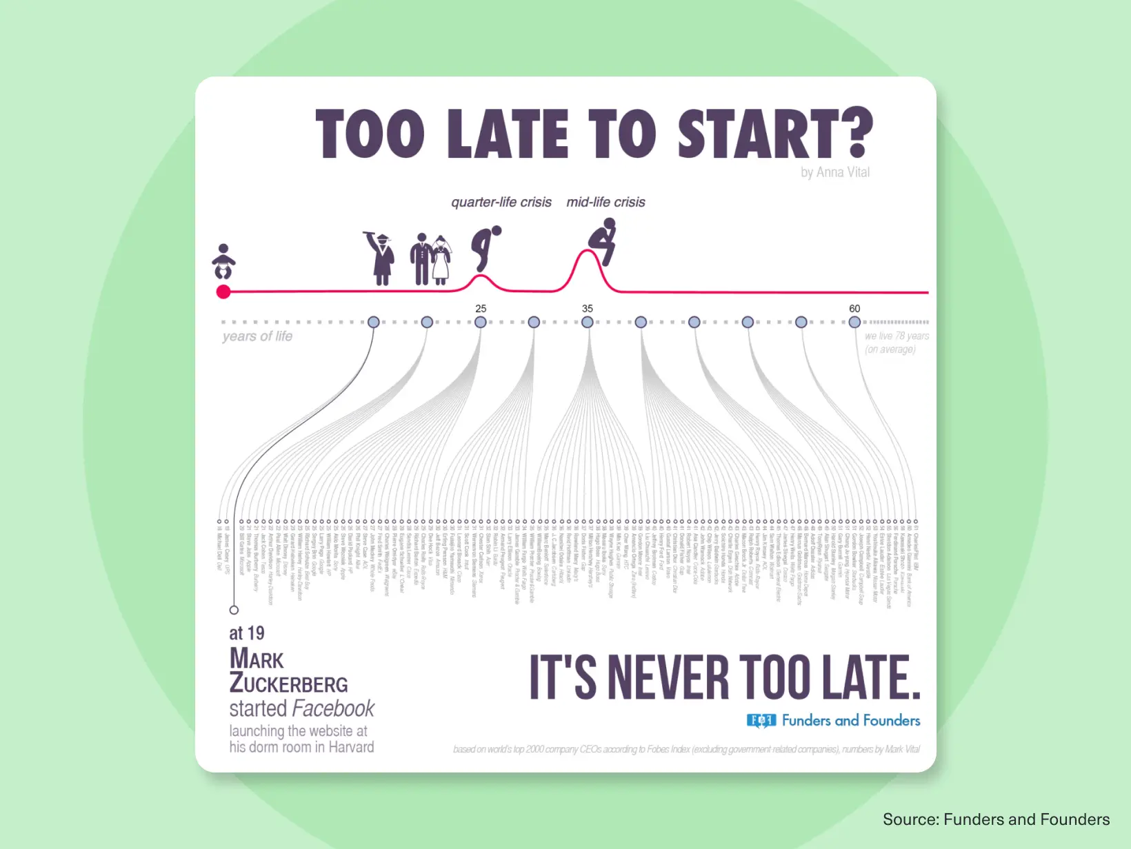
What works here: This timeline infographic shuts down the “I’m too old to start” idea by showing when famous founders actually launched their companies. The flowing connector lines guide your eye, and the simple grayscale palette with a pop of red keeps everything clear and focused.
Try this: Use connector lines to show relationships in timeline data. Keep your color palette tight—one or two accent colors max. - Climate Extremes, Regional Impacts, and the Case for Resilience – World Bank
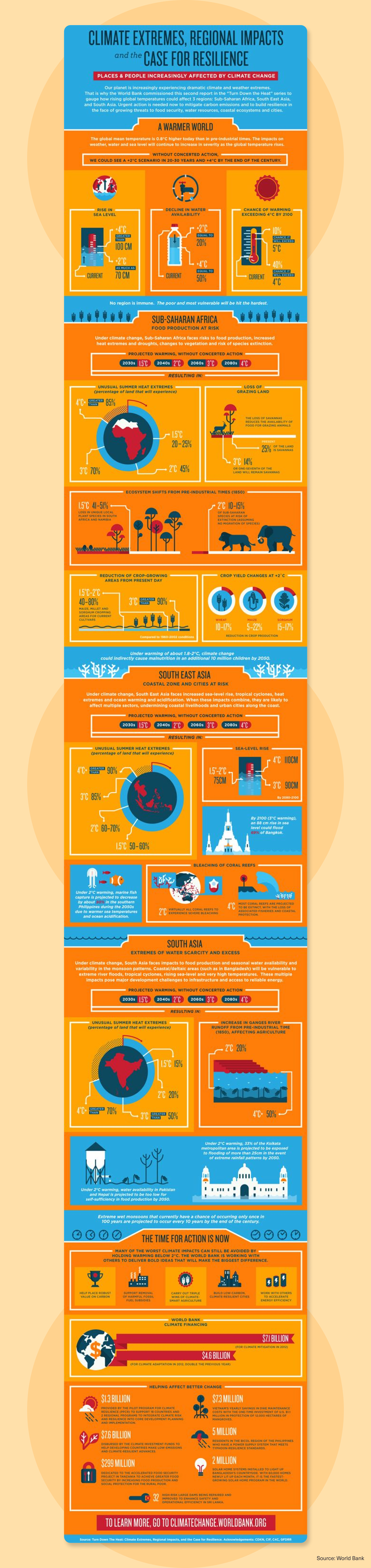
What works here: This is how you turn a 50-page climate report into something people will actually look at. Bold color blocks separate each region, and the consistent icons make it easy to scan in just a few minutes
Try this: Lead with maps if you’re using regional data for social impact design. Use color blocks to create clear sections that work as standalone pieces. - History of Life As We Know It – Carlos Ramos, Zamira Saab, William León

What works here: Turning 4 billion years of evolution into a single circular timeline is bold. In this infographic, it works because of smart color-coding and a strong center point. The supporting map callouts show continental drift without cluttering the main visual
Try this: Circular timelines work great for cyclical data or when you want to show a complete journey. Use color zones to break up dense information. - Burger Recipe – Jing Zhang
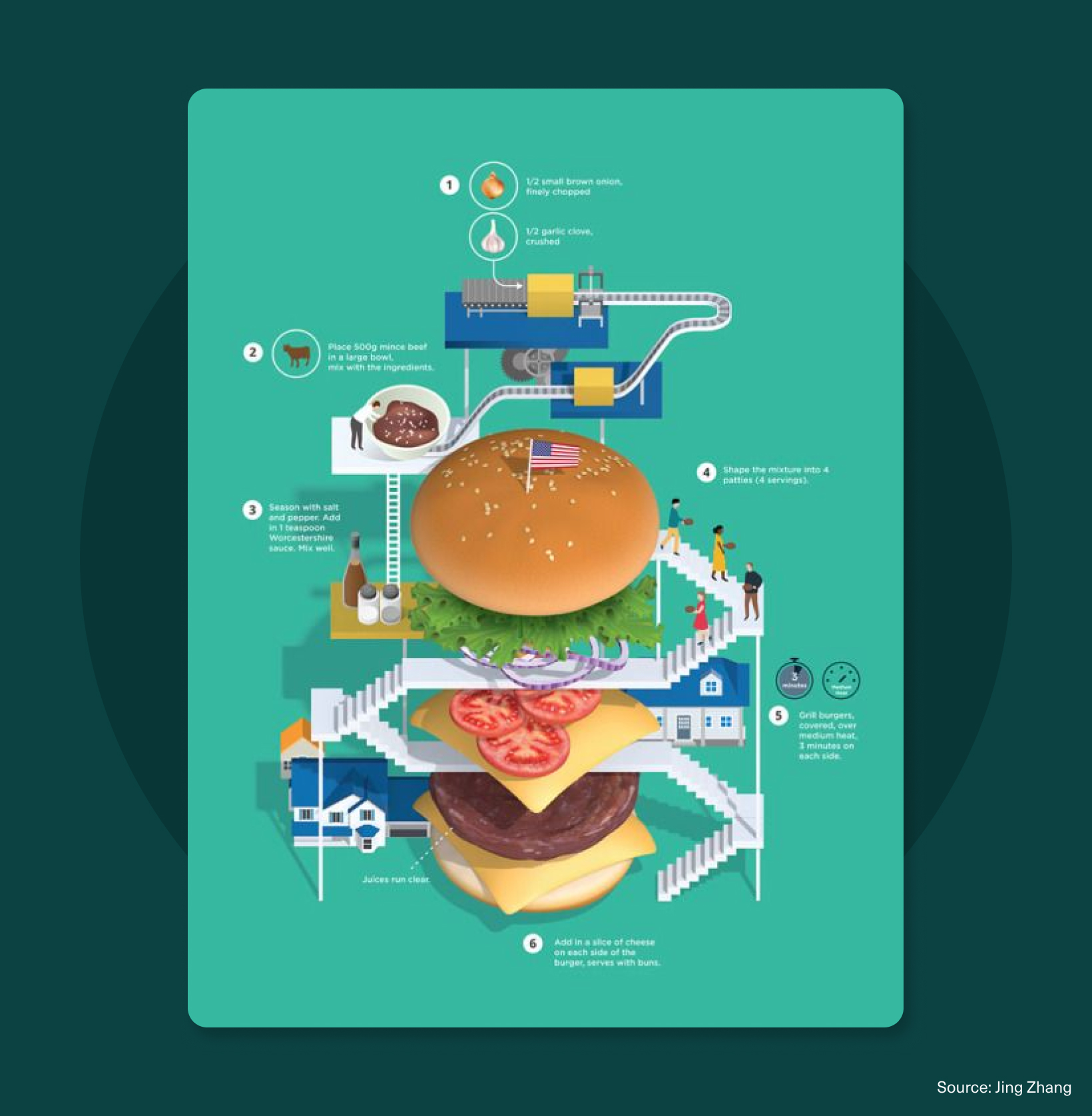
What works here: Recipe infographics usually feel like afterthoughts, but this one makes building a burger look like an actual process flow. The numbered callouts guide you through each step, the playful illustrations keep it fun, and that massive burger stack in the center? Instant focal point.
Try this: For step-by-step processes, use numbered visual anchors and a strong central image that shows the end result. - Top 40 Jobs Most Exposed by AI – Visual Capitalist
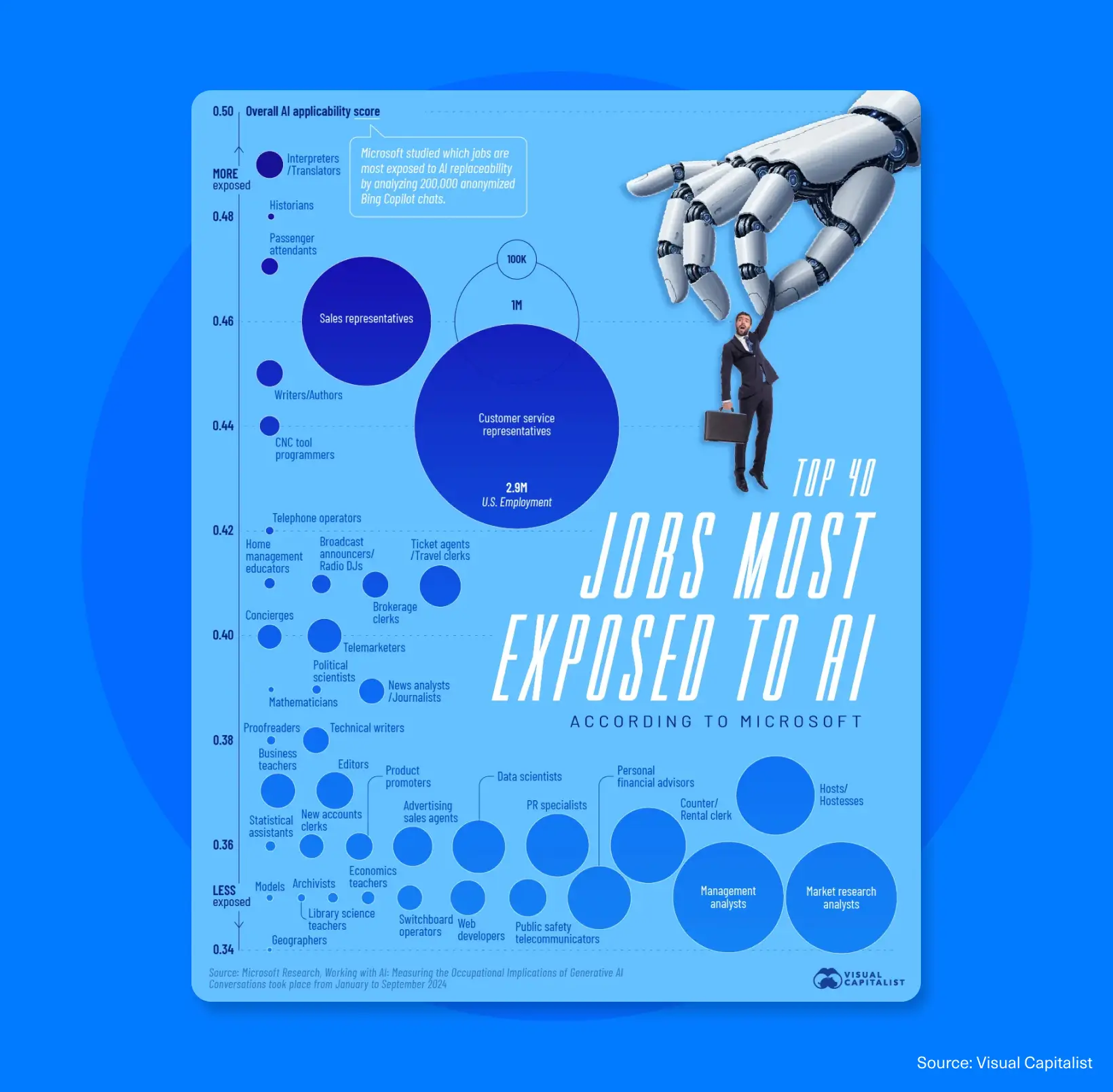
What works here: This infographic plots jobs along a clear “less exposed to more exposed” scale, with bubble sizes hinting at employment volume. The monochrome blue palette keeps it professional, while callouts highlight the key takeaways.
Try this: Use bubble charts on a single scale when comparing exposure, risk, or priority across roles or categories. - Tech’s Bizarre Beginnings & Lucrative Pivots – Visual Capitalist
What works here: Even data-heavy content can feel fun if you nail the illustration style. Hand-drawn visuals and bold headers make tech history easy to follow. The warm orange palette keeps it consistent, and the “then vs. now” layout makes the changes clear at a glance.
Try this: When showing before/after comparisons, use consistent layouts and playful illustrations to keep people engaged. - The Almighty Dollar – The Pew Forum
What works here: This radial chart turns income brackets into clean, color-coded bars that stack around a central point, making comparisons quick and easy.Clear labels and a simple legend keep it readable, and the circular layout makes the topic more engaging to look at.
Try this: Radial charts work great when you need to compare multiple categories around a central theme. Keep labels big and readable. - Each State’s Favorite Fast Food – Visual Capitalist

What works here: Bold state color blocks + recognizable brand logos = instant understanding. You can spot regional favorites in seconds, and the playful food visuals make it easy to share.
Try this: When mapping preferences or regional data, use recognizable brand elements and keep the color contrast high. - World’s Most Popular Artist – Ken Bromley Art Supplies

What works here: Instead of boring bar charts showing search volume, this fills each country with actual artwork from their most-Googled artist. It’s a visual collage that sticks in your brain—you can literally see Frida Kahlo dominating Mexico and Van Gogh all over Europe.
Try this: When you’re mapping global data, embed visual elements that actually represent what you’re showing. - A Cup of Curly Insecuritea – Shreya Menon

What works here: Building survey data around a tea cup metaphor makes an emotional topic feel warm and approachable instead of clinical. The percentage callouts are bold enough to scan, the simple charts break down complex feelings, and the cohesive illustration style ties it all together.
Try this: Use metaphors and illustrations to soften heavy or emotional topics while keeping the data clear. - Europe’s Top Economies in 2026 – Visual Capitalist

What works here: Complex economic data made visual in seconds. This radial layout groups countries into color-coded regions and sizes each block for instant comparison. The central map anchors everything, bold typography makes scanning easy, and the structured layout keeps GDP data from feeling overwhelming.
Try this: Group data by category using color and size to show relative importance at a glance. - Left vs. Right – David McCandless & Stephanie Posavec
What works here: Political infographics are often biased or confusing, but this one keeps things clear. Mirrored sections let you compare left vs. right ideas side by side, while red-and-blue color coding and consistent icons make the differences easy to understand.
Try this: For any comparison infographics, mirrored layouts with consistent icons make comparisons instantly recognizable. - Bestselling Video Games – Visual Capitalist

What works here: This infographic design uses actual game cover art and franchise branding, making the bestselling titles instantly recognizable.
Try this: When you’re ranking products, brands, or anything with a visual identity, use their actual logos and imagery. - How to Learn to Draw – Anna Vital
What works here: “Learn to draw” feels vague until you see it laid out as a clear path with numbered steps. Simple icons mark each milestone, and clear labels show exactly where you are.
Try this: For onboarding flows, skill-building guides, or any step-by-step process, map it as a single visual path with clear milestones. People need to see the finish line to start walking. - TikTok Trends Speed of Culture – Design Force

What works here: This bubble chart plots cultural trends on a “fast-fading vs. long-lasting” scale by using color to show velocity and bubble size to hint at impact. Instead of just listing trends, it shows you how they connect—which fleeting moments feed into bigger cultural shifts, and which ones stick around long enough to build a strategy on. It’s pattern recognition for people who need to decide what’s worth paying attention to.
Try this: When you’re mapping trends or evolving data, use color gradients to show speed or urgency and varied sizes to show impact. Structure the layout so viewers can see how short-term spikes connect to long-term patterns. - How’s Life in Portugal? – OECD

What works here: Government reports don’t have to be boring. Bold rank callouts, simple icons, and clear section labels keep it scannable, while the cohesive illustration style makes the data feel friendly instead of bureaucratic.
Try this: Humanize data with illustrated characters and visual metaphors that connect categories to a central theme. - How the Coca-Cola Formula Has Changed Over Time — Visual Capitalist

What works here: The split circular layout shows 1886 vs. today side-by-side, so you immediately spot what changed (and what Coke won’t tell you about). Plus, the iconic bottle image ties it all back to the product.
Try this: For before/after product comparisons—new features, redesigns, formula changes—split circular layouts with strong brand elements make differences pop. - Food & Wine Pairing Method – Wine Folly

What works here: Wine pairing guides usually assume you already know what you’re doing. This matrix flips that by mapping food categories and cooking methods against wine types in a color-coded grid. Point at “grilled chicken” and find your answer in five seconds.
Try this: Matrix layouts work great for “if this, then that” recommendations. Perfect for pairing guides, compatibility charts, or feature comparisons.
A good infographic turns numbers and data into a story your audience can actually follow. Instead of making them work to understand your point, you hand them the insight on a plate. - The 1%’s Share of U.S. Wealth (1989–2024) — Visual Capitalist
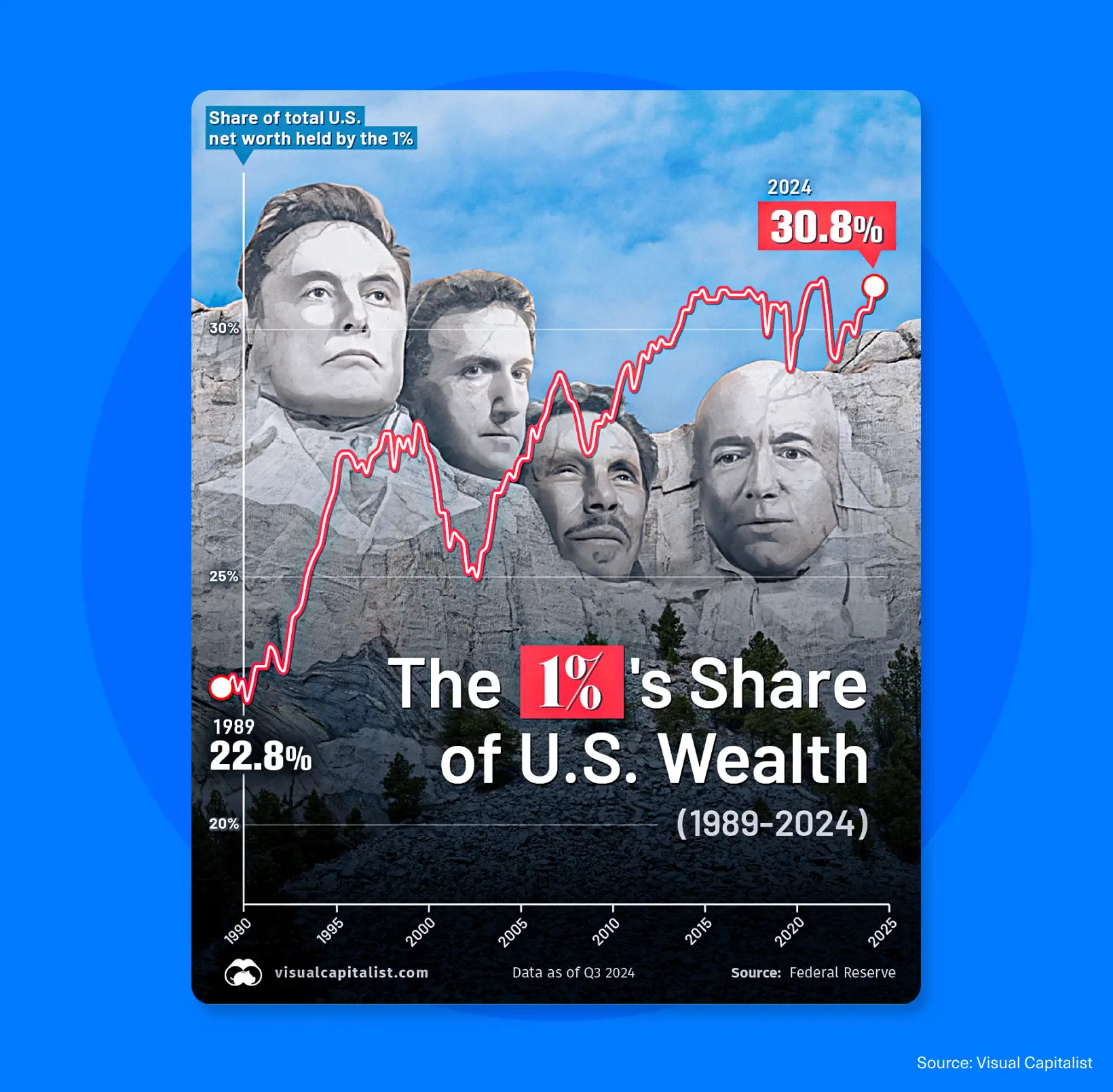
What works here: Combining a clean line graph with a bold headline callout tells the story before you even read the details. The high-contrast trend line, labeled endpoints, and dramatic background imagery add impact without distracting from the data.
Try this: Lead with your biggest stat in a bold callout, then support it with a simple chart. - A Brief Introduction to Typography – Enrix Boix

What works here: By splitting typography into scroll-friendly sections, this infographic makes the topic easier to digest instead of overwhelming. Strong hierarchy, high-contrast type, and tons of whitespace make it easy to scan.
Try this: For educational content, break it into clear sections with strong visual hierarchy and breathing room. - The Problem With Plastic – Information is Beautiful
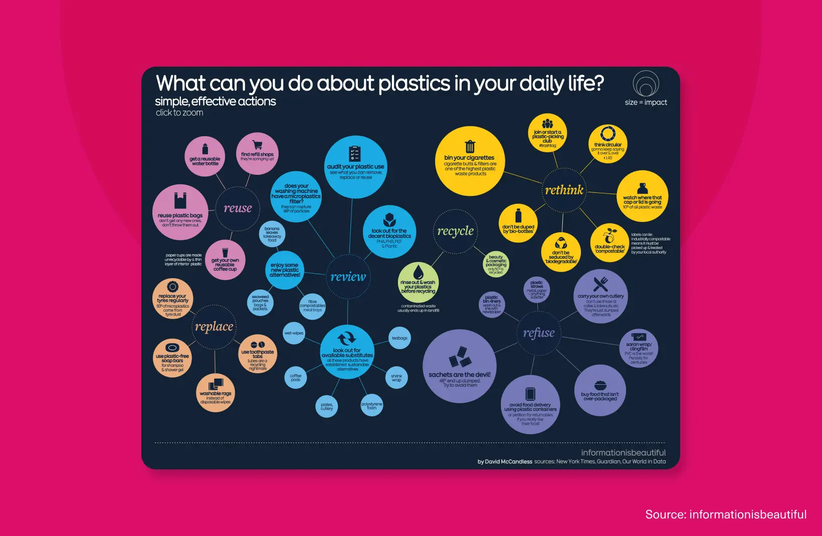
What works here: This bubble infographic groups actions by theme, using color and size to highlight their relative impact.
Try this: Use bubble networks to organize tips, actions, or features by theme. Color-code by category, and size by importance. - The Rise of the Gig Economy — The Edge Malaysia
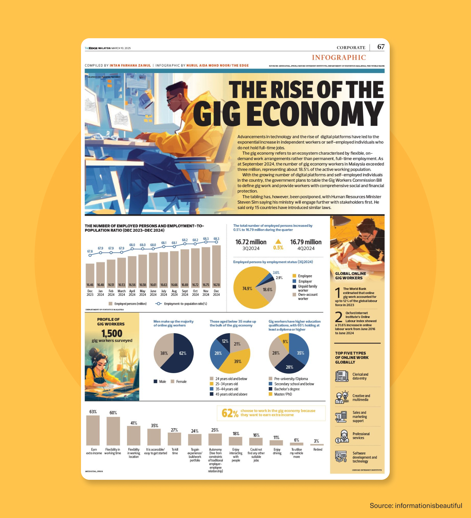
What works here: The story and the data work together here. Headlines, charts, and callouts explain gig work trends fast, while a mix of chart types shows the story from different angles.
Try this: Combine narrative text with supporting charts in a grid layout for editorial-style infographics that tell a complete story. - 5 Niche Energy Tariffs to Consider Now – Guilherme Henrique

What works here: Energy tariffs are about as exciting as reading your electricity bill, but this centers everything around a smart meter visual. Strong typography and a consistent grid keep it from turning into a wall of text.
Try this: When explaining options or categories, use a central visual anchor and radiate info outward with numbered callouts. - History of Pandemics – Visual Capitalist

What works here: This timeline maps pandemics across centuries using a flowing, organic layout. The color-coding separates different diseases, and clear date markers keep you oriented as you move through history.
Try this: For historical timelines with varying impact levels, use flowing organic layouts with sized elements to show scale. This will make it more engaging than a straight line with dates. - Coronavirus Riskiest Activities – Information is Beautiful
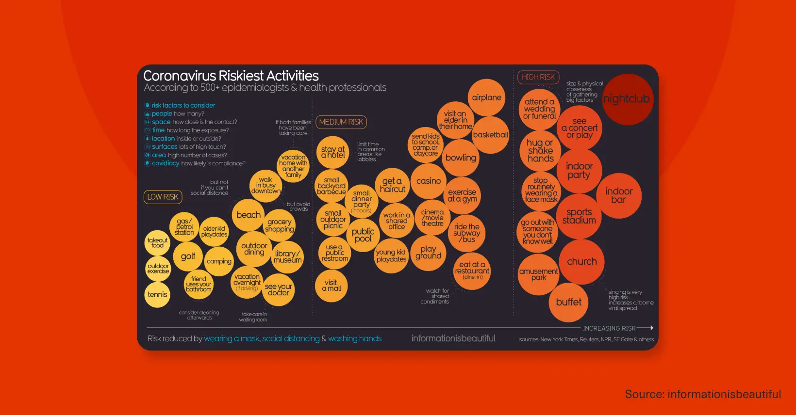
What works here: Bubble chart infographics often feel like someone dumped marbles on a table, but this one works because it plots activities along a single “low risk → high risk” line.
Try this: Bubble charts on a single axis work great when you need to show relative risk, priority, or urgency across a ton of items without creating a mess.
Ready to make infographics part of your marketing strategy?
Now comes the hard part: Producing them without burning out your design team or waiting three weeks for an agency to deliver one asset. You need on-demand design solutions that function as a seamless extension of your internal team.
That’s where Design Force comes in. Our flexible subscription plans give you access to world-class professional designers who can turn your data into infographics people actually want to look at.