How to increase conversion rates in digital marketing with design
In this article, we’ll explain what a digital marketing conversion rate is, and share 4 design tips you can use to improve your customer experience (and make more sales).
What is a conversion rate in digital marketing?
Conversion rate is the percentage at which your marketing efforts convert (or turn) a stranger into a paying customer to your business.
But before you can increase the conversion rate of your digital marketing, you need to lay the foundation of your marketing strategy (or plan of action).
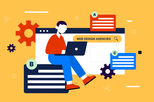
Let’s visualize: Think of your digital marketing strategy as a road.
It’s designed with your goals in mind, to guide your ideal audience from A to B, from starting point to end goal.
And that’s great, but there’s one thing missing on our metaphorical road: the transport.
The transport is your brand’s design.
It’s the shiny vehicle that your audience can use to make the journey and convert from stranger to customer. Without the transport in place to access your marketing output (your messaging), how will they get to the endpoint of purchasing your product or service?
The transport, or design, you choose, will be a key factor in how quick, comfortable and enjoyable your audience’s journey along the road will be.
4 design elements to improve your marketing journey and boost your conversion + the digital design hacks to get you there quicker:
The Design element: Logo
The hack: Keep it simple
Your logo can become one of the key memorable elements to your brand’s overall design, making you instantly recognisable (= more likely to convert) regardless of where your content is served to them.
Keeping your choice simple, clear and legible at any size should be top priority.
Logo creators like Wix or Canva can be a great source of inspiration, as well as sites like Pinterest.
Take a look at other businesses within your niche to see what looks good and what doesn’t, and test different options until you’re happy.
For a more in depth look at what makes a good logo, read this.
The Design element: Fonts
The hack: Choose wisely between serif and sans serif
Is it really that important what fonts you use? Yes.
Using too many different fonts within your digital marketing can become confusing for your audience. Especially if those fonts are wildly contrasting in their individual design.
The fonts you choose need to be readable on multiple screen types, sizes and saturations, so consider how they look when shrunk or viewed on mobile.
Look back at your overall business and marketing strategy when deciding your options. Having a clear understanding of your audience and brand messaging will determine which route will be most effective for to increase your digital marketing conversion rate.
Choosing serif or sans serif will give your customer a subliminal sense of what your business is about.
Serif fonts, those that have ‘tails’ at the edges of each letter, are more widely associated with authoritative and professional brands, which is why you’ll see them on news sites.
Sans serif fonts, on the other hand, are associated with modern and commerce brands and are more widely used in digital formats.
The Design element: Color
The hack: Less is more
The colors you choose for your branding and across your digital marketing can evoke an emotive response from your audience.
If you’re not sure where to start when deciding what colors to use, look into the psychology of colors and see which emotion best resonates with your brand message.
For example, red can evoke feelings of hunger as it raises your metabolism, which is why you’ll see it used across so many fast food brands.
Yet it can also resonate with danger, so using red for a wellness brand might not be the smartest move.
When combining colors, less is always more. We recommend using one main color, and supplementing it with up to two more across all of your marketing. The color wheel is a great tool for determining which colors complement each other, as well as color combination tools like this one.
The Design Element: Imagery
The hack: Don’t be afraid of white space
Using images within your designs creates connection and balance between the information you’re serving.
But don’t be afraid to include white space (empty space) when designing your digital marketing layouts. The negative space forces the viewer to take in the different elements of the design, and avoids making them feel bombarded or overwhelmed with information.
While producing your own photography and image graphics is the best direction, stock imagery can be a fantastic option if you’re in a pinch. Websites like Unsplash or Shutterstock have plenty of royalty-free photographs that you can embed into your designs.
Overall, increasing your digital marketing conversion rate comes down to user experience
All of the elements we’ve covered in this article resort back to one common theme:
They improve the UX of your designs, which will positively affect the overall marketing journey for your audience.
Consistency across all of your digital marketing output will create cohesion for your brand, and help boost brand recognition.
And if you’ve successfully designed each element with the user in mind, your audience are far more likely to convert into loyal, paying customers.
Need help determining your design direction? Get in touch with Design Force today.
