

Brand colors aren’t just pretty hues—they’re the secret weapon behind unforgettable brands.
Think about it: What’s Tiffany without its robin egg blue or Coca-Cola without its bold red? These colors do more than catch your eye; they tell a story, shape perceptions, and create connections.
Whether you’re a creative professional or an entrepreneur taking the reins on your own branding, choosing the right brand colors is a critical step in defining your identity and standing out from the crowd. Done right, your colors can become the visual shorthand for who you are, what you stand for, and why you’re unforgettable.
In this article, we’ll show you how to choose brand colors, and craft a brand color palette that feels fresh, strategic, and undeniably you. From color psychology in branding to actionable tips and creative examples, we’ll guide you step-by-step through the process.
Let’s make your brand colors work as hard as you do.
Why brand colors matter
The role of brand identity colors
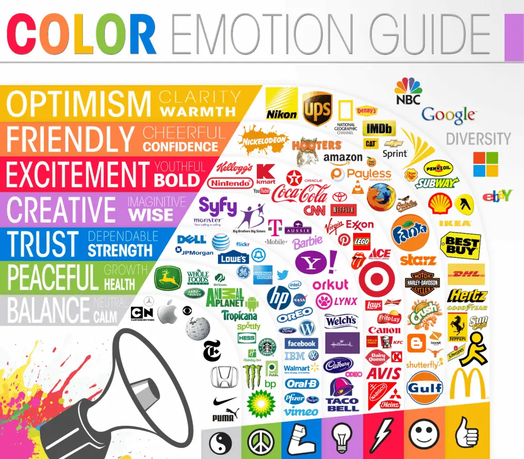
Colors are the unsung heroes of branding. They’re the reason you can spot a McDonald’s from miles away or feel a sense of creativity when you see Spotify’s vibrant green.
Colors evoke emotion—they make your audience feel something. Whether it’s excitement, trust, calmness, or joy, the right palette can communicate your brand’s personality in an instant. Think of it as a visual elevator pitch: Before you say a word, your colors have already spoken volumes.
The business impact of colors
Color is more than a “nice-to-have” element—it’s a business powerhouse. Research shows that color increases brand recognition by up to 80% and plays a significant role in consumer decision-making.
Take Tiffany & Co., for example. Their light blue boxes don’t just hold jewelry; they hold a promise of elegance and exclusivity. That’s the power of a well-chosen color—they don’t just look good; they sell.
Key takeaway: Your brand colors aren’t just decorative—they’re persuasive. When chosen intentionally, they can become one of your most valuable assets for building recognition, trust, and loyalty.
The 3-step creative process of choosing brand colors
Ready to dive into the creative part? Here’s where the magic happens—not by picking your favorite color, but by strategically crafting a palette that tells your brand’s story.
Step 1: Define your brand personality
If your brand were a person, how would you describe them? Are they playful and quirky, or refined and sophisticated? Maybe they’re bold and daring, or warm and approachable.
Start by jotting down a list of adjectives that capture your brand’s vibe.
For example:
- A wellness brand might lean into “calming,” “natural,” and “restorative.”
- A tech start-up might aim for “innovative,” “trustworthy,” and “modern.”
Once you’ve nailed down your personality, think about what colors align with those traits. A brand focused on fun and energy might go for vibrant yellows or oranges, while a minimalist luxury brand might opt for sleek blacks or muted neutrals.
Step 2: Understand color psychology
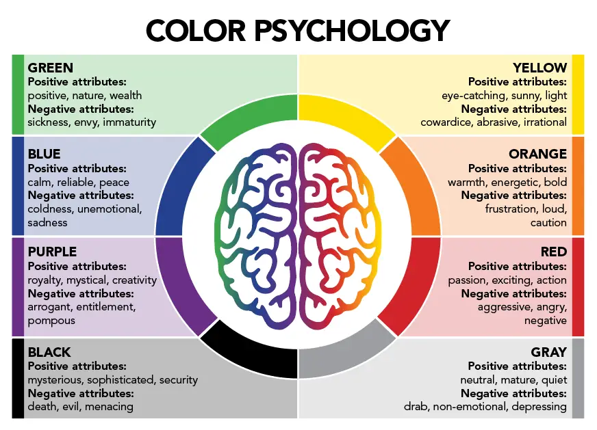
Let’s talk about the emotional power of color. Did you know that red can boost your heart rate while blue can help you feel calm? Or that green conveys growth and health, while purple channels creativity and luxury?
But don’t stop there—context matters, too. What works for one industry may feel out of place in another. For example:
- Blue is a go-to for tech brands (think Facebook and LinkedIn) because it conveys trust and reliability
- Green is popular in wellness and sustainability (like Whole Foods) for its connection to nature and growth
Step 3: Analyze the competition
Here’s a creative twist: Look at what your competitors are doing—and do the opposite.
If everyone in your industry is playing it safe with muted tones, maybe it’s time to go bold. Lyft’s vibrant pink, for example, was a daring move that set it apart from Uber’s monochromatic black-and-white branding.
This doesn’t mean you should choose colors just to be different—your palette still needs to align with your brand’s personality. Doing the research will highlight gaps and opportunities–finding a way to stand out visually can give you an edge.
Step 4: Experiment with tools
Now for the fun part: playing with color tools. Use platforms like Coolors or Adobe Color to create and test palettes. Build mood boards to see how different colors work together and align with your brand’s vibe.
Need inspiration? Look to nature, art, or even your favorite fashion brands. Creativity is everywhere—use it to craft a palette that feels authentic and fresh.
Building a balanced palette
The 60-30-10 rule
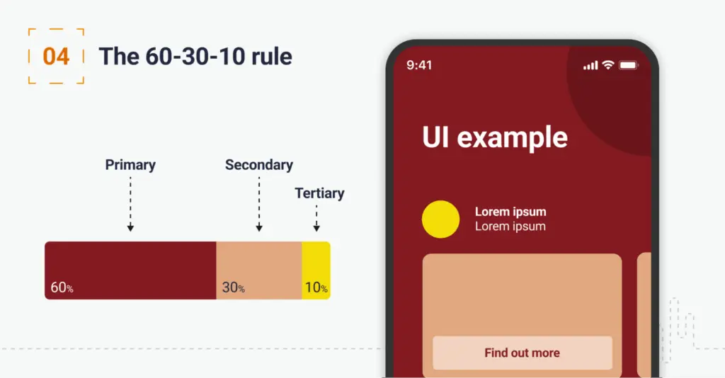
Ever feel like something just works visually, but you’re not sure why? That’s the magic of the 60-30-10 rule. It’s a simple formula to create harmony in your designs:
- 60% dominant color:
This is your brand’s foundation - 30% secondary color:
Adds depth and variety - 10% accent color:
The pop that grabs attention
For example, a coffee shop might use rich brown as the dominant color, a warm beige as the secondary, and a bright orange accent to energize the design.
Types of color schemes
Not sure what type of palette to choose? Here are a few options to consider:
- Monochromatic:
Variations of a single color for a clean, cohesive look - Complementary:
Opposite colors on the wheel for high contrast and energy - Triadic:
Three evenly spaced colors for vibrancy and balance - Analogous:
Colors next to each other for a harmonious, natural feel
Each scheme brings something unique to the table. For example, a monochromatic palette can feel sleek and modern, while a complementary palette adds boldness and drama.
Examples of Different Color Schemes in Branding
Monochromatic
Apple’s branding often utilizes varying shades of gray, exemplifying a monochromatic scheme.

Complementary
FedEx uses purple and orange, colors opposite each other on the color wheel, creating a striking complementary scheme.

Analogous
Land Rover employs greens and yellows, which are adjacent on the color wheel, resulting in a harmonious analogous palette.

Triadic
Google’s use of primary colors (red, blue, yellow) showcases a vibrant triadic scheme.

Testing and refining
Your palette might look great on screen, but how does it perform in the real world? Test it across all mediums—digital, print, and even merchandise. Check for contrast, legibility, and accessibility using tools like WebAIM.
Design Force tip:
Get feedback. Share your palette with your team, stakeholders, or even a focus group. Sometimes, a fresh pair of eyes can catch details you might have missed.
Applying and maintaining brand colors
You’ve crafted the perfect palette—now what? A brilliant brand color palette is only as good as its application. Consistency is key when it comes to building recognition and trust, and your colors should work seamlessly across every touchpoint, from your website to your business cards.
In this section, we’ll dive into how to implement your brand colors effectively and ensure they stay timeless and cohesive as your brand evolves.
Creating brand guidelines
Think of your brand guidelines as the rulebook for your colors. A brand colors guide should document the HEX, RGB, and CMYK codes for consistency across all platforms. Define how your colors should be used on logos, websites, social media, and even packaging.
Consistency across platforms
Your brand colors should create a seamless experience, whether someone sees your Instagram post, visits your website, or picks up your business card. For example, Instagram’s gradient palette is instantly recognizable, whether it’s on their app or a billboard.
Future-proofing your palette
Trends come and go, but your brand’s core colors should remain timeless. If you want to stay fresh, consider adding trendy accent colors or experimenting with gradients, but always stay true to your brand’s identity.
You’ve crafted your palette, refined it, and ensured it’s balanced—great work! But creativity is a never-ending process, and staying inspired is just as important as laying the foundation. Whether you’re looking to refine your existing colors or add a fresh twist, this section is here to spark new ideas and keep you ahead of the curve.
Creative Inspiration
Let’s start with the classics. Some of the most iconic brands in the world have built their identities on carefully chosen colors that perfectly align with their values. Studying these brands can offer valuable insight into how color can evoke emotion, tell a story, and build recognition:
- Netflix
Bold red for passion and excitement—perfect for a brand that’s all about captivating entertainment

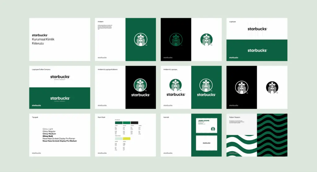
- Starbucks
Calming green for growth and sustainability, reflecting both their coffeehouse vibe and their commitment to eco-conscious practices
- Google
Playful multicolor for diversity and innovation, reflecting their brand’s mission to make information accessible to everyone, everywhere
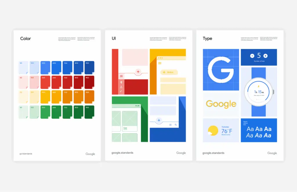
These brands have turned their palettes into visual signatures, proving that the right colors can transcend design and become part of your audience’s emotional connection to your brand.
Emerging Trends
The world of branding is constantly evolving, and color trends are no exception. If you’re looking to keep your palette fresh and modern, here are some trends that are making waves in the creative world:
- Gradients that add depth and visual interest:
Gradients are evolving beyond Instagram’s famous pink-orange blend, offering a way to create dynamic, layered designs that feel modern and fresh. - Dynamic branding with adaptable color schemes:
Brands are moving away from rigid palettes and embracing flexibility, allowing colors to shift and adapt based on context while still feeling cohesive. - Multicolor palettes that reflect diversity and inclusivity:
Vibrant, multi-hued palettes are gaining traction as brands aim to project inclusivity and creativity in their identities.
Balancing trends with timelessness
Design trends are exciting, but they’re also fleeting. While it’s tempting to dive headfirst into the latest craze, remember that your core brand colors should stand the test of time. Use trends as accents or seasonal updates to complement your existing palette, rather than replacing it entirely.
The key is balance: Stay modern without losing the essence of what makes your brand unique. After all, your palette is more than just a collection of colors—it’s an extension of your brand’s personality and story.
Wrapping up your color journey
Choosing brand colors is where creativity meets strategy.
A well-crafted palette can communicate your story, build trust, and make your brand instantly recognizable. It’s not just about looking good—it’s about creating impact.
Ready to start? Use the tips and tools in this article to craft a palette that’s as unique as your brand. And don’t forget to subscribe to our blog for more creative branding tips.
At Design Force, we’re here to inspire and empower your creative journey–if you’re in need of production designers who know their stuff, learn more about us here to see if we’re the right fit for your team.