

That constraint is both the challenge and the power of your one-pager design. Done well, it works harder than a 10-slide deck. Done poorly, it gets skimmed in two seconds and set aside.
A well-executed one page layout design guides the reader’s eye, prioritizes information, and signals credibility. The structure does the persuading before the words do.
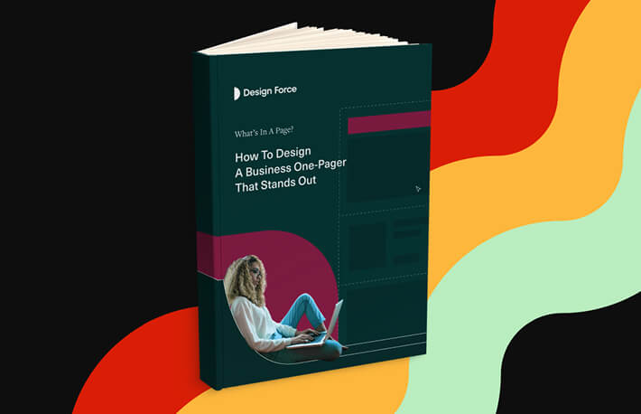
Below, we walk through eight one-paper design ideas that turn a forgettable document into one people actually engage with. We’ve included free templates at the end so you have somewhere to start.
What makes a business one-pager different?
A business one-pager is a single-page summary of the most important information about your company, product, service, or project.
Unlike a proposal or a deck, there’s no room for clutter. Every design choice carries weight. The layout, font selection, color decisions, and spacing all have to work in concert to make the document scannable, credible, and worth keeping.
One-pagers serve two very different purposes, and understanding which one you’re creating will shape every decision you make:
- External use: investor pitches, client proposals, partner presentations, conference handouts, and sales leave-behinds
- Internal use: team alignment documents, project briefs, strategy overviews, and onboarding summaries
The context differs, but the design standard stays the same. Clear, clean, and visually intentional.
8 one-pager design tips to make your document stand out
Most one-pagers get skimmed and forgotten. Here’s how to design one that actually holds attention.
1. Stick to your brand personality
Every visual choice should connect back to who your company is and how you want to be perceived.
That means your brand color palette, fonts, and tone of your copy. If your brand identity is bold and modern, your one-pager should feel that way. If it’s restrained and minimal, every element has to earn its place.
A one-pager that looks disconnected from your other materials signals inconsistency. And for investors or clients who are evaluating whether to trust you, inconsistency is a red flag.
Quick tip: No formal brand guide yet? Start by locking in three things: your primary color, heading font, and body font. Stick to just those, and your document will already feel cohesive.
2. Build a clear visual hierarchy
Visual hierarchy tells readers what matters most. Without one, every element on the page competes for attention equally, and when everything’s fighting to be noticed, nothing wins.
In a one page layout design, hierarchy comes from combining size, weight, color, and positioning deliberately. When those elements work together, the reader’s eye moves through the document in exactly the order you intended.
Here are three ways to build it:
- Use size contrast intentionally. Your headline should be noticeably larger than your subheadings, which should be noticeably larger than your body text. A 2:1.5:1 ratio is a reliable starting point.
- Group related content visually. Items that belong together should share a visual container, whether that’s proximity, a background shape, or a consistent style.
Pick one thing to highlight. Use a contrasting color, a larger font, or a callout box for the single point you most want the reader to take away.
3. Treat white space as a design element
White space is not empty space. On a one-pager especially, it’s one of the most productive tools you have.
A packed one-pager is harder to read, feels less credible, and tends to overwhelm people before they’ve absorbed your opening line.
White space does three things well:
- Improves legibility. Breathing room between elements prevents the visual clutter that makes people stop reading.
- Directs attention. Space around an element signals that it matters. A headline with generous margin above and below it pulls more focus than one sandwiched between other content.
- Signals quality. Documents with generous white space read as considered and premium. Dense, over-packed layouts read as rushed.
When you’re not sure whether to cut an element or shrink your margins, cut the element.
4. Choose typography that works at every size
Your font choice shapes how the one-pager feels before anyone reads a word.
Serif fonts like Georgia or Playfair Display carry a sense of formality and tradition, which works well in financial, legal, or heritage brand contexts. Sans-serif fonts like Inter, Helvetica, or DM Sans read as modern and clean, a natural fit for tech, SaaS, and creative businesses.
Whatever typeface you choose, a few core principles apply:
- Stick to two fonts. One for headings, one for body text. Introducing a third creates visual noise without adding anything meaningful.
- Set body text between 10 and 12pt. Smaller than that becomes difficult to read in print. Larger and you lose space you can’t afford.
- Get the contrast right. Dark text on a white or light background is still the gold standard for legibility. If you’re placing text over a colored background, check that the contrast ratio actually passes basic readability standards. Combinations like light gray on white or red on green cause problems.
And if your one-pager is going to print, test it before you finalize. Print a draft at actual size and read it under normal lighting. Problems that are invisible on screen tend to become obvious on paper.

5. Let the colors guide attention
Color is one of the fastest ways to direct where the reader looks and how they feel about what they’re reading.
Used with intention, it reinforces your brand and creates a natural visual flow through the page. Used carelessly, it creates confusion and makes the document feel amateurish.
A minimal color approach almost always works better:
- Use your primary brand color for headlines, key callouts, and accents
- Use a neutral tone, white, light gray, or a tint of your primary, for backgrounds
- Reserve a contrasting accent color for your call to action only
Every color choice should serve a purpose. If a design element’s color doesn’t do any real communicative work, remove it or make it neutral.
6. Keep the formatting dynamic
Dense blocks of text are the fastest way to lose a reader. Even with genuinely strong content, solid paragraphs in a one-pager create a visual wall that makes people tune out. Formatting is what breaks that pattern.
- Bullet points let readers extract value quickly without working through full paragraphs. Use them for features, benefits, and key data points.
- Bold text should be used sparingly, for the most important phrases only. When everything is bolded, nothing stands out.
- Short paragraphs are easier to process than long ones. Two to three sentences is usually the right ceiling. If you need more than that, the content probably belongs somewhere else.
- Visual callouts, like boxed stats, highlighted quotes, or numbered steps, break up the page and give readers quick wins as they move through.
The goal is to make the reading experience feel effortless. If someone has to work to get through your one-pager, the design isn’t doing its job.
7. Use visuals that earn their space
With a single page to work with, every element has to justify its presence. That’s especially true for images, which take up significant room.
The best visuals in a one-page brochure design do one of three things:
- Illustrate something that’s harder to explain in text such as a product workflow, a process diagram, or a before-and-after.
- Reinforce your brand positioning through the mood or feeling of the image.
- Provide social proof at a glance. Some examples include a chart showing results, a recognizable client logo, a key metric in large type.
If you’re unsure whether an image is earning its place, remove it temporarily and see whether the page feels stronger or weaker. That answer is usually immediate.
8. End with a clear call to action
This is the step most commonly skipped, and the one that does the most damage when it’s missing. A one-pager without a call to action is a document that just ends. You’ve spent the whole page building a case, and then you leave the reader with nowhere to go.
A strong call to action has three qualities:
- Specific. “Book a 20-minute call” is more compelling than “Contact us.” “Download the full deck” is clearer than “Learn more.” Vague CTAs produce vague results.
- Single. Give the reader one thing to do. Two or three options dilutes the action. Choose the outcome that matters most and make that the obvious next step.
- Easy to act on. Include whatever someone needs to follow through, a URL, a QR code, an email address, a phone number, right below the CTA text. Friction kills follow-through.
Visually, your CTA needs to stand out from the surrounding content. It can be a contrasting color, a boxed section, or a clear visual break all work. The reader should be able to spot it without searching.
These one-pager design ideas only go so far without a good starting point. Below are six template types to orach suited to a different context and audience
One-page brochure design inspiration you can use for free
Now that you know how what a good one-page design is, here are some of our business one pager design templates that you can use and customize:
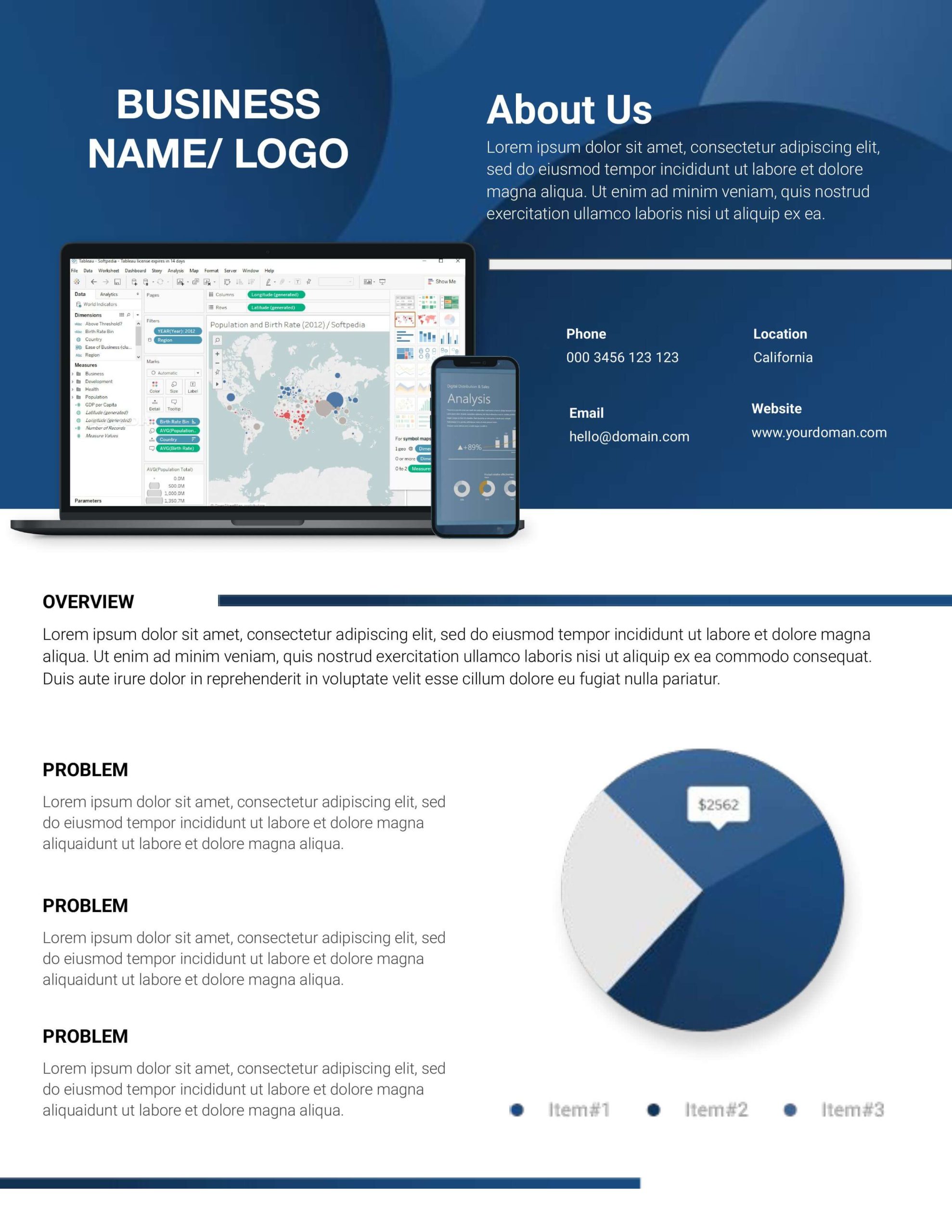
1. Tech Theme
The dark navy header builds instant credibility while the product mockup shows the software in action. This gives prospects a visual reference without needing to read a word.
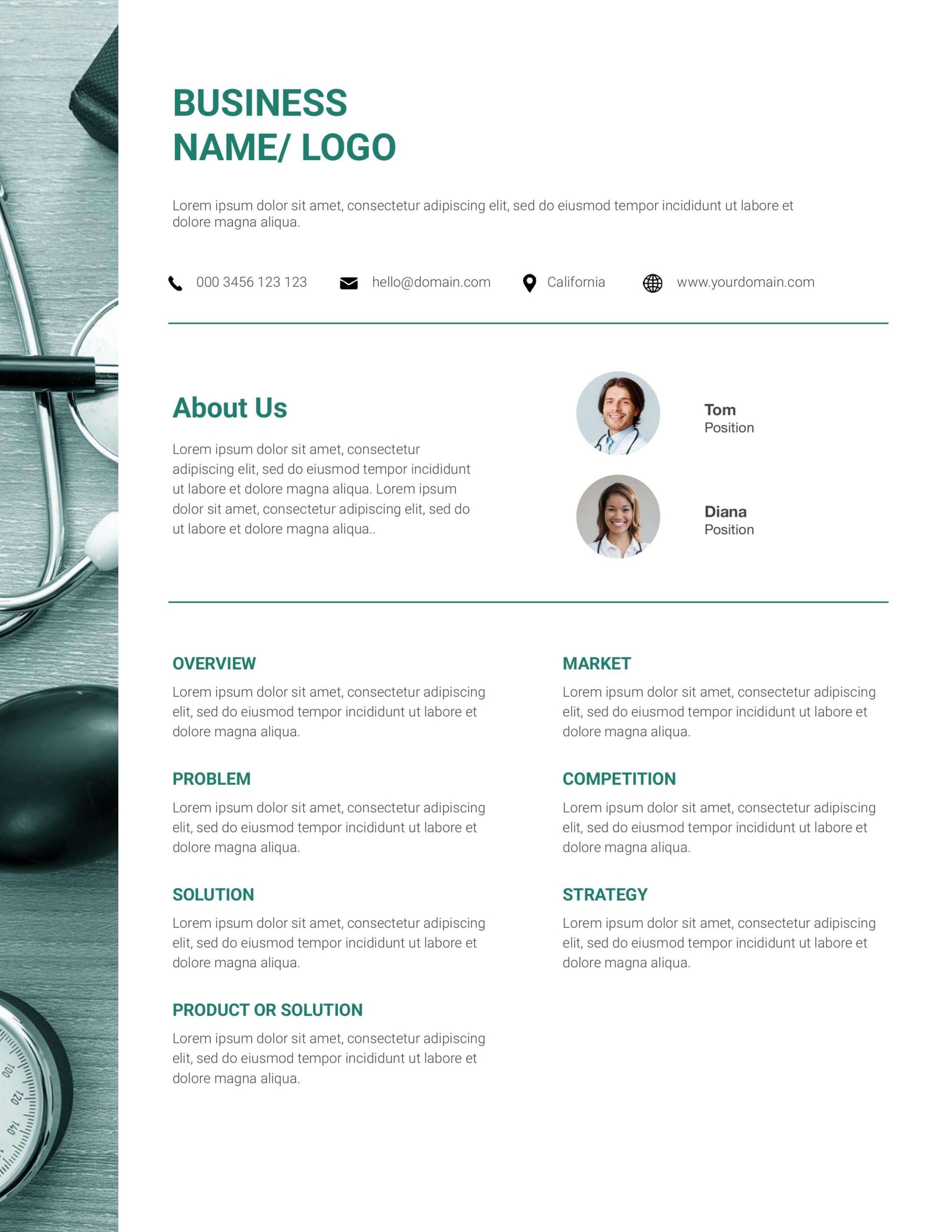
2. Health Theme
Team photos placed next to the About Us section build trust quickly, while the two-column grid keeps content grouped and easy to scan.
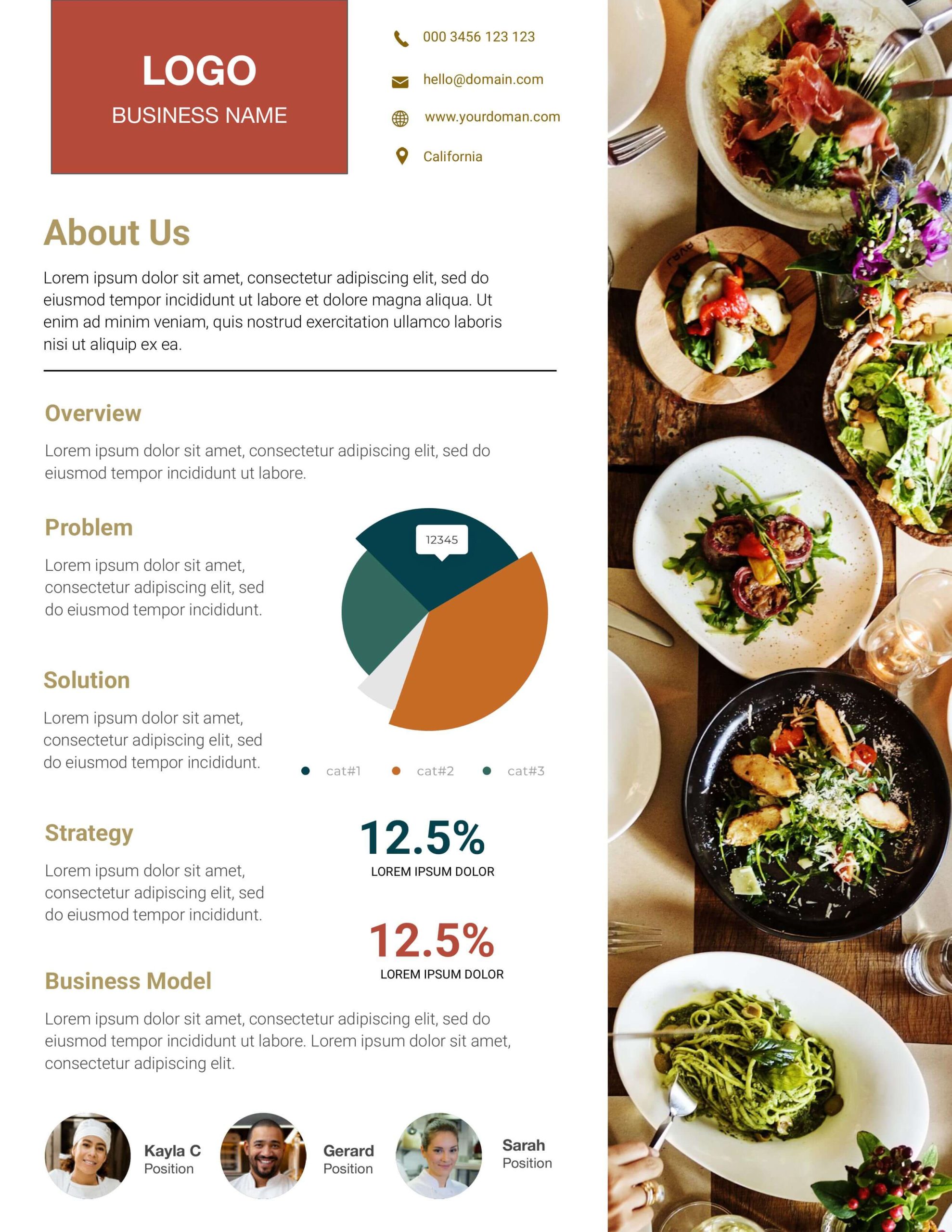
3. Restaurant Theme
The full-bleed food photography does the heavy lifting before the copy even kicks in, and the stat callouts add visual rhythm without cluttering the page.
4. Beauty Theme
The wide lifestyle hero sets the brand’s mood immediately, while the clean grid below keeps the layout from feeling as busy.
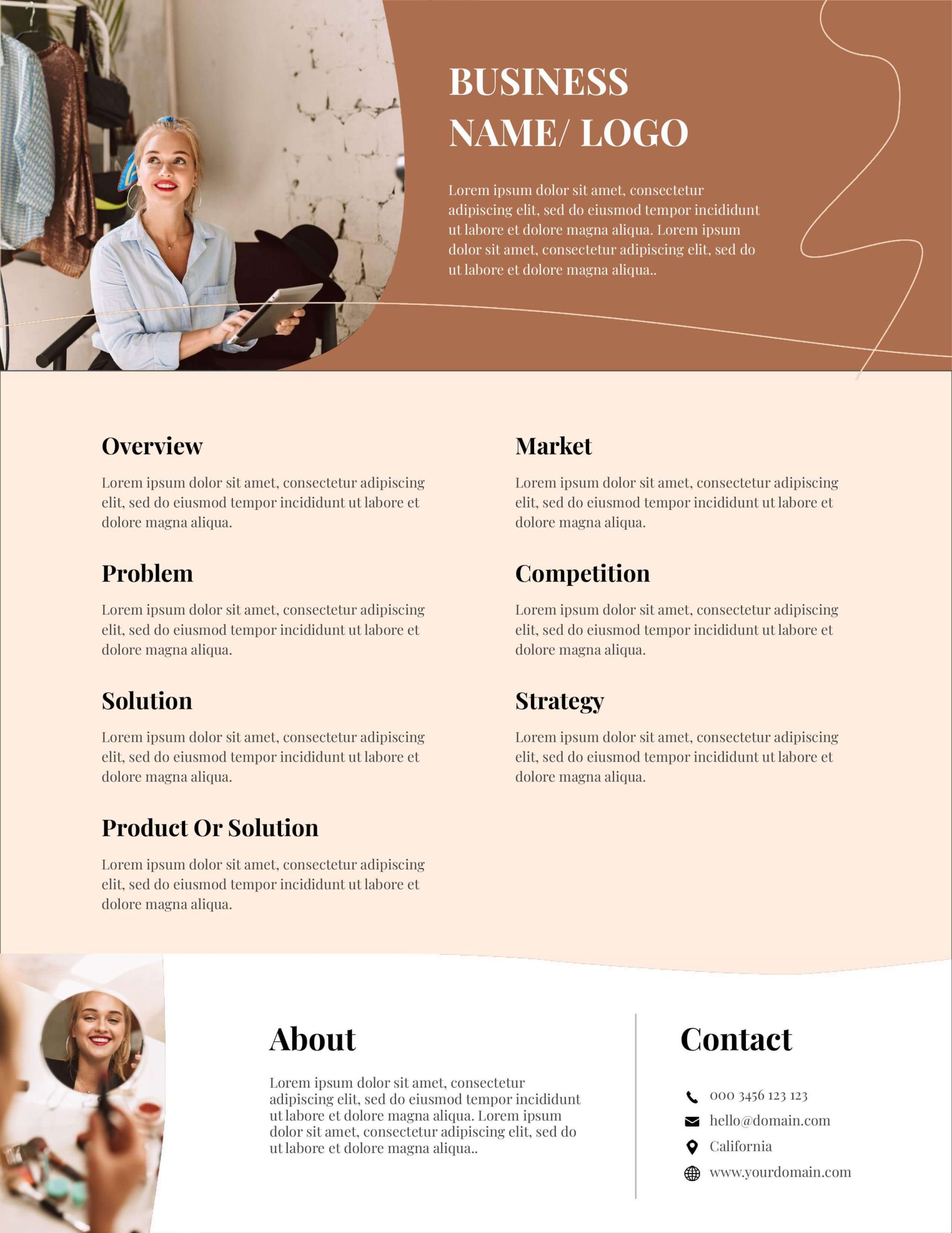
5. Lifestyle Theme
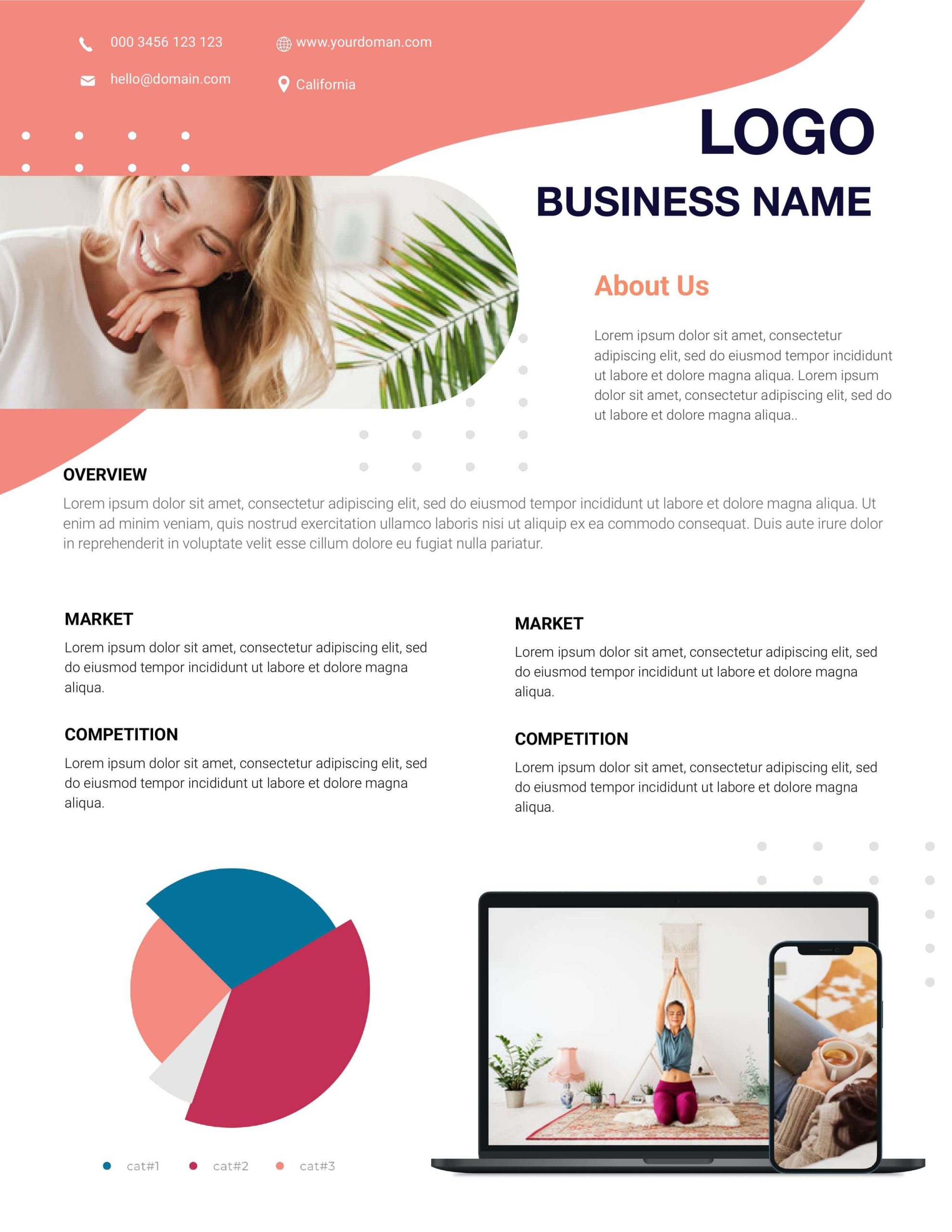
A consistent coral accent color ties the whole document together, while the lifestyle photo above the fold tells you exactly who this brand is for.
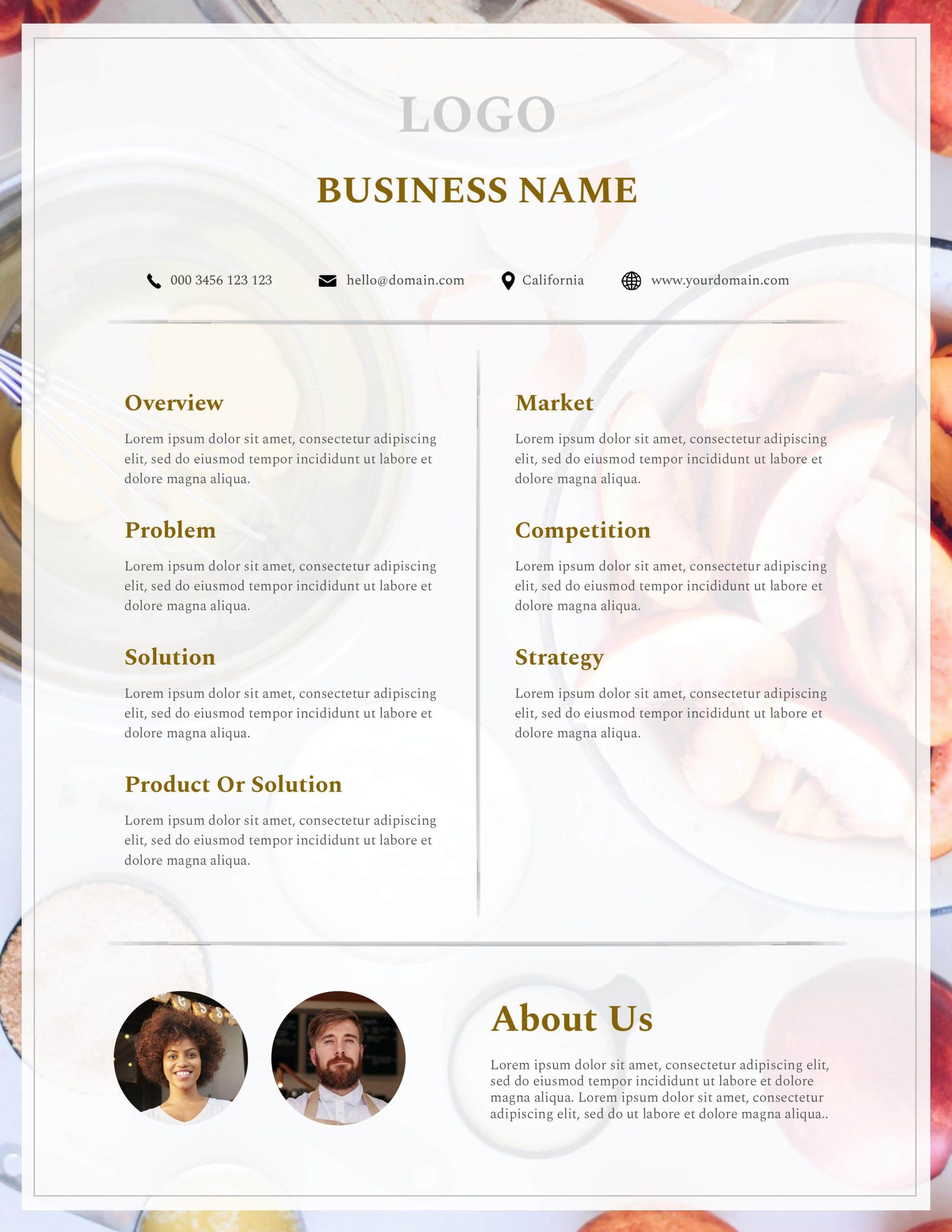
6. F&B Theme
Full-bleed background photography creates strong visual impact, while the frosted overlay card keeps the content on top of it fully legible.
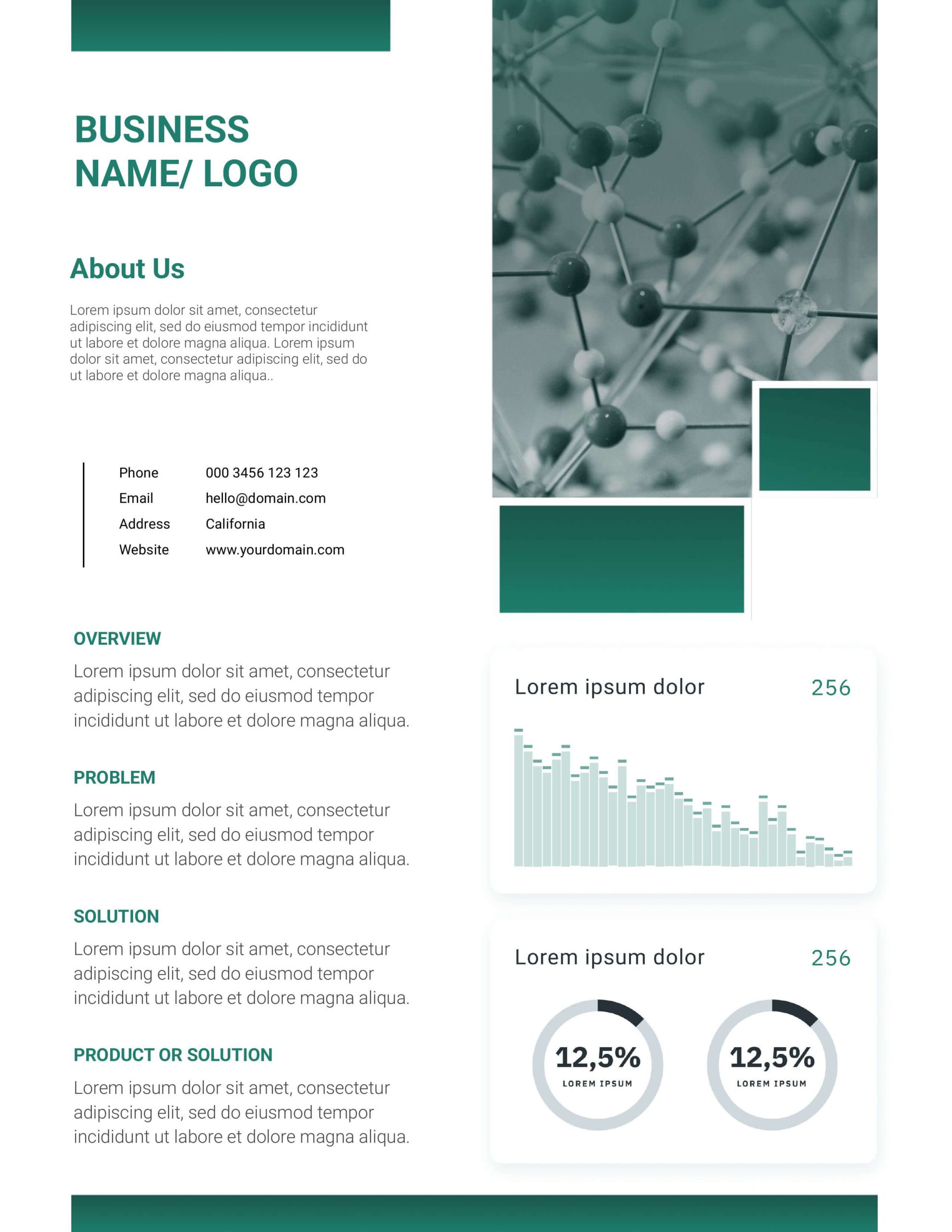
7. Pharmaceuticals Theme
Data visualizations earn their place here because numbers are proof in a scientific context, and the structured contact block makes the document easy to act on.
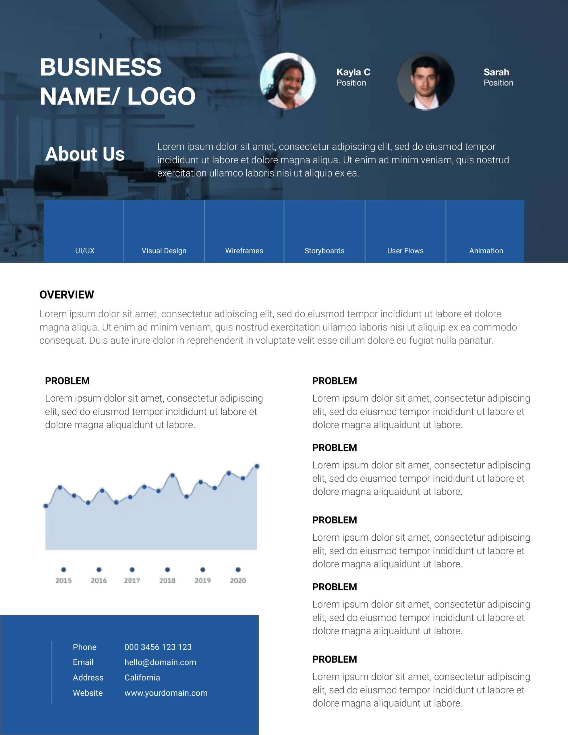
8. Corporate Theme
The dark hero banner pairs authority with human presence by combining team portraits and a bold header, setting the right tone before the reader gets to the details.
Good design is what makes a one-pager do its job
A business one-pager is one of the highest-leverage documents your company can produce. The right design helps leave a stronger impression, whether it lands in front of a potential investor, a new client, or your own team.
Start with the template that fits your situation, apply these fundamentals, and refine from there!
If you’d rather hand the whole project to a team of professionals, Design Force can help. Our designers work across every format, one-pagers, decks, digital ads, web design, and more, with a dedicated project manager handling the process so you don’t have to manage it yourself. Book a call to see how it works!