
Why balance is the hidden superpower behind every standout design
Ever looked at a design and just felt…comfortable? That’s no accident—balance is the quiet force making everything click. Whether you’re designing a bold landing page or a subtle brand identity, the balance principle of design is what keeps everything feeling intentional and inviting. But achieving that sweet spot between chaos and order? That’s where the real magic happens.
In this article, you’ll discover what the design balance truly means, why it’s the backbone of visual harmony, and how to master its different forms—from symmetrical to radial balance. With real-world examples and hands-on tips, you’ll learn to spot, create, and fine-tune visual equilibrium in your own projects.
Understanding the balance principle of design: Why stability fuels creativity
At its core, balance design principle is about arranging visual weight so your work feels stable and harmonious. Imagine every element—text, images, color blocks—as having its own “weight.” The trick? Distributing these weights so your composition neither tips too far in one direction nor feels bland and lifeless.
Why does this matter? For starters, balance shapes how viewers experience your work. A balanced design feels trustworthy, intuitive, and easy to navigate, while an unbalanced one can leave users feeling restless—or worse, confused. In UI/UX, a well-balanced layout boosts readability and guides users naturally, while in graphic design, it creates emotional resonance and brand credibility.
Exploring the four types of balance: From symmetry to creative chaos
Every designer’s toolbox should include an understanding of all balance types. Here’s how each one works (and when to wield it).
Symmetrical balance
Think: Classic comfort with a modern twist
Symmetrical balance is the mirror-image arrangement. Like folding your design down the middle and finding both sides match up. This approach radiates stability, authority, and a sense of order. It’s a go-to for corporate reports, formal invitations, or any context where trust and tradition matter.
When to use it:
- Corporate branding
- Annual reports
- Minimalist websites
Many of the world’s most iconic logos use symmetry in their design to create instant recognition and design harmony.
Chanel’s interlocking “CC” logo is a flawless mirror image, radiating luxury and elegance, while McDonald’s golden arches form a perfectly balanced “M,” projecting stability and approachability.
This use of symmetry helps these logos feel reliable and timeless, making them memorable no matter where you spot them—from packaging and digital icons to billboards and storefronts.

Asymmetrical balance: Dynamic, modern, and full of life
Asymmetrical balance throws out the rulebook—here, you balance different elements by their visual weight, not by mirroring. A large, colorful image on one side might be offset by a cluster of smaller text blocks or bold typography on the other. The result? Designs that feel fresh, energetic, and uniquely engaging.
When to use it:
- Editorial spreads
- Trendy landing pages
- Portfolio sites
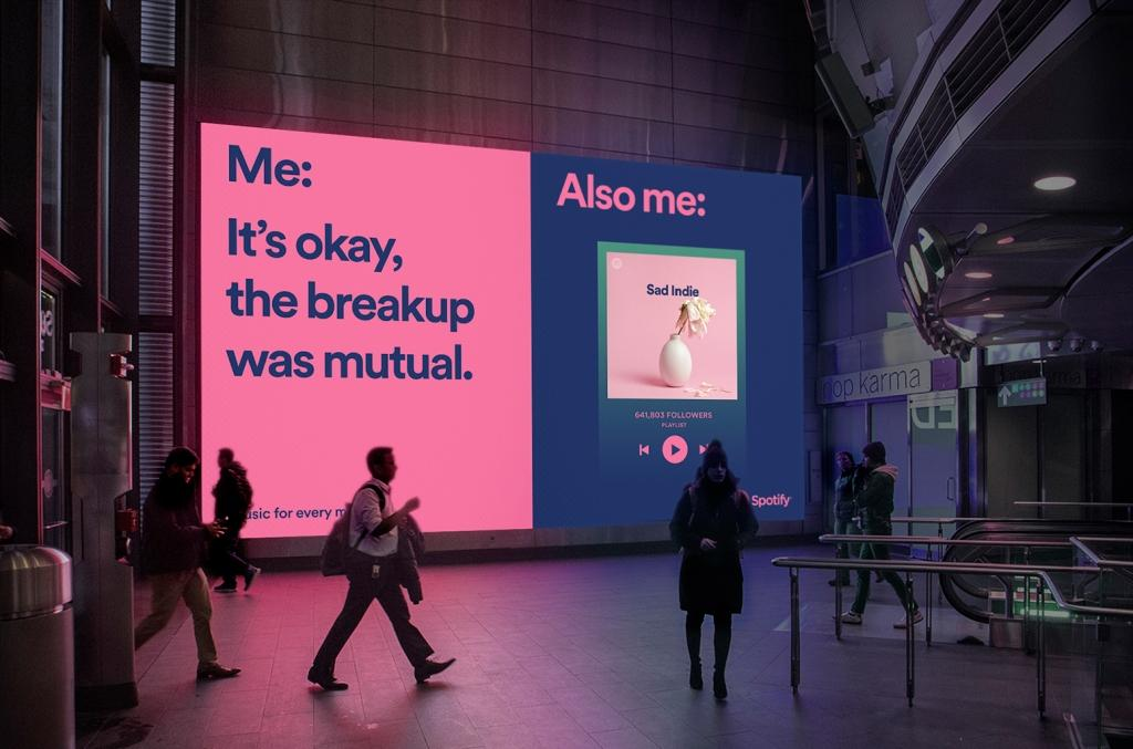
Spotify’s marketing visuals and app interfaces thrive on asymmetry. Think of their playlist covers or landing pages: a bold image or gradient on one side, balanced by playful, oversized typography or floating elements on the other. It’s dynamic, energetic, and feels modern—just like Spotify’s brand personality.
Radial balance: All eyes on the center
Radial balance organizes elements around a central point—think mandalas, sunbursts, or data visualizations. This type of balance naturally draws attention inward, making it perfect for logos, infographics, or interactive UI elements where you want users focused on a key idea.
When to use it:
- Icon or logo design
- Infographics
- Dashboard widgets
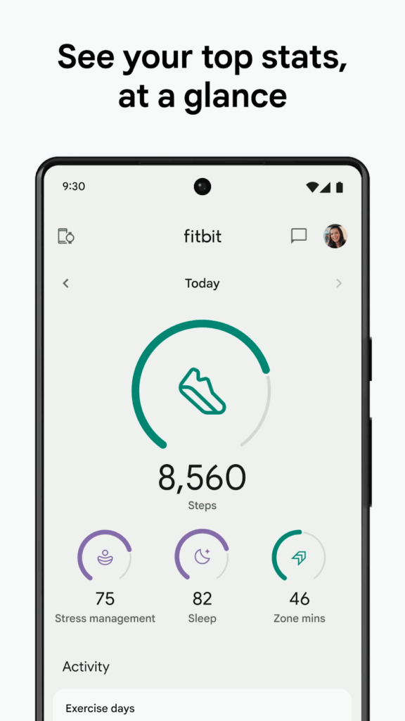
Fitbit frequently incorporates radial balance in its health and activity dashboards. Circular charts—like those tracking steps, heart rate zones, or sleep cycles—radiate data from the center, making it easy for users to see their progress at a glance. This radial layout not only organizes complex health metrics visually but also reinforces Fitbit’s brand promise of clarity and user empowerment with every sync and stat.
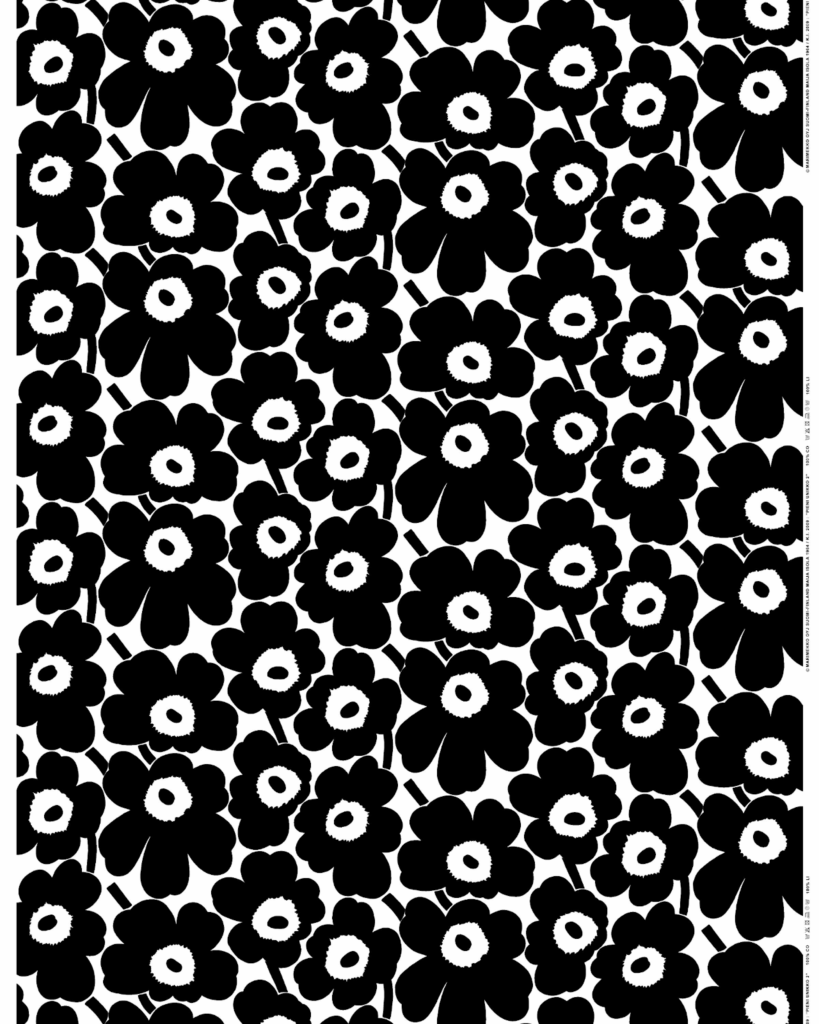
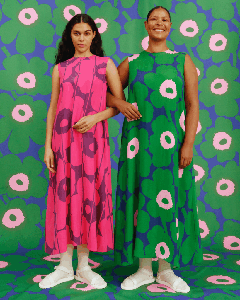
Crystallographic (mosaic) balance: Harmony through repetition
Crystallographic, or mosaic balance, is all about repeating patterns evenly across a canvas. Think tiled backgrounds, textile designs, or modular UI elements. It creates a sense of unity and rhythm—each piece is distinct, but together they form a cohesive whole.
When to use it:
- Background textures
- Pattern-driven websites
- Surface or fabric design
Marimekko, the Finnish design house, is renowned for its bold, repeating patterns used in textiles and home goods. Their iconic Unikko (poppy) print features evenly distributed floral motifs across fabric, wallpaper, and ceramics, with no single element dominating the composition. This use of crystallographic (mosaic) balance creates a sense of playfulness and endless repetition, making Marimekko’s surface designs instantly recognizable and full of lively energy.
Achieving visual equilibrium: Practical tips for real-world results
So, how can you tell if your design is balanced—and what can you do if it isn’t? Let’s break it down.
Measuring visual weight: The art of the squint test
Visual weight comes from more than just object size. Color intensity, density, texture, and negative space all play a role. To spot heavy areas, try the “squint test”—step back, blur your eyes, and see where your attention lands. Are certain spots demanding all the focus? Time to rebalance.
Using grids and guides: Your secret alignment weapon
Grids aren’t just for neat freaks. They help distribute elements evenly and anchor your compositions in logic. Tools like Figma’s layout grids or Illustrator’s guides make it easy to snap, align, and test different arrangements without guesswork.
Design Force tip: use the right tools
- Figma
Use the “Layout Grid” and “Smart Distribute” features - Illustrator
Lean on the “Align” panel and artboard grids
Balancing contrast and white space: Let your design breathe
Don’t underestimate the power of white space. It’s the “lightweight” that can offset a bold hero image or dense block of text. Use it intentionally to give your visuals room to shine and prevent your design from feeling crowded.
Imagine a vibrant product shot centered in a hero section, balanced by generous margins and minimal text, for example.
Iterative testing: Because balance is a moving target
Flip your design horizontally, print it in grayscale, or ask a trusted colleague for gut-reaction feedback. Sometimes what feels balanced on-screen shifts in a new context. Keep tweaking until it feels just right—your eye (and your audience) will thank you.
Top tools and resources for practicing balance in your designs
Ready to put these principles into play? Here’s your designer’s toolkit for mastering the balance principle of design:
- Figma
Smart distribute, layout grids, and alignment tools make balancing a breeze - Illustrator
Use the align panel and customizable artboard grids for pixel-perfect symmetry - Sketching and wireframing
Start with thumbnail sketches to test different weight distributions before jumping into digital - Plugins and downloads
- Explore free “Balance” UI kits
- Try grid-system plugins for your favorite design software
Design Force tip:
Rapid sketching can reveal new ways to achieve visual equilibrium before you commit time to high-fidelity mockups.
Level up your designs by mastering the balance principle
Balance isn’t just a buzzword—it’s the foundation of design harmony, readability, and emotional impact. By understanding and applying symmetrical, asymmetrical, radial, and crystallographic balance, you’ll unlock new dimensions in your work and keep your audience engaged from first glance to last click.
So, here’s your challenge:
Apply one new balance technique in your next project. Start small, iterate, and watch your designs transform from “meh” to memorable.
Liked this deep dive into the balance principle of design? Subscribe to the Design Force blog for more expert design guides, tips, and inspiration or if you’re looking for a reliable design partner, book a call with us.
Design smarter, not harder—that’s the mantra. Let’s make balance your new creative superpower.