The average person sees more than 5,000 pieces of content every day.
They have about 8.25 seconds to decide whether your post is worth their attention.
In a feed full of noise, social media graphic design is the difference between a scroll and a stop. But getting it right has become significantly harder. Platforms are shifting toward video. Algorithms are rewarding native content. And audiences have become skilled at spotting anything that feels generic or off-brand.
Here are 15 social media graphic design tips that will get your content noticed in 2026.
1. Define your visual identity first
Most brands start posting before they’ve figured out how they want to look. The content calendar comes first, and the visual identity gets built around it. The result is often a feed that looks inconsistent and difficult to build on.
Your brand identity is the foundation everything else sits on. It covers your brand colors, typography choices, image style, and the way you use white space. Locking these down before you plan content means every post reinforces the same brand rather than working against it.
Consistent use of brand colors alone can increase recognition by up to 80%. Consumers are also 81% more likely to recall a brand’s color than its name. Visual consistency is one of the most cost-effective investments you can make for brand loyalty.
If you haven’t done this work yet, start with a simple one-page brand reference that specifies your primary and secondary palette, font hierarchy, and two or three examples of the image style you’re aiming for.
2. Use color with purpose, not just personality
Color is the fastest way the brain categorizes what it sees. Within 90 seconds of encountering a brand, between 62% and 90% of a person’s initial judgment is based on color alone. This means your palette is actively working to persuade your audience.
First, choose colors that align with your brand values and positioning. For example, blue often signals trust, while red can evoke energy or urgency.
Second, prioritize contrast. High contrast between text and background ensures your posts are readable on small mobile screens. A quick way to check this is by viewing your design in grayscale. If elements are hard to distinguish, your contrast needs to be increased.
Platform context also matters. TikTok users prefer bright, high-energy colors, while Instagram audiences often appreciate a more balanced look. Understanding these differences helps you choose the best visual style for each platform.
3. Design for the format, not just the platform
A common mistake is simply resizing one design for every platform. For example, turning a square post into a Story or a LinkedIn banner.
The social media dimensions change but the design doesn’t. And the result? Content that looks like it was made for somewhere else.
Every format has its own logic:
- Stories and Instagram Reels are vertical, immersive, and built for motion
- Carousels work sequentially, inviting the viewer to swipe through
- Static posts need to make their point in a single frame
- LinkedIn favors professional, text-supported visuals
- Pinterest rewards tall, high-quality imagery optimized for saves
Designing for the format means thinking about how people consume each content type, not just where they view it. Visual hierarchy, text length, and how fast information appears should change based on the format, not just the screen size.
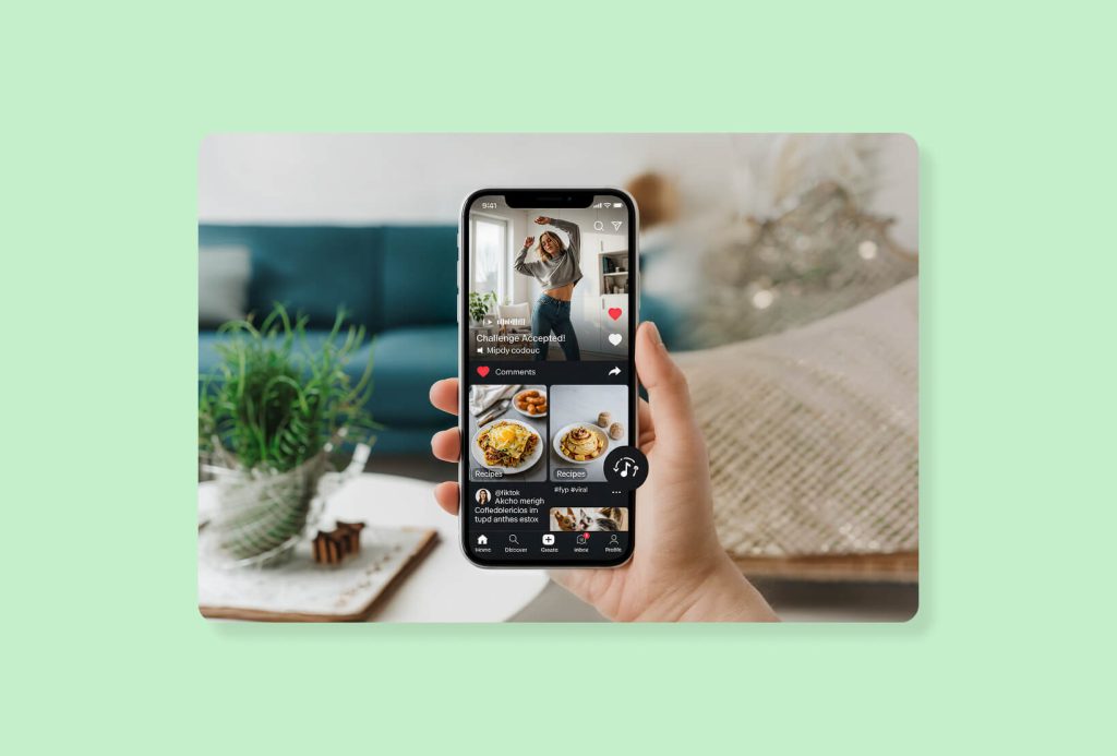
4. Make video your default
Video marketing is no longer a format worth experimenting with. It’s the dominant medium on every major platform. It accounts for over 60% of total social media consumption. Short-form video generates 2.5 times more engagement than long-form content across platforms.
This doesn’t mean every post needs to be a fully produced video. Motion can be as simple as an animated text or a subtle transition in a carousel. Even adding movement to something previously static can improve performance.
5. Capture their attention in the first three seconds
Every piece of social content has a first frame, and that first frame determines whether someone keeps scrolling or stops.
For video content, creators who lead with a strong hook in the first three seconds report a 58% increase in average watch time. For static posts and carousels, the same principle applies to the visual entry point: What does the viewer see first, and does it give them a reason to read further?
Strong hooks tend to do one of three things. They:
- Present something unexpected
- Make an immediate promise of value
- Open with a question the audience is already asking.
Weak hooks tend to start with a logo or a generic visual that doesn’t signal what the content is about.
Your first frame or visual focal point needs to do the heavy lifting. For example, if you’re designing a Reel, decide what appears in the thumbnail before you finish the video.
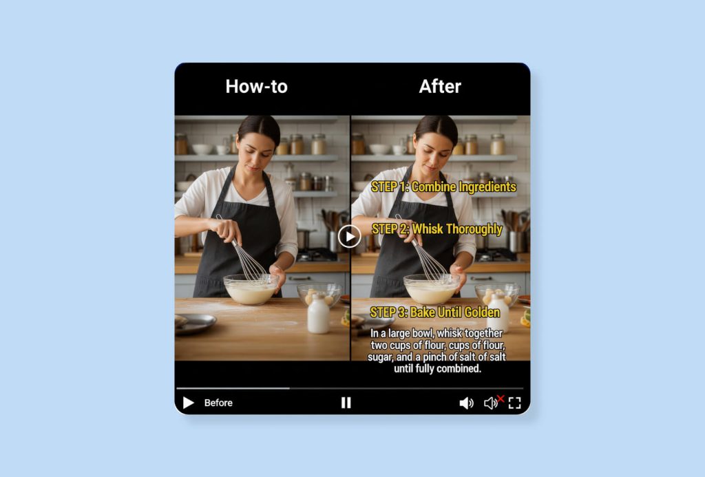
6. Design for silent viewing
Most social videos are watched without sound. People scroll in public, at work, or while multitasking. So if your video depends on audio to make sense, you’ve already lost the majority of your potential audience.
When you design for silent viewing, build the story into the visuals and text. Use captions that track with the spoken content. Add text overlays that summarize key points as they appear.
This applies to captions too. Write copy that works as a standalone. A viewer landing on your post from a hashtag or a share shouldn’t need to hit play to understand what you’re communicating.
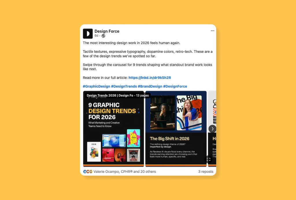
7. Use carousels to build narrative
Carousels are among the highest-performing formats on Instagram, but most brands use them as a vehicle for bullet points. A slide with a tip. Another slide with a tip. A final slide with a CTA. The format works, but it undersells what carousels can do.
The data backs the format. Later’s analysis of more than 44 million Instagram feed posts found carousels had the highest average engagement rate at 3.11%, ahead of images at 2.76% and videos at 2.60%. If your goal is engagement, carousel design is a high priority.
Buffer’s 2026 analysis highlights a clear distinction between these formats: Instagram Reels excel at reaching new viewers, while carousels are better for driving deeper engagement. A smart strategy uses Reels to get discovered and carousels to build a connection.
Effective carousels use narrative structure. The cover sparks curiosity while middle slides build tension or reveal information progressively. The final slide provides a clear resolution and CTA. This structure rewards the viewer at every swipe, keeping them engaged until the end.
8. Make typography do more work
Typography is one of the most underused design tools in social media content. Most brands treat it as a way to display text. The stronger approach is to use it as a visual element in its own right.
Use large, bold typography to create immediate hierarchy and legibility at thumbnail size. Typography adds personality, especially when pairing a display typeface with a clean body font. For maximum readability, ensure high contrast and avoid using more than two typefaces on small screens.
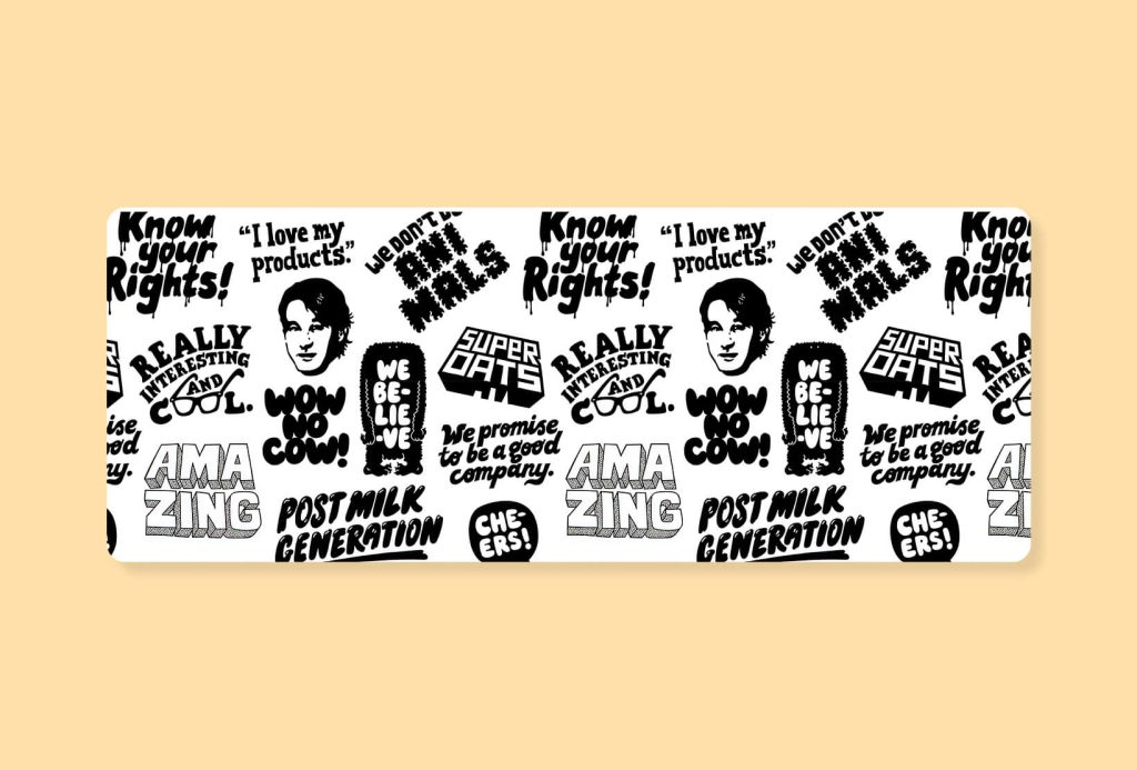
Oatly treats words as design. Bold display type, hand-lettered phrases, and condensed stacked headlines coexist without feeling chaotic. Their approach proves that font choices alone can communicate a brand’s personality and values instantly.
9. Turn data into visual content
Using well-designed graphics for your data makes a much stronger impact. Numbers buried in a caption often get overlooked, but presenting that same information as a clear visual can stop a user from scrolling past.
Infographics and charts work because they turn complex data into visuals that the eye can process instantly. Posts with images generate 2.3 times more engagement than text-only updates, making data-led visuals both useful and highly shareable.
Data visualization applies whether you’re sharing industry research, your own product metrics, or a comparison that positions your brand favorably. The same number at 80pt, color-blocked, with a one-line context statement is a post.
10. Stand out with custom illustrations
Stock photography is everywhere, and audiences often tune it out. Using custom illustrations makes your brand stand out because it shows a deliberate creative choice.

76% of consumers say authentic, relatable social content matters more to them than polished, high-production content. However, strong social design does not always mean technically perfect. It means human and relatable. Once a visual language is established, specific shapes, characters, or textures become associated with your brand.
11. Leverage interactive formats
Social media platforms are designed for two-way communication, yet many brands only push information out. Interactive content changes this dynamic, and platforms often prioritize posts that encourage user participation.
Interactive formats have seen a 45% increase in engagement since 2023 across platforms. Polls, quizzes, sliders, and question stickers on Stories do more than generate engagement numbers. They give your audience a reason to participate, which deepens the connection and generates audience insight at the same time.
12. Build a template system, then break it selectively
Templates often get a bad reputation for creating “sameness,” but when used correctly, they are essential. They help brands maintain consistency without having to design every post from scratch.
Emplifi’s 2025 data found 23% wanted posts once per day, and 18% wanted multiple posts per day. Success on social media content creation requires both high-quality design and a consistent posting schedule. Using a template system makes it much easier to maintain the volume of content needed to stay visible to your audience.

The goal is a visual logic that makes every post feel like it belongs to the same brand, even when the content varies.
13. Make your profile a brand statement
The posts in your feed get most of the attention, but your profile is what converts curious visitors into followers and followers into customers. It’s also often the first thing someone sees when your content is shared out of context.
Your profile picture, header image, bio link, and pinned content need to work together and reflect the same visual identity as your posts. Even a consistent avatar across platforms makes your brand easier to find and harder to confuse with a competitor.
Review your profiles periodically with fresh eyes. Ask whether someone landing on your profile for the first time would understand what your brand does and why they should care within a few seconds. If the answer isn’t immediate, the profile needs work.
14. Design with your analytics in front of you
Every platform gives you data on what’s working.The brands that consistently improve their social media design treat data analytics as part of the creative process, not an afterthought.
Look for patterns. Which formats drive the most saves? Which designs generate comments versus shares? What visual style performs best on each platform?
However, data-driven content can quickly become repetitive. The key is to use performance data as a foundation to invest in what works while still leaving room for creative risks. This balance allows your content strategy to remain both effective and engaging over time.
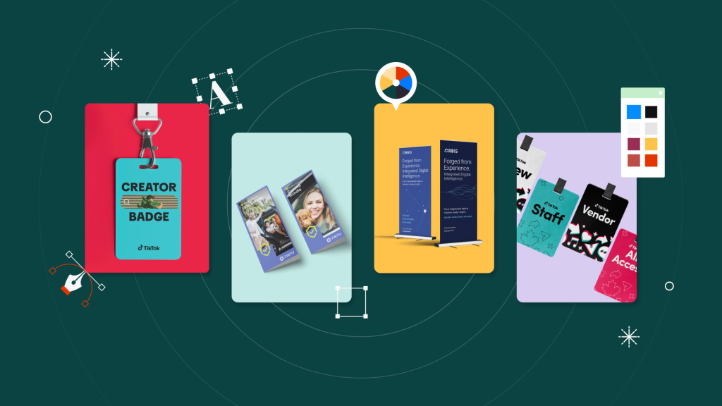
15. Know when to bring in a design partner
Creating social content that is on-brand, visually strong, and calibrated to each platform is a significant creative and operational undertaking. Graphic trends move fast. Formats multiply. And internal teams often don’t have the bandwidth to keep up with volume without sacrificing quality.
Outsourcing a design subscription service like Design Force give access to a dedicated team that learns your brand and produces high-quality content quickly. This model gets rid of the long ramp-up time of hiring freelancers or agencies and ensures consistent, on-brand output because the designers are already familiar with your visual language.
The design decisions that compound over time
One viral post doesn’t mean you have strong social media skills. Instead, brand recognition is built through hundreds of small, consistent decisions that train your audience to know it’s you the moment they see your content.
Following these social media graphic design tips will help make sure your content performs at its best across all platforms. And if you find yourself hitting a wall on capacity, that’s usually the sign to bring in support before the quality starts to slip.