

Mastering the principles of design is (strategic) magic
Design isn’t just how something looks. It’s the invisible force that sparks emotion, tells stories, and turns plain information into memorable moments. Think about the brands you love, the apps you can’t put down, the posters that stop you in your tracks—graphic design is the magic behind them all. In a world obsessed with visuals, mastering the fundamentals of design is more than a creative superpower. It’s a strategic advantage.
Welcome to Graphic Design 101—the foundational guide for designers, marketers, and anyone who wants to understand how visual communication works. If you’re ready to build a creative toolkit that will help you design with purpose (not just make things ‘look good’), you’re in the right place.
In this article, we’ll break down the what, why, and how of graphic design. You’ll get the foundational elements, learn the rules (and when to break them), and discover how principles like color, composition, and typography come together to make brands unforgettable. Throughout, you’ll find links to deeper dives and practical examples, all curated to help you level up your creative game—whether you’re new to the field, re-skilling, or just hungry for fresh inspiration.
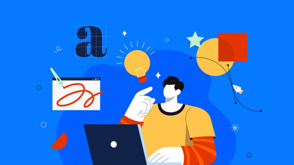
What is graphic design? Moving beyond the surface
Graphic design is the craft of visual communication. It’s how brands show their personality, how data becomes stories, and how every message (big or small) finds a way to cut through the noise.
At its heart, graphic design is about solving problems visually. Whether that’s helping a brand stand out in a saturated market or making complex information accessible, designers use a curated blend of imagery, typography, color, and structure to achieve their goals.
The many faces of graphic design
- Logo design
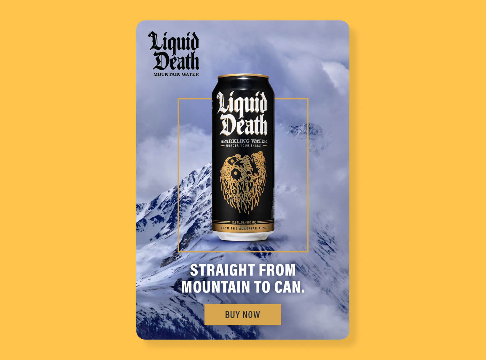
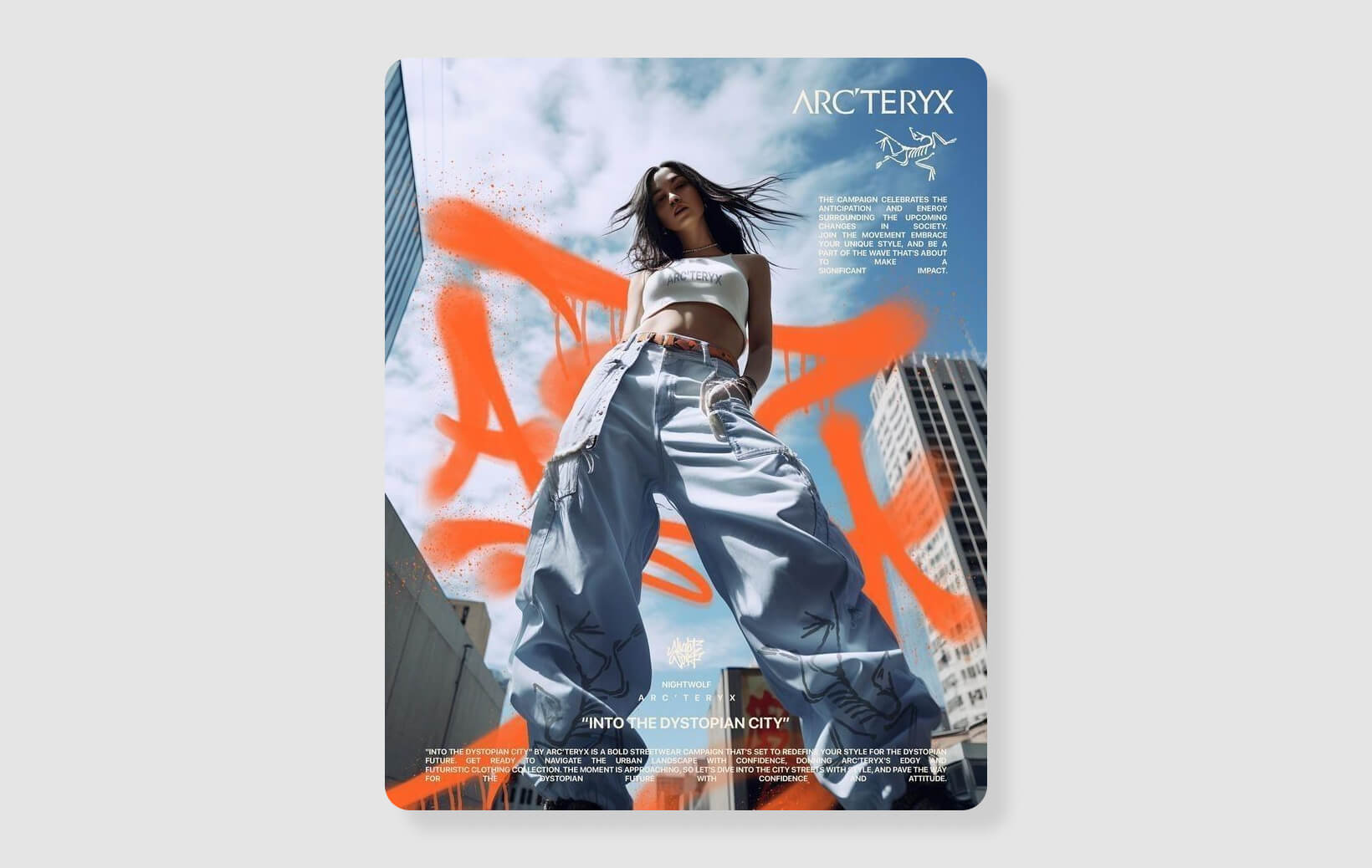
A logo distils an entire brand identity into a single, unforgettable mark. It’s not just about looking unique—it’s about being instantly recognizable and full of meaning. (Curious about what makes a logo effective? See our guide to what makes a good logo.) - Brand identity
This is the sum of every visual element a brand uses—colors, type, imagery, patterns, even tone of voice. A strong identity builds trust and consistency, making a brand feel like a cohesive ‘personality’ across every touchpoint.
It’s the reason Nike feels like Nike, whether you’re looking at a shoe box or a billboard.
- Print design
From business cards and brochures to posters and packaging, print design bridges the physical and digital worlds, giving audiences something tangible to hold onto. Here, designers consider not just layout, but also paper, finish, and the tactile experience. - Digital design
Websites, apps, dashboards, social media—anywhere pixels live, designers shape how users interact, learn, and connect. Here, user experience (UX) and accessibility are critical—because a beautiful site is useless if no one can navigate it. (Get actionable UX design tips for digital projects.) - Motion graphics and animation
Animated visuals bring stories to life, capture attention, and explain complex concepts in seconds.
Design in the Digital Age
Design has evolved—fast. Now, we’re designing for mobile-first audiences, adapting to ever-changing platforms, and embracing innovations like AI in graphic design. Designers are no longer just creators; they’re strategists, technologists, and advocates for inclusive design. User interface (UI) and user experience (UX) design are now essential skills. Accessibility is non-negotiable, and responsive, mobile-first design is the new normal. The creative toolkit is bigger than ever, from Figma and Adobe Creative Suite to AI-powered image generators and smart prototyping tools.
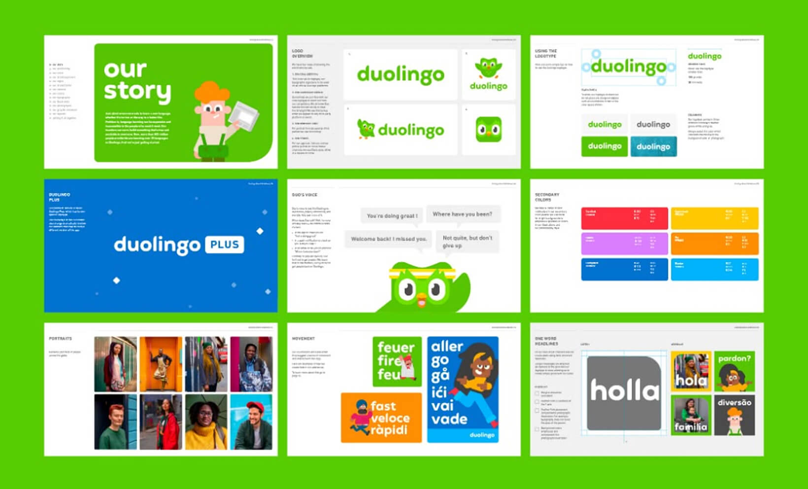
For example, consider how Duolingo’s interface blends vibrant color palettes, playful animations, and friendly iconography. Every design choice is intentional—guiding users step by step, reinforcing the brand’s approachable personality, and making language learning feel both accessible and engaging. The result? Complex content becomes fun and intuitive, and learners are encouraged to keep coming back for more.
Further reading:
The core design elements
Every masterpiece, from a subway poster to a viral Instagram ad, is built from the same basic elements. Mastery starts with understanding how and why these elements work together.
1. Line
Lines are the most fundamental graphic elements; used to direct attention, divide space, or create movement. Thick, bold lines can suggest strength or urgency, while thin, flowing lines feel gentle and sophisticated. In layouts, lines guide the eye, connect ideas, and provide structure.
2. Shape
Shapes are containers for ideas. Geometric shapes (squares, circles, triangles) feel stable, logical, and clean, often used in tech or corporate branding. Organic shapes (think leaves, blobs, hand-drawn icons) bring warmth, playfulness, or a human touch. Overlapping shapes can create depth, while symmetrical shapes provide balance.
3. Color
Color is design’s emotional engine. It sets mood, creates hierarchy, and provides instant meaning. Understanding color psychology gives you the power to influence perception and action; a vibrant red can signal urgency or excitement; a soft blue evokes calm and trust. Contrasting colors can draw attention to calls-to-action; harmonious palettes build brand recognition and visual unity.
Design Force tip:
Use color intentionally. Consider accessibility (color contrast), cultural meanings, and how colors appear on different screens or in print.
4. Texture
Texture is what gives design a tactile feel—even in flat digital spaces. Subtle paper grain, brushed metal, or a grainy overlay can add interest, realism, or vintage vibes. Texture creates visual depth, making backgrounds or illustrations pop without clutter.
5. Space
Space is the ‘pause’ between visual notes. It’s not wasted—it’s what gives designs breathing room and clarity. White space (or negative space) improves readability, separates sections, and lets key elements shine. Crowded designs feel overwhelming; well-spaced layouts feel modern and easy to navigate.
6. Form
Form refers to the three-dimensional quality of an object—real or implied. Gradients, shadows, and perspective tricks can make flat designs feel layered and dynamic.
7. Typography
Typography isn’t just font choice—it’s how you arrange, size, and style type to create voice and personality. Serif fonts can convey tradition or authority; sans-serif fonts are modern and clean; script fonts feel personal and expressive.
Design Force tip:
Good typography isn’t noticed, it’s felt. It should guide the reader effortlessly through content, setting the tone at every turn.
Further reading:
- Build your understanding of the seven key elements of design to see how these concepts work in harmony.
- Get creative with design texture in your next project.
- Explore font choices and branding in typography for brand identity.
Design principles: The rules behind good design
Now that you know your elements, it’s time to orchestrate them. Design principles are the rules that make visuals work together harmoniously, transforming scattered parts into a unified, compelling whole.
1. Balance
Balance is the distribution of visual weight. Symmetrical designs (where elements mirror each other) feel stable and formal. Asymmetrical designs (where elements of different sizes or colors are balanced across a composition) feel dynamic and modern.
Balanced layouts are comfortable to view and easy to navigate. They subconsciously reassure the viewer, making information easier to absorb.
Learn more about achieving balance.
2. Contrast
Contrast is what makes things stand out. It’s the difference between light and dark, big and small, bold and subtle. Without contrast, designs feel flat—nothing catches the eye.
Design Force tip: Use contrast to draw attention to critical information, like headlines, CTAs, or data points. Pair dark text with light backgrounds, or vice versa, and don’t be afraid of bold color juxtapositions.
3. Alignment
Alignment brings order to chaos. When elements are carefully lined up (text, images, icons), everything just ‘clicks.’ Poor alignment feels amateurish; sharp alignment feels professional and intentional.
4. Proximity
Proximity is about grouping related items together. Think of a restaurant menu—starters grouped on the left, mains in the center, desserts on the right. Proximity makes scanning fast and intuitive.
5. Repetition and rhythm
Repetition creates unity. Repeating a color, typeface, or icon style across your design (or your entire brand) ties everything together.
Rhythm is the sense of movement created by these repeated elements—like the beat in a song.
Design Force tip:
Consistent button styles across a website make navigation effortless.
6. Hierarchy
Hierarchy tells your audience what to look at first, second, and last. This is achieved through size, color, placement, and type. Headlines are big and bold; body copy is smaller and regular. CTA buttons are bright and prominent.
Want to check examples of Visual Hierarchy in Design?
7. Negative Space
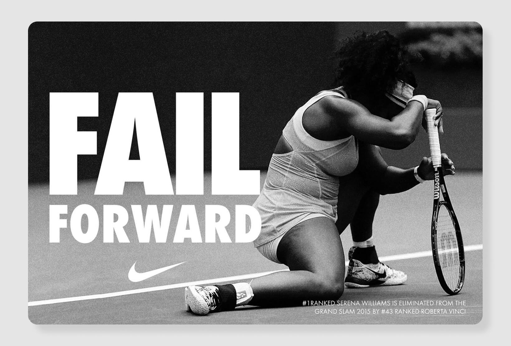
Negative space is the designer’s secret weapon for clarity. It gives the eyes a place to rest, keeps layouts from becoming cluttered, and can be used cleverly to create hidden imagery or double meanings (see: the FedEx arrow).
Further reading:
- Unlock the secrets of essential design principles for creative work.
- See practical applications of balance in graphic design.
- Master the art of negative space.
Color, typography and hierarchy: The trifecta of visual clarity
These three facets are the backbone of readable, memorable, and persuasive design.
Color: More than decoration
Color isn’t just eye candy, it’s the emotional engine of your design. Want to excite? Use a pop of red. Want to reassure? Lean into blue. Color can guide, unite, and persuade when used with intention.
- Consider your audience and brand
Tech brands love blues for trust; food brands often use red to stimulate appetite. - Don’t overload your palette
Three to five colors is usually plenty for a cohesive look. - Use color contrast for accessibility
Ensure text stands out against backgrounds for all users.
Discover the psychology behind your palette in our guide to color psychology in design.
Typography: The voice of your brand
Typography is where function meets personality. Choose a font that reflects your message—clean and simple for startups, elegant and serifed for law firms, playful for kids’ brands. But it doesn’t stop at the font:
- Adjust line spacing for readability
- Use caps, bold, or color for emphasis (sparingly!)
- Pair fonts with purpose—a bold headline font and a readable body font is a classic move
Dig into the nuances with our best practices for typography in brand identity.
Hierarchy: Guiding the eye
A good design reads like a well-edited story: headline, subhead, supporting text, call-to-action. Hierarchy is all about using size, weight, color, and placement to show what’s most important.
- Make your headline the star—large, bold, and unmissable
- Subheads help scan and break up content
- Use color or contrast to make CTAs irresistible
See hierarchy in action with our tips on typographic hierarchy techniques and examples, and keep your layouts powerful with visual hierarchy.
Further reading:
Composition and layout systems: Bringing order to creativity
Composition is the secret sauce that makes designs feel ‘just right.’ It’s about arranging elements so the overall message is clear, balanced, and enticing.
Layout Basics
- Rule of Thirds:
Divide your space into a 3×3 grid. Place key elements along these lines or intersections for dynamic, balanced compositions. - Visual Flow:
Use lines, arrows, or images to move the viewer’s eye across the design. Z-patterns and F-patterns mimic how people naturally scan pages. - Focal Point:
Decide what you want viewers to see first—make it big, bold, or uniquely colored.
Grid systems
Grids are the scaffolding of every great design. They bring order, make layouts easier to organize, and ensure consistency across pages or screens. Modular grids help web designers align images, text, and CTAs so everything feels cohesive, even as content changes.
- Use column grids for websites and brochures
- Try modular grids for more experimental layouts
- Stick to the grid—then break it on purpose for creative emphasis
Explore how grid systems streamline your workflow.
Mood boards
Mood boards are your playground for inspiration. Before you design, gather images, color swatches, typography samples, and patterns. This not only defines your creative direction but also helps align your team or client.
- Mix found images, swatches, and sketches
- Use them to explore different directions quickly
- Mood boards keep teams aligned and inspired
Get inspired with our mood board how-to.
Slides and presentations
Translating design principles into presentations is an art form. Use slides to tell a visual story—limit text, use impactful imagery, and keep layouts clean. Remember: every slide should have one clear message.
- Use big visuals and one key idea per slide
- Guide the viewer’s eye with arrows, lines, or animation
- Don’t overload—less is more
Become a slide superstar with our tips for slide composition.
Design Force tip:
1. Start with a wireframe or rough sketch before jumping into software.
2. Use grid templates to keep alignment consistent.
3. Audit your design for visual flow—ask others where their eyes land first.
4. Don’t be afraid of white space; it’s your friend.
Branding and identity design: Building unforgettable brands
Branding is the soul of design. It’s how companies become icons and how ideas stick in our minds long after the first impression.
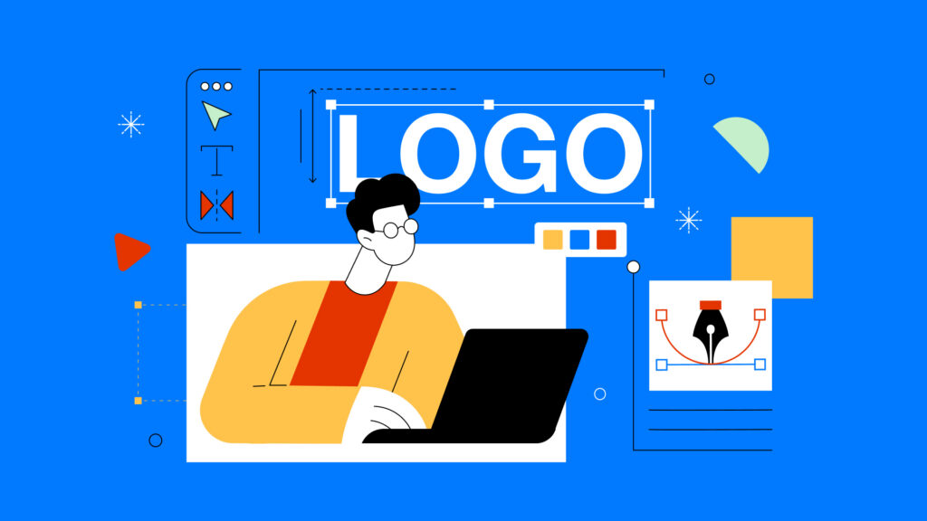
Logo design
A logo is the crown jewel—it captures a brand’s personality, mission, and positioning in one compact symbol. Great logos are simple, memorable, and flexible (working in color, black-and-white, tiny social icons, and giant billboards).
Design Force tip:
Test your logo in real-world scenarios. On a business card, as a website favicon, on a t-shirt, etc. If it loses clarity or impact, simplify.
See what makes a logo unforgettable in our guide to logo design.
Brand identity
A brand’s identity system goes beyond the logo: it includes a defined color palette, primary and secondary fonts, imagery guidelines, iconography, and even tone of voice. This system ensures every touchpoint feels unmistakably ‘on-brand.’
Airbnb’s ‘Bélo’ symbol, custom typeface, and approachable photography style are used everywhere (from the app to billboards to swag) creating instant recognition.

Design systems
Design systems are playbooks for consistency, especially in growing teams. They include reusable components (like buttons, cards, icons), style rules, and code snippets. A well-crafted system saves time, minimizes mistakes, and keeps brands looking sharp at scale.
Going beyond the basics
Modern identity design also considers motion, sound, and interaction. How does your logo animate? Does your brand have a signature motion or sound? Memorable brands think in 360°.
Further reading:
- The role of design in shaping brand identity and customer experience
- Branding tips
- Brand design inspirations
The design process: From brief to brilliance
Behind every polished design is a process—part science, part art, part good old-fashioned teamwork.
1. Briefing
Start by clarifying the project’s goals, target audience, message, deliverables, and deadlines. A great brief is a creative blueprint, it prevents miscommunication, saves time, and sets expectations.
Design Force tip:
Ask questions. Who is this for? What’s the desired action? What are the brand’s non-negotiables?
2. Research and Inspiration
Collect references, mood boards, and competitor examples. Explore trends, but don’t be a slave to them—blend inspiration with originality.
3. Ideation and Sketching
Don’t jump straight to digital. Sketch ideas on paper or whiteboards. This phase is about quantity—capture every wild thought before narrowing down.
4. Execution
Move to your favorite design tool (Figma, Adobe XD, Illustrator, etc.). Build out your best ideas, paying close attention to hierarchy, balance, and color.
5. Feedback and refinement
Present concepts to stakeholders or teammates. Listen to feedback, iterate, and polish until the design is both beautiful and functional.
6. Delivery and handoff
Prep your files for print or digital use. Package assets, export in the right formats, and (if digital) provide specs or style guides for developers.
7. Review and iterate
After launch, gather data—user feedback, engagement metrics, or usability testing results. Don’t be afraid to tweak and improve.
The role of user experience and accessibility
UX is about making designs easy and enjoyable for everyone. Test your work with real users, simplify navigation, and ensure content is accessible to all—including those with disabilities. Use proper contrast, alt text, and legible fonts.
Designing for impact: Beyond aesthetics
Design is a force for engagement, education, and change. Want your work to stick? Make it meaningful.
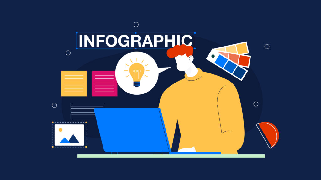
Storytelling through design
The best designs tell a story using imagery, color, and type to create an emotional arc. Infographics turn data into insight; campaign visuals stir action; thoughtful packaging creates anticipation.
Designing for engagement
Motion, interaction, and bold visuals capture attention—especially for younger audiences. Experiment with micro-animations, interactive elements, or bold color to keep people engaged. Find out how to design to engage.
Social impact by design
Design can educate, rally, and drive change. Use your skills for causes you care about—whether that’s climate action, accessibility, or social justice. Explore the fundamentals of social impact design.
Tips for designing with impact
- Start with empathy: Who are you designing for?
- Use visual metaphors to simplify complex messages.
- Seek feedback from diverse audiences.
- Don’t be afraid to take a stand. Design can shape culture.
Emerging design trends: What’s now and what’s next
Design is always evolving. To stay relevant (and keep your work fresh) embrace curiosity.
AI and automation
From generative art to smart design suggestions, AI in graphic design is transforming creative workflows. Embrace new tools, but keep your unique creative spark at the center.
Minimalism and boldness
The pendulum swings: minimalism rules for clarity and elegance, but bold colors, expressive typography, and maximalist details are making a comeback for brands that want to stand out.
Mobile-first and accessibility
Design for small screens first, then scale up. Fast load times, legible fonts, and touch-friendly layouts are a must. Check out our mobile-first website design guide.
Presenting and evolving
Design is always “in beta”—be ready to adapt, tweak, and update as trends, technology, and audiences change. For tips on presenting your evolving work, see how to present designs to clients.
Further reading:
Your creative challenge
Graphic design is where creativity meets purpose. Every color, typeface, and pixel counts—each one shapes how your message lands and how your brand lives in the world.
Now it’s your turn.
Your challenge:
Pick one principle or technique from this article and use it in your next project. Maybe you’ll try a new grid system, experiment with color psychology, refine your typographic hierarchy, or audit your brand’s visual consistency. Embrace the squiggly, messy process—creativity is rarely a straight line.
From our creative team to yours
At Design Force, we believe design should be as powerful as it is playful. We’re a passionate team of creative partners (designers, strategists, and storytellers) helping ambitious brands, startups, and marketers bring their ideas to life. Whether you need to build a cohesive brand identity, launch a standout campaign, or simply make your message pop in a crowded market, we’re here to turn inspiration into impact.
If you found this guide useful and want more like it, subscribe to the Design Force blog. We publish practical, no-fluff resources on graphic design, branding, and visual communication—built for people who need ideas they can actually use.
And if you’re looking for extra creative capacity: Design Force is a design production service—an on-demand design team for marketing and creative teams. We help you move faster and stay on-brand across the assets you ship every week, from campaigns and social to web and product visuals.
Subscribe to get new posts delivered straight to your inbox.